Category: Tech Video

  • What Makes a 3D Logo Stand Out in Modern Design?

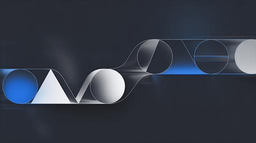
    What Makes a 3D Logo Stand Out in Modern Design?

    A 3D logo stands out in modern design when it feels designed, not dressed up.

    There is a difference.

    A dressed-up logo has shine, shadows, bevels, maybe a dramatic spin. It looks nice for a second. Then it feels like every other logo reveal you have already seen.

    A designed 3D logo has a reason behind it. The depth fits the brand. The material says something. The lighting is not random. The motion has behavior. Even if you remove the effects, the mark still makes sense.

    That is the real test.

    A Weak Logo Does Not Become Strong in 3D

    The flat version has to work first.

    No way around it.

    If the original logo has odd spacing, thin details, confusing shapes, or poor balance, the 3D version will expose those problems. It can sometimes exacerbate their condition. Depth creates extra edges, shadows, angles, and areas for the eye to get lost.

    That is why brand identity design matters before the 3D work begins.

    A good logo should still read in one color. It should still look clear in a small size. It should not fall apart when placed on a plain background.

    Only after that does 3D logo design become useful. Then depth can add weight. Light can add mood. Materials can add personality.

    But effects should support the mark, not rescue it.

    Depth Needs a Reason

    Depth is not automatically impressive.

    A logo can be 3D and still look forgettable.

    The depth has to match the business. A sports brand can carry impact. A children’s brand may need softer volume. A SaaS brand may need clean, controlled surfaces. A gaming studio can go darker and more dramatic. A wellness brand may need warmth instead of heavy shadows.

    This is what makes a 3D logo stand out in real use. It feels like it belongs to that brand, not to a random template pack.

    An explainer video company may treat a logo the same way it treats a video intro. The final mark should feel connected to the whole visual story, not like a separate shiny object placed at the end.

    If depth does not help the brand feel clearer, it is probably just decoration.

    Materials Can Change the Whole Mood

    A logo made in glass feels different from one made in stone.

    Chrome feels different from matte black. Brushed metal feels different from soft plastic. Frosted acrylic feels different from gold. These choices are not small details. They change the personality of the logo.

    This is where logo rendering matters.

    A healthcare logo with harsh metal and sharp reflections may feel cold. A luxury logo with loud neon may feel cheap. A tech logo with muddy surfaces may lose its clean look.

    A custom 3D logo should use materials that make sense for the brand. Not every logo needs to look like polished steel. Not every logo needs glow. Not every logo needs reflections.

    Sometimes the strongest choice is quiet.

    A soft shadow. One clean highlight. A surface that does not fight the mark.

    That can look more premium than a logo overloaded with effects.

    Lighting Is Part of the Design

    Lighting is not a final polish step.

    It decides what people see first.

    Too much light can flatten the logo. Too little light can hide the shape. Too many highlights can make it look like plastic. A hard spotlight can make a serious brand feel like an old TV intro.

    Good lighting gives the logo form. It shows the edges. It creates depth. It gives the mark a place to exist.

    This is where 3D logo branding becomes more than exporting a file. The logo needs a small visual world around it. Maybe it sits in dark space. Maybe it appears over a clean background. Maybe the light moves slowly across one edge.

    The brand decides the mood.

    A calm brand does not need aggressive lighting. A gaming logo can handle more contrast. A fintech logo may need neat reflections and clear surfaces.

    Lighting should guide the eye, not show off.

    Motion Should Behave Like the Brand

    A 3D logo does not need to fly, spin, explode, and land with a heavy sound effect.

    That look gets old fast.

    Good 3D logo animation feels like the brand in motion. A sports logo can hit hard. A luxury mark may reveal slowly. A SaaS logo may assemble with clean timing. A kids’ brand can bounce a little. A film logo may carry drama.

    The motion should feel intentional.

    Good logo animation techniques are not about using every trick. A small camera push can be enough. A clean build can work. A light sweep can work. A material shift can work. A short reveal can work.

    A 3D explainer video company can help keep that motion consistent across a larger brand video system, so the logo reveal, transitions, product shots, and closing screen feel like they came from the same world.

    Random movement makes the logo look busy. Planned movement makes it feel memorable.

    One Hero Render Is Not Enough

    A logo cannot live only in one perfect render.

    It has to work in less perfect places too.

    A reel intro. A website header. A YouTube thumbnail. A pitch deck. A trade show screen. A product launch video. A profile banner. A dark background. A light background. A tiny placement where half the surface detail disappears.

    This is where many 3D logos struggle.

    They look great when shown full-screen, then fail everywhere else. The details are too thin. The shadows are too heavy. The angle is too specific. The logo only looks good on one background.

    A proper logo system needs versions.

    A flat logo for everyday use.
    A 3D still for campaign graphics.
    A short animated logo for social posts and video intros.
    A longer reveal for bigger brand moments.
    A transparent-background version for overlays.

    These are the real benefits of 3D logo design. The brand gets useful assets, not just one impressive file.

    Avoid the Template Feeling

    Most people cannot name why a 3D logo feels generic, but they can feel it.

    Blue glow. Metal text. Smoke. Lens flare. Random particles. Slow spin. Big impact sound.

    It feels familiar in the wrong way.

    For 3D logo design for modern brands, restraint matters. A logo with one good idea usually lasts longer than a logo with ten effects fighting for space.

    Remove the shine for a moment.

    Is the silhouette still clear?
    Does the shape still feel balanced?
    Does the depth make sense?
    Would the logo still work if the animation were shorter?

    If the answer is no, the design is hiding behind polish.

    Good 3D work has taste. Taste often means knowing when to stop.

    The Flat Logo Still Has a Daily Job

    A simple 2D logo design

    A brand still needs the 2D version.

    Documents need it. Invoices need it. Small website placements need it. Favicons need it. Packaging may need it. App icons may need it. Simple social templates may need it.

    A heavy 3D logo cannot do every job.

    That is fine.

    The smart approach is not 2D versus 3D. It is 2D and 3D working together. The flat logo handles daily brand use. The 3D logo handles high-impact moments. The animated logo handles videos, launches, campaign openers, and presentations.

    A 2D explainer video company may use the flat mark inside clean character scenes or educational videos where a dimensional logo would feel too heavy.

    Consistency does not mean every version looks identical. It means every version feels like the same brand.

    Industry Fit Matters More Than Trend

    A gaming logo can be louder.

    A healthcare logo usually should not be.

    A finance brand needs trust. A SaaS product needs clarity. A children’s brand needs warmth. A sports brand can use speed and impact. A luxury brand often needs less, not more.

    This is where how to design a 3D logo becomes a judgment call.

    A logo should fit the market without copying everyone in it. If every competitor is using cold blue glass and chrome edges, a cleaner or warmer treatment may stand out more.

    A SaaS explainer video company may reduce the 3D logo reveal to a minimum because the audience should grasp the platform rather than sit through a visual effects presentation.

    The design should know the room it is entering.

    Process Shows in the Final Piece

    A strong 3D logo is not built by pressing one button.

    The work usually starts with the idea. What should the logo feel like? Where will it appear? What parts of the existing identity must stay untouched?

    Then the mark is adapted for depth. Edges are cleaned. Curves are checked. Spacing is tested. The model is built for the angles people will actually see.

    After that come materials, lighting, camera, render tests, motion, sound, and final exports.

    That animation pipeline matters. A logo that looks good as a still may move badly. A material that works on black may fail on white. A five-second reveal may look great once and feel annoying before every video.

    The process catches those things before the final delivery.

    A rushed logo often looks fine in one mockup and struggles in the real world.

    The Logo Should Help People Remember You
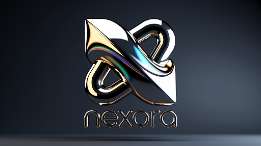
    A well-designed 3D logo

    A 3D logo should not only impress someone once.

    It should help them recognize the brand again.

    This is how 3D logos enhance brand identification. The logo treatment is consistent throughout launch videos, social media, campaign visuals, presentations, product demos, and branded introductions. People gradually come to associate that appearance with the firm.

    A short reveal before a video.
    A clean render on a campaign graphic.
    A motion version inside a reel.
    A closing logo on a brand film.

    Small repeated moments build memory.

    But don’t abuse it. If the logo animation is too lengthy, consumers will skip it. If the render is too busy, people recall the effect rather than the mark.

    The best 3D logos support the content. They do not slow it down.

    Final Words

    A 3D logo stands out in modern design when the idea is stronger than the effects. The flat mark must be clear first. Then depth, materials, lighting, motion, logo rendering, and visual effects can add presence. A strong 3D logo works across real brand touchpoints, not just one beautiful mockup.

    It supports video introductions, social media, product debuts, presentations, websites, and campaigns. But it requires moderation. The goal is not to decorate the logo. The idea is to make the brand easy to identify and recall.

    Frequently Asked Questions

    A 3D logo stands out when its shape is obvious, the depth serves a purpose, the materials are appropriate for the brand, and the lighting or motion enhances rather than detracts from the identity.
    Not always. A flat logo is best suited for everyday use, tiny displays, papers, icons, and basic layouts. A 3D logo is ideal for video introductions, debuts, presentations, promotions, and high-impact digital events.
    The advantages include increased visual presence, greater utilization in video content, memorable logo reveals, reusable digital assets, and a more cohesive brand across websites, social media, and presentations.
    A 3D logo is often generated using concept planning, 3D modeling, material design, lighting, rendering, animation, post-production, and final exports for various platforms.
    Yes. A 3D logo may be utilized in reels, thumbnails, video intros, launch posts, motion graphics, campaign visuals, and profile material if it is correctly converted for mobile displays.

    Related Articles:

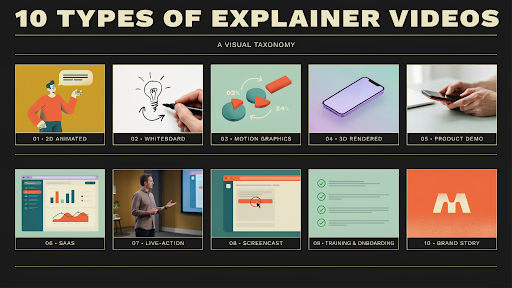
  • 10 Types of Explainer Videos and When to Use Each One

    10 Types of Explainer Videos and When to Use Each One

    There are many types of explainer videos, and the wrong choice usually starts with a simple sentence: “Can we make it look like this?”

    That sentence causes trouble.

    A reference video can be useful, but it should not decide the whole direction. A SaaS product, a medical device, a brand story, and a staff training process do not need the same kind of video. One needs screens. One needs depth. One needs people. One needs slow, clear steps.

    The style should answer the viewer’s problem, not the team’s personal taste.

    1. 2D Animated Explainer Videos

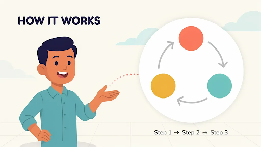
    An example of 2D animated explainer videos

    2D animation works well when the viewer needs to see a situation.

    A patient trying to understand care instructions. A manager chasing approvals. A customer support rep stuck with the same question again. A small business owner trying to fix payment issues before the day ends.

    Those little scenes make a message easier to follow.

    A 2D explainer video company can turn a plain service pitch into a short, human story. It does not need to be dramatic. It just needs to show the problem clearly enough for the viewer to think, “Yes, that is what I deal with.”

    Use 2D for healthcare, HR, education, fintech, apps, customer support, service pages, and training topics with a human angle.

    Keep the story small. One problem. One setting. One clear shift.

    2. Whiteboard Explainer Videos

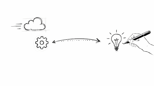
    An example of whiteboard animation

    Whiteboard animation is closer to teaching than selling.

    It has a slower pace. A line appears. A label follows. The next idea connects to it. The viewer watches the explanation form piece by piece.

    That makes it useful for compliance topics, nonprofit messages, policy explainers, safety steps, simple financial education, and internal training.

    If you are wondering when to use whiteboard explainer video content, use it when the topic needs patience. A claims process, employee policy, or step-by-step lesson can work well here.

    But the style has a weakness. It can look tired fast.

    A hand drawing a lightbulb, a stick person, an arrow, and a dollar sign feels like something people have already skipped before. Whiteboard needs specific visuals and a sharp script. Without that, it becomes a template with narration.

    3. Motion Graphics Videos

    An example of a motion graphics video

    Some messages do not need a character walking through a story. They need structure.

    A dashboard flow. A service timeline. A report. A payment journey. A system diagram. A set of numbers that needs to make sense quickly.

    That is where motion graphics help.

    Icons, labels, charts, forms, UI screens, and movement can all be used in a motion graphics video to put together vague ideas. It’s good for banking, cybersecurity, SaaS, transportation, business-to-business (B2B) services, internal slideshows, and information that looks like a report.

    A good explainer video company should not add motion only to make the screen look active. Movement should show what changes, what connects, or what comes next.

    If the viewer is busy watching arrows fly around, the video has already lost focus.

    4. 3D Explainer Videos

    An example of a 3D explainer video

    Some products cannot be explained properly from the outside.

    Medical devices, industrial tools, machinery, construction systems, hardware, product mechanisms, and architecture concepts often need depth. The buyer may need to see inside the product, understand how parts move, or watch an assembly process.

    A 3D explainer video company can show those details in a way photos and flat graphics cannot.

    That is the real value of 3D. Not that it looks expensive. That it makes the physical thing easier to understand.

    The 2D vs 3D explainer video for business question should be practical. If the message is about a person’s problem, 2D may be better. If the message is about a product’s structure, movement, or technical details, 3D is usually the stronger choice.

    Do not choose 3D to impress. Choose it when flat visuals leave too many questions.

    5. Product Demo Videos

    An example of a product demo video

    A product demo video should stop warming up and show the product.

    Too many demos waste the first half with broad claims. “Built for teams.” “Designed for better work.” “Made to simplify.” Fine, but what does it actually do?

    A useful product demo video shows the main action quickly.

    For software, show the workflow. For ecommerce, show size, texture, use, setup, or comparison. For hardware, show handling, assembly, performance, or the main feature.

    It works best when the buyer is already interested but wants to see proof. The best places to put it are on demo pages, sales emails, tracking ads, and training flows.

    Do not turn the demo into a complete feature tour. Show the one action that matters most. Then stop.

    6. SaaS Explainer Videos

    A SaaS explainer video example

    SaaS is hard to explain because software is invisible until the workflow is shown.

    A feature name does not mean much. A dashboard screenshot does not prove value. The viewer needs to see the old problem, the new flow, and the result.

    The best explainer video style for SaaS is often a mix. A short user scene can show the pain. Motion graphics can clean up the workflow. UI moments can show the product doing the work.

    A SaaS explainer video company should not make every SaaS video follow the same structure. A homepage explainer is different from a feature walkthrough. A help center clip is different from a sales demo. Onboarding videos need different pacing too.

    For SaaS, one video should answer one main question. The “everything we do” video usually becomes the video people abandon.

    7. Live-Action Explainer Videos

    A live-action explainer video

    Live action works when a real face adds trust.

    A founder explaining why the product exists. A doctor walking through a treatment. A trainer showing a task. A consultant explaining a service. A customer sharing a real problem.

    These videos can feel direct because there is a human being in front of the viewer.

    Live action is useful for healthcare, coaching, real estate, education, consulting, professional services, and founder-led brands.

    It is not always easier than animation. Lighting, sound, locations, scheduling, reshoots, and camera comfort all matter. It can also age quickly if the office, team, or product changes.

    Use live action when the person on screen makes the message more believable. Not just because “real footage” sounds serious.

    8. Screencast Explainer Videos

    An example of a screencast explainer video

    Screencast videos are plain by design.

    They show the screen. They show the click. They show what happens next.

    Because of this, they can be used for product walkthroughs, software lessons, onboarding, internal tools, help centers, and support material. People aren’t looking for a story. They want to complete a task.

    A screencast needs clean pacing. No rushing. No wandering through menus. No long intro before the first useful action.

    This style works best when the interface is already fairly clear. If the UI is confusing, the video may expose that problem instead of fixing it.

    For practical step-by-step help, a screencast can beat more polished animated explainer videos because it gets straight to the point.

    9. Training and Onboarding Videos

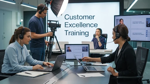
    A training and onboarding video

    Training videos should be judged by what happens after the viewer watches.

    Can they do the task?
    Can they avoid the mistake?
    Can they repeat the process without asking someone else?

    If not, the video missed the point.

    Training videos can use 2D animation, live action, screencast, motion graphics, or a mix. The format depends on what the person needs to learn. Safety training may need real footage. Software onboarding may need screen recording. Customer service training may need character scenes.

    Use training videos for employee onboarding, customer education, sales enablement, healthcare instructions, support content, and internal workflows.

    Keep them practical. Show the step. Show the mistake. Show the right action.

    Nobody opens a training video hoping for a brand speech.

    10. Brand Explainer Videos

    A brand explainer video

    A brand explainer video should make the company easier to understand.

    That sounds basic, but many brand videos fail at it. They look polished. They use nice music. They talk about trust, growth, better solutions, and helping businesses move forward. Then the viewer finishes and still cannot describe what the company actually does.

    That is a problem.

    A good brand explanation shows people what the company does, who it helps, and why that help is important. Someone who hasn’t seen it should be able to explain it in one line.

    This layout works well for landing pages, investment decks, campaigns to raise awareness, sales openings, and new brands that need to be clear quickly.

    Do not try to cover every service. Make the core offer clear first.

    Choosing the Right Type

    If you are asking which type of explainer video is best, start with the viewer’s question.

    Do they need to see a human problem? Use 2D or live action.
    Do they need a lesson? Use whiteboard.
    Do they need a system or data flow explained? Use motion graphics.
    Do they need physical product detail? Use 3D.
    Do they need software steps? Use screencast or a demo.
    Do they need to understand the business quickly? Use a brand explainer.

    This is also how to think about explainer video types for marketing funnel planning.

    Awareness videos should make the problem clear. Mid-funnel videos should show process, proof, or use cases. Bottom-funnel videos should answer doubts and show the product more directly.

    The viewer’s question should choose the format.

    Final Words

    The best explainer video type is the one that helps the viewer understand with the least confusion. 2D works for human stories. Whiteboard is useful for teaching. Motion graphics help with systems, data, and workflows. 3D is better for physical products and technical details. 

    Videos that show how to use a service, live action, screencasts, teaching videos, and brand explainers can all be useful. After you know what the video is for, who it’s for, and what it needs to do, choose the style.

    Frequently Asked Questions

    2D animation, whiteboard animation, motion graphics, 3D animation, product demos, SaaS explainers, live-action videos, screencasts, training videos, and brand explainers are the major kinds.
    A lot of the time, a mix of UI scenes, motion graphics, and short 2D scenes works best in SaaS videos. Whether the video is for teaching, demos, training, or raising awareness, the right style will depend on what it’s for.
    When simple images can’t clearly show how an object works, moves, is put together, or has technical features that need to be explained, use 3D explainer videos.
    Yes. When the script is clear and specific, whiteboard videos can still be used for step-by-step topics, policy discussions, training, and education. 
    Start with the viewer’s need. If they need a story, use 2D. If they need a process, use motion graphics or whiteboard. If they need product detail, use 3D or a demo video.

    Related Articles:

  • How to Use Explainer Videos as Lead Magnets (With Examples)

    How to Use Explainer Videos as Lead Magnets (With Examples)

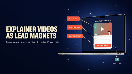
    An explainer video lead magnet is not just a normal video with a form placed in front of it. That is where many campaigns go wrong. A visitor does not give an email because your team made a video. They give it because the video promises something useful enough to trade for.

    That difference matters.

    A company story video will rarely work as a lead magnet. A short video that helps someone solve a problem, compare options, prepare for a buying decision, or understand a process has a much better chance.

    The video has to earn the lead before the form asks for it.

    Start With a Problem People Already Care About

    A lead magnet should not feel like a locked sales pitch.

    If the video opens with “Who we are” and “Why we are different,” most people will leave. They were not looking for your brand history. They were looking for help.

    Start with a problem that is already sitting in the viewer’s mind.

    A SaaS team may care about onboarding drop-offs. A clinic may need to explain treatment steps to nervous patients. A fintech brand may want to help buyers compare payment tools. A real estate firm may need to explain what investors should check before choosing a project.

    That is a better base for a lead magnet strategy. The video gives value first. The brand earns attention after.

    Make the Promise Specific

    A weak lead magnet says, “Watch our explainer video.”

    A stronger one says, “See the three onboarding mistakes that make new users quit.”

    Now the viewer knows what they will get.

    Specific promises work better because people are busy and skeptical. They do not want vague learning. They want a useful answer.

    This is where video lead generation becomes practical. The video is not just there to look professional. It has a job. It should teach one thing, explain one process, or remove one serious doubt.

    For example:

    “Watch how to compare vendors before booking a demo.”
    “See how the system works from request to delivery.”
    “Learn what your team should fix before switching platforms.”
    “Get a 5-minute breakdown of the buyer journey.”

    That is the kind of wording that makes a form feel less annoying.

    Do Not Gate the Wrong Video

    Not every explainer video should be gated.

    A homepage explainer should usually stay open. A simple product overview should stay open. A short social clip should stay open. Those videos help people understand the basics, and hiding them too early can damage trust.

    A lead magnet should go deeper.

    Think of a buyer guide, a product walkthrough, a short training video, a comparison explainer, a recorded session, or a practical checklist-style video. That kind of gated video content can work because the viewer gets more than a basic introduction.

    An animated explainer video company can help shape the video so it feels like a useful asset, not a commercial trapped behind a form.

    The simple rule: keep first-touch videos open. Gate the videos that answer deeper questions.

    Build a Landing Page That Does Not Oversell

    A lead magnet landing page should be clear, not loud.

    The visitor needs to know what the video covers, who it is for, and why it is worth watching. That does not require a long page.

    A good landing page video setup might include a direct headline, two or three lines of explanation, a few points about what the viewer will learn, and a short form.

    Do not write six paragraphs before the form. Do not stuff the page with every benefit. Do not make the visitor work too hard.

    If the video is useful, the page should make that usefulness obvious quickly.

    A landing page for “How to Reduce SaaS Onboarding Drop-Offs” does not need to explain the entire product. It needs to prove that the video will help the right person solve one painful issue.

    Keep the Form Light Enough

    A lead capture form is where good lead magnets often lose people.

    The video may sound useful, but then the form asks for name, work email, phone number, company size, budget, timeline, job title, country, and a message.

    That feels like paperwork.

    For a short video, ask for less. Name and email may be enough. For a serious demo or technical walkthrough, work email, company, and role may be fair. For a consultation request, more fields can make sense because the person is asking for direct help.

    The form should match the value of the video.

    This affects conversion rate more than many teams expect. One extra field can be enough to make someone think, “Not now.”

    Ask only for what you need to follow up properly.

    Example: A SaaS Onboarding Lead Magnet

    A SaaS explainer video example

    Here is a practical example.

    A SaaS company wants better demo leads. Instead of gating a generic product overview, it creates a video called “Why New Users Drop Off Before Activation.”

    The video walks through three common onboarding gaps, shows what those gaps look like inside a product journey, and gives the viewer a simple way to check their own flow.

    That is one of the best video lead magnets for SaaS because it starts with the buyer’s pain, not the product pitch.

    A SaaS explainer video company can make this stronger by mixing simple UI scenes, short workflow visuals, and plain scriptwriting that speaks to product managers or customer success teams.

    The lead is more useful because the viewer has already shown interest in a specific business problem.

    Example: A Technical Product Walkthrough

    Some products cannot be explained properly with a few photos and a paragraph of copy.

    Medical devices. Industrial equipment. Hardware systems. Machines. Product mechanisms. Architecture concepts. Complex installations.

    For these, a gated technical explainer can be valuable.

    A 3D explainer video company can show internal parts, movement, assembly, depth, and product function in a way flat images cannot. A video called “See How the System Works From the Inside” may be worth a short form if the viewer is a serious buyer.

    This can help with B2B lead generation, especially when the audience includes engineers, procurement teams, investors, distributors, or technical decision-makers.

    The gate works because the video gives access to information the viewer cannot easily get elsewhere.

    Example: A Human Problem Video

    Not every lead magnet has to be technical.

    A service brand can use a video to explain a painful situation. An HR platform might create a gated video called “How to Handle Employee Feedback Before It Turns Into Conflict.” A healthcare provider might create one around patient preparation before a procedure. A finance brand might explain common mistakes before applying for business funding.

    A 2D explainer video company can make these topics feel more human through characters, simple scenes, and relatable moments.

    This works when the viewer needs to feel understood before they trust the solution.

    These are useful explainer video lead magnet examples because they do not start by saying, “Here is our service.” They start by showing a real problem and helping the viewer handle it better.

    Example: A Buyer Comparison Video

    Some leads are not ready to buy yet, but they are close enough to compare.

    That is a good moment for a comparison-style lead magnet.

    A video like “What to Check Before Choosing a Video Production Partner” or “How to Compare SaaS Vendors Without Getting Lost in Feature Lists” can work well because it helps the buyer make a smarter decision.

    This kind of video is useful because it sits between education and sales. It gives the viewer a framework. It also positions the brand as helpful before a sales call happens.

    The best explainer video examples do not feel like a pitch in disguise. They give the viewer something they can use.

    Use the Video in More Than One Place

    A lead magnet should not sit quietly on one landing page.

    Promote it through blog posts, LinkedIn posts, email campaigns, paid ads, retargeting, sales follow-ups, and website banners. A blog can explain the topic broadly and then offer the video as the deeper version. A LinkedIn post can share one strong idea from the video and point people to the full breakdown.

    That is how to use explainer videos as lead magnets without depending on one traffic source.

    The video should have multiple entry points. Different people will find it at different stages.

    A cold visitor may come from an ad. A warmer lead may come from a blog. A sales prospect may get it in an email. Same asset, different context.

    Follow Up Like You Paid Attention

    The lead magnet is not finished when someone fills the form.

    That is where many brands waste the opportunity.

    If someone watches a SaaS onboarding video, do not send them a generic company brochure. Send something related to onboarding. If they watch a technical product walkthrough, send a use-case video or implementation guide. If they watch a buyer comparison video, send a case study or checklist.

    This is how to turn video viewers into leads that sales can actually talk to.

    Watch behavior matters too. Someone who watches the full video is warmer than someone who leaves after 30 seconds. Treat those people differently.

    A form gives you contact details. Viewing behavior gives you context.

    Test the Offer Before Blaming the Video

    If the lead magnet is not converting, the video may not be the problem.

    The title may be too soft. The landing page may not explain the value. The form may ask too much. The CTA may sound boring. The audience may be too broad.

    Test those pieces.

    Try a sharper title. Try a shorter form. Try a different thumbnail. Try a stronger CTA than “Submit.” Try “Watch the Free Breakdown” or “Get the 5-Minute Guide.”

    Lead magnets are small systems. The video matters, but the offer around the video matters just as much.

    Make It Useful Enough to Remember

    A good lead magnet should leave the viewer with something they can use.

    A checklist. A simple framework. A mistake to avoid. A process to follow. A question to ask before buying.

    That is what makes the video feel worth the email.

    Too many gated videos talk about the brand for too long and teach too little. That is why people stop trusting gated content.

    Teach first. Sell lightly. Make the next step obvious, but do not turn the whole video into a pitch.

    Final Words

    An explainer video lead magnet works when the video gives people a real reason to share their details. Keep basic homepage and product videos open. Gate deeper content that teaches, compares, demonstrates, or solves a specific problem. 

    Build a focused landing page, keep the form fair, and follow up based on what the viewer actually watched. The goal is not just email list building. The goal is to attract people who care enough about the topic to become real leads.

    Frequently Asked Questions

    An explainer video lead magnet is a useful video offered in exchange for contact details, usually through a landing page or gated form.
    Product demos, buyer guides, training videos, comparison explainers, technical walkthroughs, and problem-solving videos usually work best.
    No. Basic homepage, product overview, and brand awareness videos should usually stay open. Gate deeper videos that offer more specific value.
    Most lead magnet videos work well between 3 and 10 minutes. The video should be long enough to teach something useful without wasting time.
    Promote it through blog posts, email campaigns, LinkedIn content, website banners, paid ads, retargeting campaigns, and sales follow-up emails.

    Related Articles:

  • Best Places to Embed Explainer Videos for Maximum Conversions

    Best Places to Embed Explainer Videos for Maximum Conversions

    Video placement landing page conversion is not just a design choice. It is a timing choice. A good explainer video can still underperform if it appears after the visitor has already made up their mind, or worse, if it appears before they even know why they should care.

    That is usually where brands lose the value of the video.

    They spend time on the script, animation, voiceover, and edits. Then someone drops the video into a random section because “it looks nice there.” Nice is not the goal. The goal is to help the visitor move past doubt.

    The best spot for a video is often the place where the visitor quietly pauses and thinks, “I need a little more before I click.”

    Start With the Page’s Real Job

    A homepage does not behave like a product page.

    A pricing page does not behave like a blog post.

    A paid landing page is even less forgiving because the visitor came from one specific promise. They are not there to explore your whole brand story. They want the thing the ad mentioned.

    That is why explainer video placement has to start with the page goal. Is the page trying to explain a new product? Sell a service? Push a demo request? Help someone compare plans? Reduce support questions?

    The video should support that one job.

    Before asking where to place explainer videos on a website, ask what question the page must answer before the visitor takes action. That question is the video’s home.

    Above the Fold Is Not Always the Answer

    A lot of teams automatically want the video near the top.

    Sometimes that works. An above the fold video can help if the offer is hard to explain with a headline and two lines of copy. Technical SaaS products, healthcare services, fintech platforms, and unfamiliar B2B tools often need a quick visual explanation early.

    But above the fold can also become a cluttered mess.

    A hero section may already have a headline, subheading, CTA, product image, badges, and social proof. Add a large video and the visitor has too many things fighting for attention.

    So, should an explainer video be above the fold?

    Only if it helps the first decision. If the visitor needs to understand the problem first, place the video after the opening section. Let them feel the need before asking them to watch.

    A smart explainer video services company should look at the page flow before suggesting placement. The video file is not the whole strategy. The viewing moment matters too.

    A Hero Video Must Earn Its Space

    A hero video should make the headline clearer.

    If the page says, “Reduce customer onboarding calls without adding more support staff,” the video should show that pain quickly. A confused user. A crowded support inbox. A cleaner onboarding flow. Then the outcome.

    What it should not do is open with a slow logo animation and a broad company intro.

    A homepage explainer video works when the visitor finishes it and says, “Okay, I get what this does.” That is the standard.

    Keep the hero video short. Use a thumbnail that tells people what they are about to learn. Put a simple line near the play button.

    “See the workflow in 60 seconds” is stronger than “Watch our video.”

    One gives a reason. The other just asks for time.

    Place the Video Where the Visitor Starts Doubting

    The best video placement is not always the most attractive section.

    It is the section where doubt starts.

    On a service page, that may be after the main promise. The visitor likes the offer but wants to know how the process works.

    On a product page, it may be beside the feature section. The buyer sees the feature names but cannot picture the product in use.

    On a demo page, it may be near the form. The visitor wonders what happens after submitting it.

    That is the logic behind the best places to embed explainer videos. The video should answer a live question. If there is no question at that point, the video becomes filler.

    Product Pages Need Proof You Can See

    Explainer video on a product page

    A product page video has a simple job: show the product doing something useful.

    Not a brand mood piece. Not abstract shapes. Not a voiceover saying “built for modern teams” while nothing specific happens.

    Show the problem. Show the product action. Show the result.

    For software, that may be a short workflow. For ecommerce, it may be size, use, setup, texture, or comparison. For technical products, it may be the part of the product a photo cannot explain.

    If the product has internal parts, assembly, depth, or moving mechanics, a 3D explainer video company can help show what normal footage cannot. That video belongs near technical details, specs, or comparison sections because that is where buyers look for proof.

    The page should feel clearer after the video, not just prettier.

    Landing Pages Need a Tight Match

    A paid landing page video should match the ad promise almost word for word in spirit.

    If the ad promised faster reporting, the video should show faster reporting. If the ad promised easier onboarding, show the onboarding problem and the fix. Do not use a general company video here. It will feel disconnected.

    This is how landing page videos increase conversions in the real world. They reduce the time it takes for someone to understand the offer. They also make the next click feel less risky.

    Place the video near the main offer. Keep a CTA close. Give the video a headline that frames the point.

    Landing pages are not built for wandering. They are built for one decision.

    Pricing Pages Need Reassurance, Not Pressure

    Pricing pages make people cautious.

    They compare plans. They check limits. They wonder if the price is fair. They worry about choosing the wrong option. Sometimes they leave to “think about it” and never return.

    A short video near pricing can help, but it has to be calm.

    Use it to explain who each plan is for, what happens after signup, what support includes, or why one package fits a certain type of customer. That supports conversion rate optimization because it answers objections at the moment they become real.

    Do not turn pricing into a hard pitch.

    Pricing already feels like a decision. The video should make that decision easier, not heavier.

    Human Problems Need Human-Led Videos

    Some pages need the visitor to recognize themselves before they care about the solution.

    A customer support product may need to show a tired agent handling the same ticket again. A healthcare service may need to show a patient trying to follow confusing instructions. An HR tool may need to show a manager struggling through a feedback conversation.

    That is where a 2D explainer video company can help.

    2D animation can show small human moments without needing actors, locations, or awkward staged scenes. It works well near pain-point sections because it makes the problem feel familiar.

    Place that kind of video after the pain is introduced. Not at the bottom. If the video is meant to create recognition, do not hide it after the visitor has already scrolled past the emotional part.

    SaaS Websites Need More Than One Video Spot

    SaaS websites often put one explainer in the hero and stop.

    That is rarely enough.

    A SaaS explainer video company will usually think in smaller video moments. A homepage video explains the core promise. A feature video shows one workflow. A demo page video explains what the sales call includes. A help center clip reduces support questions. An onboarding video helps new users reach the first useful action faster.

    That is the real point of explainer video placement for SaaS websites. The video should follow the buyer and user journey.

    One giant video cannot answer everything. Several shorter videos, placed at the right moments, usually do more.

    Forms Are Good Spots for Short Reassurance Videos

    A form looks simple to the company. To the visitor, it can feel like a commitment.

    Will someone call me right away? Will I get pricing? Is this a live demo? Will I be added to emails? How long does the response take?

    A small video near the form can remove that uncertainty.

    This works for demo pages, quote requests, consultation forms, webinar signups, trial pages, and enterprise contact pages. The video does not need to explain the whole service. It just needs to explain what happens next.

    That is a useful video CTA moment. The video supports the action instead of pulling attention away from it.

    Blog Posts Can Carry Explainers Too

    Explainer video on a blog post

    Not every video belongs on a sales page.

    Some belong inside blog posts, especially when the topic is a process, comparison, tutorial, or technical idea. A written guide can go deeper. A video can give readers the quick version.

    That is part of a stronger website video strategy. Blog videos can support education, trust, and internal linking without turning the page into a hard sell.

    Place the video after the intro if it summarizes the topic. Put it near the hardest section if it explains one tricky idea. Do not bury it at the end just because that looks tidy.

    Tidy does not always help the reader.

    Match Placement to the Funnel Stage

    A sales funnel video should match how close the visitor is to buying.

    Top-of-funnel visitors need quick clarity. Middle-of-funnel visitors need use cases, proof, or comparison. Bottom-of-funnel visitors need reassurance, pricing help, demo clarity, or next-step guidance.

    That means the same video should not be pasted everywhere.

    A broad explainer may work on the homepage. A workflow video may work better near features. A short objection-handling video may work near pricing or forms.

    The warmer the visitor, the more specific the video should become.

    Do Not Annoy People With Autoplay Sound

    Autoplay with sound is still a bad idea.

    People may be at work, on mobile, or in public. If sound starts without permission, many will close the tab before the message even begins.

    Muted autoplay can work for short product loops. But for a real explainer, let people choose to watch.

    Use a clear thumbnail. Add a visible play button. Write one sentence that tells people what the video covers. That usually helps video engagement more than forcing playback.

    A useful video gets clicked. A forced video gets closed.

    Test Placement Like You Test Copy

    No one knows the perfect placement by instinct.

    Try the video in the hero. Try it after the problem section. Try it beside the feature block. Try it near pricing. Try it above the form. Try a shorter cut if people are dropping off early.

    Watch play rate, watch time, scroll depth, CTA clicks, form submissions, and lead quality.

    Sometimes a lower video performs better because the visitor understands the context by then. Sometimes a small video near a form beats the big hero video.

    Placement is not about what looks best in a mockup. It is about what changes behavior.

    Final Words

    Video placement landing page conversion works when the video appears at the moment the visitor needs help deciding. Use hero videos when the offer needs fast clarity. Put product videos near proof sections. Use pricing videos when cost creates hesitation. Add form-side videos when the next step feels unclear. 

    Use blog videos when the topic needs a faster explanation. A good explainer video can improve conversions, but only when the page gives it a real job.

    Frequently Asked Questions

    Place it near the main offer, after the headline, or close to the first important CTA if the visitor needs clarity before taking action.
    Only when it helps visitors understand the offer faster. If the video needs more context, place it after the problem or feature section.
    They can increase conversions when they answer a real question, reduce doubt, explain the product clearly, and sit near a decision point.
    SaaS websites often need videos on the homepage, feature sections, demo pages, onboarding flows, help centers, and sales follow-up pages.
    Yes. Product pages should use videos when the product needs demonstration, comparison, technical explanation, workflow clarity, or extra trust before purchase.

    Related Articles:

  • Animated Product Videos That Make Products Easier to Understand

    Animated Product Videos That Make Products Easier to Understand

    Animated product videos help people see what a product does before they read a long description, compare features, or ask support the same basic questions. That matters because product pages are crowded. Customers skim. 

    They look at photos, scan a few bullets, and decide fast whether the product feels useful. A good animated video gives them the short version without making the experience feel like a sales manual.

    The best ones do not just show the product. They show the problem, the use, the result, and the reason someone should care.

    That is why brands use animation for physical products, digital tools, apps, financial products, health items, and household goods. When the idea needs more than a photo, animation gives the product room to explain itself.

    What Are Animated Product Videos?

    Animated product videos are short videos that use visuals, movement, characters, graphics, or 3D scenes to explain a product. Some are fun and character-led. Some are clean and technical. Some focus on a real product benefit. Others use story, humor, or a problem-solution setup to make the product easier to remember.

    You can think of them as product explainer videos built specifically around a product’s value. They may explain how it works, who it helps, what problem it solves, or why it is better than the old way of doing things.

    Unlike a traditional explainer video that may introduce a company or service, product-focused animation usually stays closer to the item itself. It gives the viewer a clearer mental picture of how the product fits into their life.

    That is also why an explainer video production company has to start with the product’s purpose, not just the style. Pretty animation is not enough. The viewer should leave knowing what the product does and why it matters.

    Why Animated Product Videos Work So Well

    The short answer is that animation can show things that live footage cannot always show easily.

    A cleaner dissolves invisible grime. A financial app changes how people manage money. A supplement brand needs to make health benefits feel approachable. A solar product may need both practical detail and visual polish. In each case, animation can simplify the message without making it boring.

    That is the real strength of animated product explainer videos. They turn product details into something easier to watch. They can zoom in, exaggerate, simplify, dramatize, or show invisible effects in a way that photos and basic copy often cannot.

    Good animated videos also give brands more control. You can control the mood, pace, color, characters, setting, and story without relying on expensive locations or perfect real-world conditions.

    The Main Explainer Video Styles for Products

    There are several explainer video styles brands can use for product videos. The right one depends on what the audience needs to understand.

    Whiteboard animation works well for educational products or simple explanations.

    Motion graphics are useful when the video needs a clean, modern feel with text, icons, and graphic movement.

    Character animation works well when the brand wants the product story to feel more human.

    A 2D animated explainer video can be a strong fit when the product benefit needs to feel clear, approachable, and easy to follow.

    3D animation works best when the product needs depth, realism, structure, or physical detail.

    There is no single best format for every product. The best choice is the one that makes the product easier to understand, not just the one that looks most expensive.

    5 Animated Product Videos Worth Learning From

    The reference list includes five strong examples: Oh Yuk, Get A Print, Addition Financial, Nature’s Dynamics, and Soleeva. Each one shows a different way to approach explainer videos for products without forcing every brand into the same visual formula.

    These are not just favorite explainer videos because they look nice. They each teach something useful about how product animation can work.

    1. Oh Yuk Shows How Animation Can Make a Simple Product More Fun

    Oh Yuk is a tub cleaner, which does not sound like the easiest product to make exciting.

    That is exactly why animation helps.

    A cleaning product often needs to show what people cannot see clearly: buildup, grime, hidden mess, and the relief of finally fixing it. A live-action product shot might show the bottle, the tub, and maybe someone using it. Animation can go further. It can turn the hidden problem into a visible one and make the effect feel more satisfying.

    This is where character-led animation works well. The video can show frustration, relief, and a cleaner result without making the topic feel unpleasant or dull.

    A 2D explainer video company might use this kind of approach when the product is simple, but the benefit needs more visual appeal. It is not about making the cleaner look realistic. It is about making the problem and solution easy to grasp.

    2. Get A Print Proves You Do Not Always Need a Voiceover

    Get A Print is a nice example because it steps away from the standard voiceover-led format.

    The product idea is simple: print photos from your phone and have them delivered. A lot of brands would explain that with narration and a few obvious scenes. This one works because it lets the visuals carry more of the story.

    That can be a smart choice when the product journey is already easy to follow. If people can understand the action from the visuals alone, the video does not need to over-explain. It can rely on pacing, character behavior, and clear visual steps.

    This is how an engaging explainer video avoids feeling like a lecture. It trusts the viewer a little. It does not spell out every tiny detail. It shows enough for the idea to click.

    For product brands, that restraint can be powerful.

    3. Addition Financial Uses Product Context in a Smarter Way

    https://vimeo.com/617397376?fl=pl&fe=sh

    Addition Financial is slightly different from the other examples because it focuses on an app and online experience. Still, it connects to products people use every day, like a phone, a credit card, or a personal finance tool.

    That makes it useful for brands that sell both digital convenience and real-world value.

    Financial products can become dry very quickly. People may understand the category, but they still need to see why the experience is easier, faster, or more useful. Animation helps by making the digital side feel less abstract.

    This is also where a SaaS explainer videos company can take notes, even outside finance. When the product lives on a screen, the video has to show more than interface shots. It needs to show how the product changes the user’s day.

    The best digital product videos do not just say the app is helpful. They show the moment where it becomes helpful.

    4. Nature’s Dynamics Makes the Product World Feel Bigger

    Nature’s Dynamics is a good reminder that product videos do not have to stay small.

    Gummy vitamins and probiotics could be shown in a simple product demo. But animation allows the brand to build a whole world around the product. That can make the video feel more memorable and more emotionally connected to the product benefit.

    This kind of approach works well when the brand wants to sell more than function. It wants to sell feeling, trust, energy, wellness, or imagination. Character animation, detailed backgrounds, and immersive transitions can help create that feeling.

    The lesson here is simple. If the product has a strong emotional or lifestyle angle, let the animation support that. Do not reduce the video to a list of ingredients and benefits.

    The product still needs clarity, of course. But it can also have charm.

    5. Soleeva Shows When 3D Is the Better Fit

    Soleeva is the example that shows why some products need more visual depth.

    Solar panels are physical, technical, and tied to real-world installation and performance. A flat illustration can explain the idea, but sometimes a more dimensional approach makes the product feel more concrete. That is where 3D earns its place.

    A 3D video showcases the shape, structure, surface, and presence of a product in a way 2D may not always capture. For solar panels, hardware, medical products, machines, devices, and anything with physical detail, that can be a major advantage.

    This is where a 3D explainer video company can help a brand show the product with more realism while still keeping the message controlled and easy to follow.

    The trick is not to use 3D just because it looks premium. Use it when depth, texture, and physical detail help the viewer understand the product better.

    Frequently Asked Questions

    Animated product videos are short videos that use animation to explain a product, show how it works, and make its benefits easier to understand.
    Yes. They can show invisible benefits, product use, before-and-after moments, and details that photos or live footage may not explain clearly.
    It depends on the product. 2D works well for simple and story-led products, while 3D is better for technical, physical, or detail-heavy products.
    Most product videos work best when they stay short and focused. The goal is to explain one clear product benefit without overloading the viewer.
    Yes, when the video explains the product clearly and removes buyer hesitation. A good product video helps people understand why the product is useful.

    Final Words

    Animated product videos work because they make products easier to see, understand, and remember. They can show hidden benefits, simplify product use, add personality, or make a technical item feel more approachable. The five examples above show that there is no one perfect format. Oh Yuk uses animation to make cleaning more visual. 

    Get A Print keeps the story simple. Addition Financial turns a digital experience into something practical. Nature’s Dynamics builds a more immersive product world. Soleeva shows how 3D can make a physical product feel real and clear.

    The right video style depends on what your product needs to explain.

    Related Articles:

  • 10 Customer Service Training Videos Worth Learning From

    10 Customer Service Training Videos Worth Learning From

    Customer service training videos can do something most handbooks, slide decks, and policy documents struggle to do. They show people what good service actually looks like. That matters because service is not only about rules. 

    It is about tone, judgment, timing, patience, and how someone handles pressure in a real moment. If your team only gets theory, they usually have to guess the rest. Video fills that gap.

    That is why the importance of customer service training videos goes beyond simple onboarding. A strong training video can make expectations clearer, help people remember the lesson, and give your team something more concrete than a list of instructions.

    The best examples usually do one of three things well. They make the lesson easy to follow, they make it memorable, or they make people actually want to pay attention.

    Why Video Works Better for Service Training Than Most Teams Expect

    Customer service is not just a script. It is behavior.

    That is why video works so well here. A good training clip lets people see the difference between saying the right words and handling a situation the right way. It can show body language, pace, tone shifts, mistakes, recovery, and the little choices that shape how a customer feels.

    This matters because a customer service team deals with real people, not perfect situations. They run into frustration, confusion, silence, hesitation, repeated questions, and messy conversations that do not fit neatly into a support manual. Video is useful because it can bring those moments to life without making the lesson feel heavy.

    A strong explainer video company would usually understand this straight away. The goal is not just to package information nicely. It is to make the lesson stick.

    What Makes a Service Training Video Actually Useful

    A lot of training content is technically correct and still forgettable.

    The better videos tend to share a few strengths:

    • They focus on real workplace tension
    • They keep the lesson narrow enough to follow
    • They avoid overexplaining
    • They show a clear takeaway
    • They feel watchable instead of like a chore

    That is especially important when the training covers common customer interactions. If the situation feels fake, the team can tell. If it feels too polished or too generic, the lesson tends to slide right by. But when the setup feels familiar, people start paying closer attention because they can see themselves in it.

    That is one reason the best customer service training videos often lean on story, contrast, or humor. They know people remember examples more easily than instructions.

    10. Customer Experience Matters by Temkin Group

    This is a good example of how a simple idea can still land well.

    The video does not need huge production tricks to work. What helps is the clarity. The lesson is tight, the pacing is clean, and the visuals help the point feel more immediate. That is often enough. A lot of training videos fail because they try to cover too much. This one keeps the focus where it belongs.

    It also shows that customer care videos do not need to be overloaded to be effective. If the message is clear and the visuals support it properly, even a relatively simple setup can hold attention longer than a more expensive but less focused piece.

    9. TEDx and the Power of a Service Story

    TED-style talks can be useful in training because they often bring a real story into the lesson instead of only delivering advice.

    That matters. People remember stories better than bullet points.

    In this example, the value comes from the specificity of the moment. The service experience is described in a way that makes the takeaway easier to picture. It does not feel like abstract advice. It feels like something that happened, which makes it easier for a team to pull useful behavior from it later.

    This is one reason an example of great customer service videos does not always have to be animated or heavily produced. Sometimes the power comes from one strong, believable story told well.

    8. Zendesk Keeps the Lesson Watchable

    Zendesk is a strong example because it understands something a lot of training content misses. People tune out when the material feels like medicine.

    That is why humor matters here.

    The point is not to make service training silly for the sake of it. The point is to keep attention long enough for the lesson to land. Zendesk’s approach works because it makes the situations feel a little more human and less like a lecture. That makes the training easier to watch and easier to remember.

    This is also where businesses can learn something broader. Customer service skill videos do not have to sound dry to feel useful. In fact, the opposite is often true. If the delivery feels too stiff, the team tends to mentally check out before the point arrives.

    7. Ritz-Carlton Still Shows Why Standards Matter

    This kind of example works because it points to something bigger than one interaction. It shows what happens when service standards are built into the culture instead of being treated like a surface-level policy.

    That is a different level of lesson.

    A lot of service problems do not come from bad intent. They come from weak expectations, uneven coaching, or teams not knowing what “great service” actually looks like in practice. Videos like this help because they connect the day-to-day interaction to the larger standard behind it.

    That is one reason customer service training should not only teach people how to respond in one moment. It should also show them what the company expects service to feel like across many moments.

    6. WACTEO by ServiceSkills Turns the Lens Inward

    This is one of the more useful examples in the list because it changes the frame.

    A lot of service training focuses only on the end customer. That makes sense up to a point. But internal behavior affects service too. If employees treat each other badly, operate in silos, or pass problems around carelessly, that eventually shows up in the customer experience.

    That is where this example stands out. It pushes the idea that service quality is not only external. It starts inside the team.

    For businesses building internal training, that is a smart angle to keep. Some of the most useful customer service training video examples are the ones that show how culture and behavior inside the company shape what customers experience outside it.

    5. HubSpot’s Skill-Focused Format Gets Right to the Point

    This kind of example is effective because it does not wander.

    It focuses on essential support skills, keeps the lesson moving, and uses clean visuals to reinforce the point. That makes it easier for teams to absorb one skill at a time instead of getting hit with a broad “be better at service” message.

    This is also the kind of structure that works well for micro-learning. One skill. One scenario. One takeaway.

    That is often a better fit for busy support environments than long training blocks. It helps people revisit one idea quickly without needing to sit through a huge module again. For growing teams, especially those already using strong digital learning habits, this kind of focused format can be much easier to roll out.

    It is also where style choices matter. Some brands may use 2D explainer video services in this kind of training because the format keeps the message structured and easy to scale without making the lesson feel flat.

    4. Empathy vs. Sympathy Makes a Soft Skill Easier to Grasp

    Soft skills are harder to teach than process steps.

    That is why this example matters so much.

    A team can be told to “show empathy” all day long, but that instruction is still vague until someone shows the difference. That is what this video does well. It breaks down a subtle emotional distinction in a way that feels clear instead of academic.

    And that is often where service training succeeds or fails. The technical side may be easy enough to explain. The human side is where teams need better examples.

    This is also why some businesses use visual formats that feel a little more crafted for softer topics. In the right context, 3D explainer video services or other stylized approaches can help a message feel more emotionally readable, though the structure still matters more than the visual finish alone.

    3. Slack Shows That Internal Tools Affect Service Quality Too

    Not every training video has to focus on tone, empathy, or customer-facing behavior.

    Some of the most useful ones show how the team can work better behind the scenes.

    That is why Slack is a smart example to include. It reminds people that customer service is not only about what one employee says in one conversation. It is also about systems, collaboration, handoffs, and response speed. If the internal setup is clumsy, the customer feels it sooner or later.

    This is where customer service demos can be especially useful. Instead of only teaching attitude, they show how tools and workflows support the job. That kind of training is practical because it helps the team understand not just how to respond, but how to work more smoothly while doing it.

    For some businesses, especially support-heavy platforms, this is also where SaaS explainer video services can overlap with training. A software workflow video can double as a teaching asset if it is built clearly enough.

    2. “What Is Customer Experience?” Makes an Abstract Idea Easier to Hold Onto

    This kind of training is useful because “customer experience” is one of those terms everyone uses, but not everyone defines well.

    That becomes a problem fast.

    If the team keeps hearing that customer experience matters but never sees it explained clearly, the phrase starts losing meaning. A video like this helps because it gives the concept shape. It turns a broad business phrase into something people can actually connect to daily work.

    That is one reason visual training works so well with abstract service topics. It gives the team something more concrete to remember than a loose definition in a handbook.

    This is also where businesses that already use commercial advertising can learn something useful. If you are spending to bring people in but not training your team to create a better experience once they arrive, you are making growth harder than it needs to be.

    1. NHA PersonAbility Shows How Storytelling Makes Training More Memorable

    This is one of the strongest examples because it uses scenario-based storytelling to show both good and bad behavior clearly.

    That contrast matters.

    A lot of training content tells people what to do. Story-based training lets them watch what happens when people do it badly and when they do it well. That is usually more effective because it feels closer to real life. The team can picture the moment, the mistake, and the better response much more easily.

    This approach is especially strong in healthcare, support, education, and other people-first environments where the emotional side of service matters just as much as the technical side.

    It also connects well with the logic behind tech explainer videos. Different topic, same principle. People understand faster when the explanation is built around a situation they can follow instead of a pile of abstract advice.

    Frequently Asked Questions

    The best ones feel practical. They focus on real service situations, keep the lesson clear, and show behavior in a way people can actually remember and apply.
    Either can work. Humor helps when it keeps attention without weakening the lesson. A serious tone works well when the situation needs more weight. The better choice depends on the topic and the audience.
    Yes. Animation can make abstract ideas, emotional skills, and service scenarios easier to explain. It is especially useful when the team needs clarity more than realism.
    Usually shorter than companies first expect. It is often better to make several focused videos than one long piece that tries to cover everything at once.
    Start with the situations the team faces most often. If the video helps with common problems, common mistakes, and common service expectations, it becomes much easier for employees to use what they learned right away.

    Final Words

    Customer service training videos work because they show behavior, not just advice. That is what makes them more useful than a list of service rules or a static training document. The best examples on this list do not all look the same, but they all make the lesson easier to understand and easier to remember. Some use humor. 

    Some use storytelling. Some keep things very simple. What matters is that they help the team see what good service looks like in action, and that is what makes the training stick.

    Related Articles:

  • Tech Explainer Videos for Products People Need to Understand Fast

    Tech Explainer Videos for Products People Need to Understand Fast

    Tech explainer videos work best when they do one thing clearly: make a complicated product feel understandable before the viewer loses interest. That matters because tech buyers usually are not short on options. They are short on patience. 

    If your product takes too much effort to understand, people move on. A good video helps by compressing the message into something faster, clearer, and easier to follow.

    A lot of tech brands still treat video like a finishing touch. Something to add once the homepage is written, the product page is live, and the sales deck is done. That is usually the wrong order. In tech, the explainer is often the first real bridge between what the company built and what the audience can actually grasp.

    Why Tech Products Need More Than Good Copy

    Most tech teams are too close to their own product. They know the workflow, the edge cases, the setup logic, the integrations, and the jargon. So when they explain it, they often explain from the inside out.

    Buyers do not think that way.

    They want the outside-in version first. What is this? What problem does it solve? Why would I care? What changes once I use it?

    That is one reason tech companies need explainer videos more than they sometimes realize. A strong explainer does not replace documentation, demos, product pages, or sales calls. It gets the viewer far enough that those things can actually work.

    This problem shows up across the board. Software tools. cloud platforms. AI products. cybersecurity services. developer tools. infrastructure products. They all get harder to explain the moment the company tries to say everything at once.

    What Makes a Tech Explainer Different

    A tech explainer is not there to sound impressive.

    That is where a lot of them go off track.

    Plenty of business videos sound polished but still leave the viewer with the same question they had at the start. What does this actually do? A tech explainer has to reduce that confusion. It has to shorten the distance between “this sounds complicated” and “okay, now I get it.”

    That is why storytelling in tech explainer videos matters. Not because every brand needs some emotional cinematic arc. It matters because viewers need a simple frame. A problem. A broken workflow. A pain point. A before-and-after. Something they can follow without doing all the work themselves.

    That is also where a strong explainer video company actually proves its value. Not by making the product sound bigger. By deciding what needs to land first and what can wait.

    Animated or Live-Action Is the Wrong First Question

    A lot of teams jump straight into the format.

    Should it be animated or live-action? Should it look sleek? Should it feel futuristic? Should it be cinematic?

    Those are not useless questions. They are just early.

    The better question is this: what is actually hard to explain here?

    If the problem is abstraction, animation probably helps. If the product is physical or trust-heavy, live action may help more. If the interface itself is the product, screen-led content might be the better route. But the format only makes sense once the communication problem is clear.

    That is why it helps to understand the broader types of explainer videos before choosing style references. The format should follow the job. Otherwise, you end up with a nice-looking video that still leaves the audience doing mental labor.

    Where Tech Explainers Help

    The homepage is the obvious place, sure. But that is only one use.

    A good explainer can support:

    • Landing pages
    • Demo requests
    • Investor conversations
    • Outbound sales follow-up
    • Product launches
    • Feature education
    • Onboarding
    • Product pages

    This is also why more brands now incorporate explainer videos into multiple stages of the funnel instead of treating one video like the whole strategy. One broader overview can introduce the product. A second video can support feature understanding. A third can reduce friction after signup. That usually works better than forcing one asset to carry the entire product story.

    Product Explainers and Process Explainers Are Not the Same

    These two get mixed up constantly.

    Product explainer videos focus on what the product is, how it helps, and why someone should care. They sit closer to marketing and conversion. Their job is to make the offer feel understandable.

    Process explainer videos do something different. They show how a workflow operates, how information moves, how a setup happens, or how a system behaves behind the scenes. These are useful when the mechanism itself is part of the value.

    The mistake is combining both too early.

    If the buyer still does not understand the core product value, a process-heavy video can bury them fast. If they already understand the value and want confidence in how the product works, the process video becomes far more useful.

    That is why a well-crafted tech explainer video usually chooses its lane. It does not try to be the homepage pitch, the workflow guide, the feature walkthrough, and the onboarding asset all at once.

    Why SaaS Brands Lean on Explainers So Hard

    SaaS-related explainer videos

    Software products are easy to oversell and easy to undersell at the same time.

    A site says the platform is flexible, powerful, scalable, and built to streamline operations. Fine. But what does that actually mean for the person using it? What changes in their day? What gets easier? What gets less frustrating?

    That is why SaaS explainer videos work when they stay disciplined. They do not throw the whole dashboard at the viewer. They narrow the point. They show the friction. Then they show the shift.

    A lot of brands looking for Saas explainer video services are really trying to solve that translation problem. They are not struggling to build features. They are struggling to explain value in a way that feels quick, believable, and easy to absorb.

    Trust Matters More Than Some Tech Teams Think

    Tech buyers are not only evaluating features. They are evaluating risk.

    Will this tool be annoying to adopt?

    Will my team actually use it?

    Is implementation going to be messy?

    Does this company know how to explain itself clearly?

    Am I buying into something useful or just something dressed up well?

    That is where the benefits of tech explainer videos go past engagement. A good explainer can lower uncertainty. It can show that the company understands the buyer’s problem and respects the buyer’s time.

    People notice when a company cannot explain its own product cleanly. They may not say it out loud. They just hesitate.

    The First Video Should Not Try to Do Everything

    This is where a lot of projects start getting bloated.

    The team wants the first video to explain the whole platform, all the user types, the feature stack, the integrations, the product story, and the brand at the same time. That is how something promising turns into something crowded.

    A better first video is narrower.

    One product.

    One pain point.

    One major shift.

    One next step.

    That matters especially before you move into onboarding explainer videos or deeper educational content. If the buyer still does not understand the core offer, they are not ready for a guided setup sequence yet.

    Style Matters, but Only After the Message Is Clear

    This is where teams often get distracted.

    They debate whether the video should feel premium, minimal, bold, or futuristic before they have agreed on the explanation itself. That is backward. The stronger move is to figure out what the viewer is struggling to grasp, then choose the format that clears that up with the least friction.

    A lot of the time, 2D explainer video services make the most sense for tech because they keep the message flexible. They are good at simplifying workflows, abstract products, interfaces, and category education without making the piece feel too heavy.

    Then there are situations where 3D explainer video services really earn their place. Hardware. layered systems. products with interiors or physical components. anything where depth and structure are part of the explanation. That is when the extra detail is doing real work.

    The audience does not care which style sounded fancier in the planning meeting. They care whether the product finally makes sense.

    Live Action Has a Place Too

    An example of live-action explainer video

    Tech brands lean heavily on animation, and sometimes that is right. But there are cases where live-action explainer videos make more sense.

    That usually happens when trust is the bigger issue than abstraction. Maybe the company needs to show the people behind the product. Maybe the setting matters. Maybe the audience does not need a metaphor. They need a real person speaking plainly.

    That is where live action can help. A founder. A team member. A customer. A real environment. Those things can make a product feel less like a floating tech claim and more grounded in something real.

    Still, live action is not automatically more human. A stiff script is stiff no matter who is on camera.

    One Video Is Rarely the Whole System

    This is something tech brands learn a bit late.

    The first explainer is not supposed to carry the entire company forever. It is an entry point. Not the whole library.

    One video may introduce the product.

    Another may explain a feature.

    Another may help with signups.

    Another may support retention.

    That is usually when creating a tech explainer video starts making more sense strategically. You stop asking one asset to do every job and start building a cleaner explanation system instead.

    Onboarding Videos Quietly Do a Lot of Heavy Lifting

    Many tech brands pour energy into acquisition and then get surprisingly thin after the user signs up.

    That is a mistake.

    If the product still feels confusing after purchase, the win is not as strong as it looked. This is why onboarding explainer videos matter so much. They cut early friction. They show people where to begin. They stop the user from landing in a dashboard and wondering what now.

    This is often where a well-produced tech explainer video earns more trust than a flashy launch piece. The user is no longer just judging the promise. They are judging whether the company actually helps once they are inside.

    That lands harder than people think.

    Tech Videos Need Better Distribution Thinking

    A strong video can still underperform if the setup around it is weak.

    That is one reason SEO video marketing matters for tech brands that want more than a few nice views. If a video is supposed to support search, it needs a proper landing strategy, supporting page copy, captions, or transcripts where they help, and a page structure that gives the asset context. A floating embed on a weak page is usually not enough.

    This does not mean every video needs a giant SEO rollout. It means the good ones should not be treated like isolated files with no plan attached.

    A Good Tech Explainer Feels Edited, Not Stuffed

    You can usually tell when a team never made the hard cuts.

    Another feature. Another claim. Another user type. Another workflow. Another benefit. It keeps going, and the viewer keeps losing the thread.

    A stronger explainer feels edited. It knows what belongs in the first explanation and what should wait. It respects the fact that the viewer is trying to make a basic decision before they are ready for the whole product map.

    That is often the difference between a forgettable video and one that actually works.

    Frequently Asked Questions

    Tech explainer videos are short videos used to explain technical products, services, platforms, or workflows in a way that feels easier to understand. They are designed to reduce confusion quickly so the audience can grasp the value without getting buried in product language.
    Because many tech products are harder to understand at first glance than the teams building them realize. People do not always have the patience to decode a platform from homepage copy alone. Video helps shorten that gap and makes the product feel more approachable.
    Not automatically. Animation often works well for software, systems, and abstract ideas. Live action can be stronger when trust, people, or real-world context matter more. The better choice depends on what the viewer needs help understanding.
    Product explainer videos help people understand what the product is and why it matters. Onboarding explainer videos help new users get started after they sign up. One is meant to create clarity before action. The other is meant to reduce friction after action.
    Usually shorter than most teams first imagine. In most cases, the sweet spot is long enough to explain one clear idea and short enough to keep the viewer moving. If the product needs more depth, that is usually a sign you need more than one video, not one longer script.

    Final Words

    Tech products usually lose people in one of two ways. They either explain too much too soon, or they explain the wrong thing first. That is why tech explainer videos matter. A good one gives the viewer a way in. It makes the product feel easier to follow, easier to trust, and easier to remember. It does not try to cram the whole company into ninety seconds. 

    It just gets the right point across at the right stage. When that happens, the rest of the marketing starts working harder too.

    Related Articles: