Category: Uncategorized

  • AI Explainer Videos: How to Explain an AI Product to Customers

    AI Explainer Videos: How to Explain an AI Product to Customers

    Most AI products share the same frustrating problem. The technology works, the results are real, and the buyer still leaves unconvinced. Nothing broke. The demo ran fine. The prospect just never got a clear picture of what the thing does for them on a Tuesday afternoon.

    Closing that gap is the job of AI explainer videos, and it’s harder than what a normal software video has to do. Sell a project management tool, and you can point at a screen while a task slides between columns. Cause, then effect. Sell an AI product and the interesting part happens where the buyer can’t look, and they’ve been oversold enough times to assume the worst.

    Key Takeaways

    • Artificial intelligence (AI) products are hard to sell because the work happens where nobody can see it, so the video has to manufacture visible proof.
    • Buyers move through four questions in order: what changes for me, did it really do that, why should I believe it, and what happens when it’s wrong.
    • Outcome comes first. Mechanism comes second, and only enough to make the outcome believable.
    • Technical evaluators and economic buyers check for different failure modes, which usually means two assets rather than one catch-all film.
    • Screen recordings prove capability while motion graphics explain the invisible middle. Most strong AI explainer videos use both.
    • Overclaiming what a model can do is now a regulatory exposure, not just a credibility problem.

    Why AI Products Break the Normal Rules of Product Marketing

    AI products break the normal rules because the thing you’re selling never appears on screen. There’s an input, a pause, and an output. The value lives inside that pause, and no camera can film it.

    Three pressures stack on top.

    Buyers are skeptical by default. After years of nearly every product rebranding itself as intelligent, purchasing teams discount AI claims before they finish reading them. Research from KPMG and the University of Queensland found that fewer than half of people across 47 countries are willing to trust AI systems, and that skepticism walks into your sales calls with them.

    They also can’t tell a serious system from a thin wrapper around someone else’s model. Two products make identical claims, and only one holds up under load.

    The vocabulary keeps moving too, so your video has to teach before it can persuade.

    What Does a Buyer Actually Need to See Before They Trust an AI Tool?
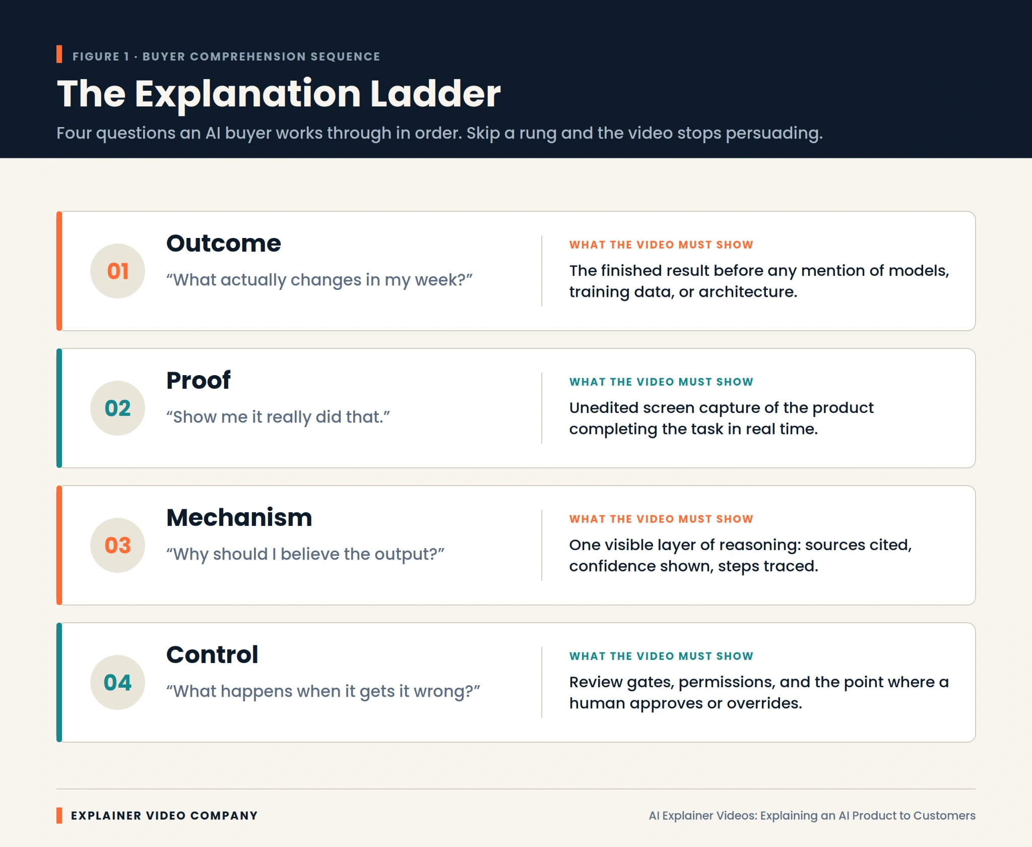
    They need four things, and the order matters more than the content. Buyers climb these rungs one at a time, and a video that skips one stops working there.

    Outcome. What actually changes in my week? The finished result, stated before any mention of models or architecture.

    Proof. Show me it really did that. Unedited screen capture of the product finishing the task, without cuts hiding the slow parts.

    Mechanism. Why should I believe the output? One visible layer of reasoning, such as sources cited or steps traced.

    Control. What happens when it gets it wrong? Review gates, permissions, and the moment a human approves or overrides it.

    Weak AI explainer videos nearly always fail at rung two. They assert the outcome with confident narration, then jump to a feature list. The buyer never saw it work, so nothing after that lands.

    Lead With the Outcome, Then Earn the Right to Explain the Mechanism

    Start with the result, because it’s the only part your buyer can evaluate without help. Anything technical you lead with is noise they have no framework for.

    The practical version: open on the broken process your buyer already lives with, show the output your product produces, then spend a short stretch on how it gets there. That mechanism section isn’t there to educate. It’s there to make the outcome credible. Once it’s done that, stop.

    Technical and Non-Technical Buyers Need Two Different Videos

    These audiences need different footage because they check for different failure modes. Simplify too far, and your engineering evaluator assumes you’re hiding something. Go too deep, and your economic buyer stops paying attention.

    Operations leads, marketing heads, and executives want the before-and-after, plus reassurance that adoption won’t cost them a quarter. Analogy helps. Jargon hurts. If you’ve wrestled with how to explain AI to non-technical people, the fix is almost always to describe the job it finishes, not the method.

    Technical buyers want the opposite: the real product on a real task, with data flow, permissions, and error handling visible. Polish makes them suspicious.

    Serving both in one film satisfies neither. A short outcome video plus a longer technical walkthrough performs better, which is how our SaaS explainer video services are usually structured.

    How Do the Best AI Companies Explain Themselves on Screen?

    Companies that explain AI well share one habit: they show real output instead of describing it. Studying strong AI explainer video examples is worth an hour before you write any script.

    Perplexity built its storytelling around citations appearing beside answers. That isn’t a feature demo. It’s a visual answer to the biggest objection anyone has about AI.

    Cursor demos inside a real code editor, for an audience that would instantly spot a staged environment. For developers, the demo is the pitch.

    Notion embedded its AI features into an interface people already knew, which removed the new-scary-thing reaction entirely.

    Glean and Harvey lean hardest on permissions and domain accuracy, because their buyers purchase governance as much as capability.

    One pattern across all four. Show the thing working, and answer the biggest doubt inside the demo rather than after it.

    Screen Recordings Prove Capability, Animation Explains the Invisible

    Use screen recording for anything the product visibly completes, and animation for what happens between the click and the result. Choosing wrongly is the most common production mistake we see.

    Screen capture is unbeatable for proof. Real interface, real latency, real output. For agentic tools chaining several steps, watching the sequence unfold persuades better than any voiceover.

    Animation earns its place when there’s nothing to film. Retrieval, ranking, and confidence scoring have no natural visual form, so one has to be built. That’s the honest answer to how to explain a black box AI. 

    You don’t open the box. You draw a truthful diagram of what goes in, what comes out, and what the system checks on the way. Good 2D explainer video services turn that abstraction into a flow the eye follows in seconds.

    One caution: animate the parts you could have filmed, and viewers assume the real product isn’t ready.

    Hardware and Edge AI Need a Different Visual Treatment
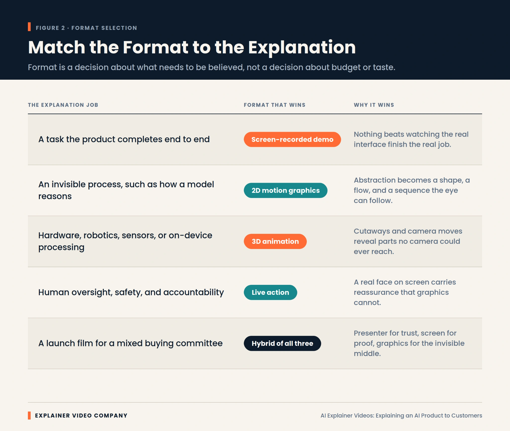

    Physical AI products need dimensional treatment because the story involves components, placement, and physics that flat graphics flatten out. A vision system on a production line or a chip inside a sealed device involves spatial relationships a viewer needs to see from several angles.

    This is where 3D explainer video services do work nothing else can. Cutaways reveal a sensor array inside a housing. Camera moves show how a device perceives the space around it. The AI product animation puts an invisible processing layer inside an object the buyer will actually install.

    Software-only teams rarely need this, and it’s worth saying so rather than buying dimensionality you won’t use. For products sitting in between, our breakdown of 2D vs 3D explainer videos covers where each approach stops being worth the investment.

    What Should You Cut From an AI Product Video?

    Cut the model architecture, the funding announcement, the founder origin story, and every adjective you can’t demonstrate. Most first drafts run forty percent long, and the excess is self-description.

    Specifically, cut these:

    • Model names and parameter counts, unless you’re selling to machine learning engineers
    • Any claim of full autonomy your product doesn’t literally deliver
    • Stock footage of glowing brains, circuit boards, and blue particle grids
    • Competing calls to action at the end, which cancel each other out
    • Feature lists arriving before the viewer understands the outcome

    Cutting early protects budget too, since scope drives production spend more than anything. Our guide to explainer video cost breaks down where the money goes.

    The question of how to demo an AI product answers itself once you’ve deleted everything that isn’t the demo.

    Overclaiming Is Now a Legal Risk, Not Just a Credibility Risk

    Capability claims now carry regulatory exposure, which changes how scripts get written.

    In September 2024, the United States Federal Trade Commission (FTC) announced Operation AI Comply, a sweep of five enforcement actions against deceptive AI claims. Securities regulators separately charged investment advisers for overstating how much AI their systems used, and the European Union AI Act introduced transparency obligations covering disclosure when people interact with an AI system.

    For anyone working out how to market an AI product, the takeaway is simple. A video that demonstrates is safe. A video that asserts is exposed.

    Write claims you could defend with a recording. If your product needs human review before it acts, show that step instead of editing around it. Accuracy framed honestly reads as confidence, not weakness.

    A 90-Second Spine That Survives a Skeptical Viewer
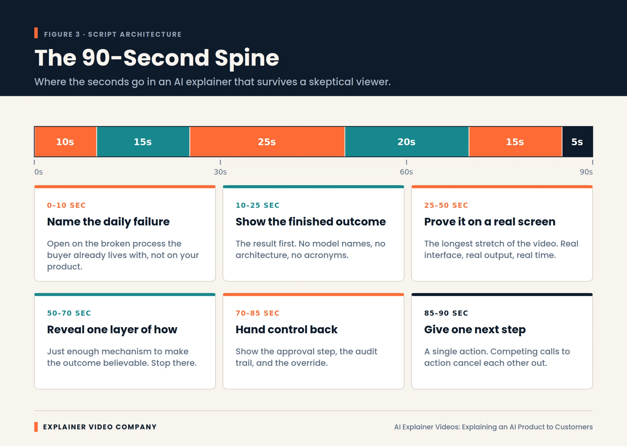
    Ninety seconds is plenty if they’re allocated properly. This structure holds up against a viewer who arrived expecting to be oversold.

    Spend the first ten seconds naming the daily failure your buyer already recognizes. Not your product. Their broken process.

    Give the next fifteen to the finished outcome, with no model names and no acronyms.

    Hand the following twenty-five, the longest stretch, to a real screen capture of the product working.

    Use the next twenty to reveal one layer of mechanism, and only one.

    Spend fifteen on where human control sits, then close with five seconds and exactly one next step.

    Among AI product demo best practices, that proportion is what most teams get wrong. In the strongest AI explainer videos, proof is the longest section, and in a first draft it almost never is.

    Measure Comprehension, Not View Count

    Track whether people understood the product, because view count says nothing about whether the explanation worked. Strong views with weak comprehension are an expensive way to confuse people faster.

    Three signals matter. Drop-off timing, since a cliff around twenty seconds usually means the outcome wasn’t clear. The questions arriving in sales calls, because effective AI explainer videos visibly change what prospects ask about. And demo-request quality, which improves as unqualified viewers self-select out earlier. Your sales team will tell you within two weeks whether it’s working.

    When evaluating production partners, ask how they measure comprehension rather than reach. It’s one of the more revealing questions covered in our guide on choosing the best explainer video company.

    Final Words

    A clear explanation compounds. Once a prospect understands what your AI does and why its output can be trusted, every downstream conversation gets shorter, and your team stops re-explaining the same concept.

    The work is mostly discipline. Outcome before mechanism. Capability proved with real footage. One layer of how it works, no more. Human control made visible. Claims limited to what you can demonstrate on screen.

    Explainer Video Company builds AI explainer videos around that sequence, matching format to what needs to be believed rather than to whatever looks impressive. If your product is stronger than your buyers currently realize, working with an experienced explainer video production company is the fastest way to close that gap.

    Frequently Asked Questions

    What is an AI explainer video?

    It’s a short video that shows what an artificial intelligence product does, proves it works using real footage, and explains enough about how it functions for buyers to trust the output. Unlike a standard product video, it has to make an invisible process visible.

    How do you explain artificial intelligence to a non-technical audience?

    Describe the job it finishes rather than the method it uses. Lead with the outcome, use a familiar comparison, and skip model names and technical shorthand. Show a real before-and-after, then add just enough mechanism to make it believable.

    How long should an explainer video for an AI product be?

    Sixty to ninety seconds works for awareness, where the goal is comprehension rather than evaluation. Technical walkthroughs for engineering or security reviewers can run three to five minutes, since that audience wants depth. Match length to buyer stage, not to a house standard.

    What is AI washing, and how do I avoid it in a video?

    AI washing means overstating how much artificial intelligence a product uses or what it can independently do. Avoid it by making only claims you can demonstrate on screen, describing human review steps honestly, and cutting language that suggests autonomy the product doesn’t deliver.

    Do explainer videos actually increase conversions?

    They usually do, though the effect depends on comprehension rather than production value. Videos that clearly answer what the product does and why its output can be trusted tend to improve demo quality and shorten sales calls. Feature descriptions without proof rarely move conversion.

    Should an AI product video show the interface or use animation?

    Use screen recording for anything the product visibly completes, since real footage is the strongest proof available. Use animation for processes with no visual form, such as retrieval or confidence scoring. Most effective AI animation sits alongside screen capture rather than replacing it.

    How do you demo an AI product that isn’t visually impressive?

    Shift focus from the interface to the transformation. Show the input as it arrives, then the finished output, compressing wait time honestly with an on-screen indicator. When the product looks plain, the contrast between a messy start and a clean result becomes the story.
    Related Articles

  • How Video Marketing Generates Leads: A Beginner’s Guide

    How Video Marketing Generates Leads: A Beginner’s Guide

    Video marketing lead generation starts before anyone presses play. It starts with the question sitting in the buyer’s head.

    “What does this company do?”
    “Is this worth my time?”
    “Will this solve the problem I have?”
    “What happens if I click the button?”

    A good video answers one of those questions at the right moment. That is why some videos bring demo requests, quote forms, and email signups, while others sit on a page looking expensive and doing almost nothing.

    The video is not the lead strategy. It is one part of it.

    A View Is Not a Lead

    A beginner mistake is counting views like they are leads.

    They are not.

    A view only means someone watched, or at least started watching. A lead is different. A lead is someone who takes a useful next step: fills a form, books a demo, downloads a guide, joins a webinar, replies to an email, asks for pricing, or clicks a CTA that shows real interest.

    This is why how video marketing generates leads has less to do with the play button and more to do with what happens after the video.

    A good video should leave the viewer with a clearer reason to act.

    No next step, no lead path.

    Start With the Buyer’s Moment

    Do not start by asking, “What video should we make?”

    Ask where the buyer is stuck.

    A cold visitor may need to understand the problem. A website visitor may need to understand the offer. A pricing-page visitor may need reassurance. A sales prospect may need a product demo. A lead who downloaded a guide may need a follow-up video that explains the next step.

    That is a more useful video marketing strategy than making one polished video and trying to use it everywhere.

    A single video cannot do the whole job. It should move the viewer one step.

    That step might be small. Watching another video. Clicking a feature page. Reading a case study. Booking a call. Small steps still matter.

    Think of the Funnel as a Set of Questions

    A lead generation funnel sounds technical, but it is really just a set of questions.

    At the top, people ask: “Do I have this problem?”

    In the middle, they ask: “What are my options?”

    Near the bottom, they ask: “Can I trust this company enough to take action?”

    Videos can answer those questions in order.

    Top-of-funnel videos should teach without pushing too hard. Middle videos should explain the process, show proof, or give examples. Bottom videos should remove doubt and make the next action feel safe.

    That is the plain version of video marketing for beginners. Put the right video in the right part of the conversation.

    Explainer Videos Help When the Offer Is Not Obvious

    Some offers are hard to understand from copy alone.

    A SaaS tool with too many features. A healthcare service with a careful process. A fintech product that needs trust. A B2B platform with several user types. A technical service that sounds useful but feels abstract.

    That is where an explainer video can help.

    It should show the problem, explain the solution, and make the outcome easier to picture. Not the full company history. Not every feature. Not a long list of claims.

    Working with an explainer video company can be useful when the business keeps explaining the same thing on calls because the website is not doing enough.

    A clear explainer can filter leads too. People who understand the offer before contacting sales usually ask better questions.

    Landing Page Videos Should Sit Near the Decision

    A video in a landing page of a company

    A landing page video should not be added just because the page looks empty.

    It has to support the page’s main action.

    If the page is built for demo bookings, the video should show why the demo is worth booking. If the page is built for quote requests, the video can explain what happens after the form. If the page promotes a webinar, the video can preview what people will learn.

    This is one practical way to use videos to generate leads: place the video close to the decision.

    A visitor should not have to scroll through six sections to find the one thing that makes the offer clear. Put the video where the hesitation happens.

    That small placement choice can change how the whole page feels.

    Educational Videos Warm Up People Quietly

    Not every potential lead wants to speak with sales today.

    Some are still learning. Some are comparing. Some are not even sure what to call their problem yet.

    Educational videos help with that early stage.

    A cybersecurity company might explain a common security mistake. A clinic might explain what to expect before treatment. A real estate firm might explain what investors should check before a property decision. A SaaS company might explain why customers fail to complete onboarding.

    That is video content marketing doing useful work.

    These videos may not create a form fill immediately. That does not mean they failed. They make the brand familiar. Later, when the viewer is ready, the company that explained the problem clearly already has an advantage.

    Story Works When the Problem Feels Personal

    Features do not always make people care.

    Sometimes the viewer needs to see a situation that feels close to their own. A manager chasing updates before a meeting. A patient confused by instructions. A founder trying to understand messy customer data. A support team answering the same complaint every day.

    A 2D explainer video company can turn those small situations into simple animated scenes. This works well for healthcare, HR, education, fintech, customer service, coaching, and service brands.

    The goal is not to make the video cute.

    The goal is recognition.

    When the viewer thinks, “That is exactly what we deal with,” the message has a better chance of turning into action.

    Demos Are for People Who Are Already Interested

    A product demo should not be the first video every visitor sees.

    Demos work best when someone has already moved from “What is this?” to “Show me how it works.”

    That is why demos are among the best videos for lead generation when used at the right time. They help warmer buyers make a decision.

    For software, show one workflow. For ecommerce, show product use, size, texture, or setup. For hardware, show the item doing its main job. For a service, show the process from inquiry to result.

    Do not turn the demo into a tour of every feature.

    Show the part that proves the product can solve the buyer’s problem. Then give them the next step.

    Technical Videos Can Bring Fewer Leads, but Better Ones

    Some videos are not made for big view counts.

    A technical product walkthrough may only interest a smaller group of people, but that group may be much closer to buying.

    Medical devices, machinery, hardware, industrial tools, architecture, and complex product mechanisms often need deeper visual explanation. Buyers may need to see internal parts, movement, assembly, or function before they trust the product.

    A 3D explainer video company can show those details in a way flat images and text cannot.

    These videos can attract engineers, procurement teams, investors, technical buyers, and product evaluators. The audience is smaller, but the intent can be stronger.

    Lead generation is not always about more names. Sometimes it is about better-fit conversations.

    SaaS Needs More Than One Video

    SaaS companies often try to make one video carry too much.

    The homepage video explains the category, the product, the features, the workflow, the integrations, the dashboard, the onboarding, and the pricing logic. By the end, nobody remembers the main point.

    A SaaS explainer video company will usually break that into smaller videos.

    One homepage explainer for the promise. One feature video for a key workflow. One demo-page video explaining what the call includes. One onboarding video helping new users get their first result. One short sales follow-up video answering a common objection.

    That is a stronger video marketing lead generation strategy because each video has one job.

    SaaS buyers like to research before talking to sales. Give them videos that answer the questions they actually have.

    The CTA Has to Be Clear

    An example of a CTA in a marketing video

    A video can explain everything well and still lose the lead at the end.

    Why? No clear next step.

    A strong video CTA should match the viewer’s stage. An educational video might send them to a checklist. A product demo might invite them to book a consultation. A pricing video might lead to a quote request. A technical walkthrough might invite them to schedule a deeper call.

    Avoid soft CTAs when the viewer is ready for something specific.

    “Learn more” is fine for early content. But if the person just watched a full demo, “Book your walkthrough” is stronger.

    Do not make interested people guess.

    Forms Help Only When the Trade Feels Fair

    A lead capture form can turn interest into contact details, but only if the timing is right.

    Do not hide every video behind a form. Early videos should usually stay open because new visitors need to understand the brand first.

    Forms work better for deeper content: webinars, full demos, technical walkthroughs, buyer guides, training sessions, and comparison videos.

    The form should match the value. A short video may only justify an email field. A detailed demo may justify name, work email, company, and role.

    Do not ask for a phone number too early. That one field can make people stop.

    Ask for enough to follow up well. Not everything the sales team wishes it had.

    Email and Retargeting Keep People Moving

    Video should not live only on the website.

    Use email marketing videos after someone downloads a guide, joins a list, asks for information, or books a call. A short video can answer one common question faster than a long email.

    Retargeting can help too.

    If someone visits a product page but leaves, show them a short video that answers the next likely concern. If they watch an educational clip, send them something deeper later.

    That is how a sales funnel video should work. It does not force a sale too early. It keeps the conversation alive until the lead is ready for the next step.

    Measure Intent, Not Just Attention

    Views are easy to celebrate. They are also easy to misunderstand.

    A video can get thousands of views and bring weak leads. Another video can get fewer views and create better sales calls.

    Track play rate, watch time, drop-off points, CTA clicks, form submissions, demo bookings, email replies, and lead quality.

    That is where video engagement becomes useful.

    If people leave after ten seconds, the opening is probably weak. If they watch the whole thing but do not click, the CTA may be unclear. If many leads come in but sales rejects them, the audience or offer may be wrong.

    The goal is not just attention. The goal is movement toward a real conversation.

    Final Words

    When you use video marketing to get leads, make sure that each video answers a real buyer question and shows them what to do next. People are interested in educational videos right away. Explainers clear things up. Warmer leads use demos to make decisions.

    Technical videos answer more in-depth questions about buying. Use calls to action (CTAs), forms, email follow-ups, and remarketing to get people to take action. Making one video for one moment in the buying journey and then seeing if it moves people forward is the best way to start.

    Frequently Asked Questions

    Using videos to get people to watch, teach them, and then turn them into leads through calls to action, landing pages, forms, demos, email campaigns, and follow-up content is what video marketing lead generation means.
    Videos get people interested in an offer by making it clear, removing uncertainty, establishing trust, demonstrating product worth, and directing viewers to a clear next action.
    For getting new leads, explainer videos, product demos, workshops, customer stories, teaching videos, landing page videos, and technology walkthroughs often work well.
    Not all the time. It’s best to leave early-stage films open. For more in-depth material like workshops, full demos, buying guides, and technical walkthroughs, gated videos work better.
    Most movies used to get leads should be short and to the point. For explainers, 60 to 90 seconds is a good length. Demos, workshops, and expert films can be longer if they need to go into more depth on a subject. 

    Related Articles:

  • How to Write an Explainer Video Script

    How to Write an Explainer Video Script

    An explainer video script template helps when the blank page starts staring back at you. That happens a lot. A company knows its product well, but the moment it has to explain that product in 60 or 90 seconds, everything suddenly feels too big. Features pile up. Stakeholders want their lines included. The script turns into a brochure with a voiceover.

    That is the mistake.

    A good explainer video script does not say everything. It says the right thing in the right order.

    Start With the Viewer, Not the Product

    Before writing one line, ask who the video is really for.

    Not “business owners.”
    Not “startups.”
    Not “anyone who needs our product.”

    Get sharper.

    Is the viewer a founder trying to explain a new tool to investors? A marketing manager comparing vendors? A customer who keeps getting stuck during onboarding? A buyer who understands the problem but does not trust the solution yet?

    This is where the target audience changes the whole script. A video for a first-time visitor should not sound like a video for a warm lead. A video for a technical buyer should not sound like a video for a non-technical customer.

    If the viewer is vague, the script will be vague too.

    The Basic Explainer Video Script Template

    Here is a simple explainer video script template for beginners that works for most business videos:

    Open with the problem.
    Show why that problem matters.
    Introduce the solution.
    Explain how it works.
    Show the outcome.
    End with a clear next step.

    That is it.

    This structure works because it follows how people think. They care about their problem first. Then they want to know if you understand it. After that, they may care about your product.

    A weak explainer video script often starts with the company. “We are a leading provider of…” That kind of opening is usually dead on arrival. The viewer is not ready to care about the company yet.

    Start where they already feel friction.

    Write the Problem Like a Real Person Would Say It

    A problem line should feel familiar.

    Bad version:

    “Managing cross-functional workflow visibility is a challenge for growing teams.”

    Better version:

    “Your team keeps missing updates because every task lives in a different place.”

    The second one is not fancy, but it sounds real. That is what good video script writing needs. Less internal language. More human pressure.

    This is also where many scripts get too polite. They soften the problem until it barely feels like a problem anymore. Do not do that. If the issue costs time, say it costs time. If customers are confused, say they are confused. If the current process is messy, say it is messy.

    The viewer should feel seen in the first few seconds.

    Know What to Include in an Explainer Video Script

    Here is what to include in an explainer video script if you want it to stay focused:

    A clear opening problem.
    A simple explanation of the solution.
    One or two useful product details.
    A believable outcome.
    A direct next step.

    That is enough for most explainers.

    The video is not your entire website. It is not a sales deck. It is not a product manual. Treat it like the front door. It should make people understand enough to take the next action.

    That is why brands use explainer video services in the first place. The goal is not just motion and design. The goal is a clearer message that does not waste the viewer’s time.

    Keep the Script Shorter Than You Want

    A professional working on a script

    Most first drafts are too long.

    A 60-second video usually gives you around 130 to 150 spoken words. A 90-second video may give you around 200 to 225 words. That is not much room.

    So, how long should an explainer video script be?

    Long enough to explain one idea. Short enough that the viewer does not feel trapped.

    If the script runs past two minutes, ask why. Sometimes the topic needs more space, especially for technical products. But most explainer videos get longer because the team is afraid to choose.

    A tight script forces decisions. That is a good thing.

    Match the Script to the Animation Style

    A script for 2D animation will not always work for 3D. A script for SaaS will not always work for a product video. The format matters.

    For physical products, a 3D explainer video company may need a script that leaves room for product rotation, close-ups, internal views, or technical motion. The words should not explain every detail the viewer can already see. Let the visuals carry some of the weight.

    That is a common mistake in product scripts. The voiceover says exactly what the screen is showing. It feels repetitive.

    Better scriptwriting gives the viewer two layers: the visual proof and the spoken meaning.

    Use 2D When the Story Needs Simplicity

    A 2D explainer video company often works best when the video needs clean scenes, simple characters, icons, and easy transitions.

    That changes the writing. You can use more visual metaphors. A messy process can become scattered cards. A confused customer can move through a short journey. A complex service can be broken into three clean steps.

    This works especially well for service businesses, apps, customer education, and internal training.

    The script should stay simple enough for the visuals to breathe. Too many words will crowd the animation.

    SaaS Scripts Need a Different Kind of Focus

    An explainer video script for SaaS products should not try to explain the entire platform.

    That is where SaaS scripts go wrong. They start with one problem, then suddenly mention dashboards, workflows, integrations, reports, automation, onboarding, analytics, permissions, and team collaboration.

    Too much.

    A SaaS explainer video company would usually start with one user problem and one product path. What does the user struggle with? What action do they take inside the product? What changes after that?

    That is the script.

    If you need to explain more features, create more videos. One big video trying to do everything usually does nothing well.

    A Simple Drafting Process That Works

    A writer working on the initial draft of a script

    Here is a practical way to write the first draft.

    Write the customer problem in one plain sentence.
    Write the outcome in one plain sentence.
    Write three steps that connect the two.
    Add the product only where it helps the story.

    End with one CTA.

    That gives you a rough video script outline without overthinking.

    After that, cut anything that sounds like a brochure. Remove filler. Replace internal terms with customer language. Read it out loud. Then read it again with the visuals in mind.

    That is how to write an explainer video script without turning it into a product lecture.

    Common Script Mistakes to Avoid

    The biggest mistakes are easy to spot once you know them.

    Starting with the company instead of the problem.
    Using jargon because the team is used to it.
    Trying to cover every feature.
    Writing sentences that sound good on paper but bad out loud.
    Adding a vague CTA.
    Ignoring the visuals until after the script is approved.

    A strong animated explainer video script should feel like a guided path. Problem. Solution. Proof. Result. Next step.

    Simple does not mean shallow. It means the viewer can follow it.

    Frequently Asked Questions

    An explainer video script template is a simple structure that helps you write a clear video script. It usually includes the problem, solution, how it works, outcome, and call to action.
    Start with the viewer’s problem. Do not begin with your company history or a long product intro. The first few seconds should make the viewer feel understood.
    Most explainer video scripts should be around 130 to 225 spoken words, depending on whether the video is 60 or 90 seconds long.
    Avoid jargon, long feature lists, vague claims, overexplaining, and CTAs that ask the viewer to do too many things at once.
    No. A 2D animation script, 3D product script, SaaS script, and live-action explainer script may need different pacing and visual planning.

    Final Words

    An explainer video script template is useful because it gives your message a shape before production begins. Start with the viewer’s problem, keep the product explanation focused, write for the ear, plan the visuals early, and end with one clear next step.

    That is the difference between a video that simply looks polished and a video that actually explains. Good scripting saves time, cuts confusion, and gives the whole explainer video production process a stronger foundation.

    Related Articles:

  • How SaaS Companies Use Explainer Videos to Reduce Churn

    How SaaS Companies Use Explainer Videos to Reduce Churn

    SaaS companies use explainer videos because churn usually starts quietly. A customer signs up, clicks through the dashboard, gets stuck on one setup step, and thinks, “I’ll come back to this later.” Then they do not. No angry complaint. No support ticket. Just a user who never reached the moment where the product felt useful.

    That is the part SaaS teams often underestimate. People do not always leave because the product is bad. Sometimes they leave because they never understood how to make it part of their work.

    A short, well-placed video can fix that faster than another help article buried three clicks away.

    Why Churn Often Starts Right After Signup

    The first session is messy for a lot of users.

    They are curious, but not loyal yet. They still have doubts. They are comparing your tool against whatever they used before, even if that old system was clunky. If the first few minutes feel confusing, the product starts losing trust.

    That is one big reason why SaaS customers churn after signup. The promise sounded good. The first experience did not make the value obvious.

    This is where an explainer video production company can help, but only if the video is built around the user’s first real problem. New users do not need a grand tour of every feature. They need to know what to do first, why it matters, and what a small win looks like.

    That small win is everything.

    How SaaS Companies Use Explainer Videos After Signup

    SaaS companies use explainer videos best when they stop treating video as a one-time homepage asset.

    The homepage explainer has its place. Fine. But churn reduction happens after the sale, inside the product, during onboarding, in support flows, and before renewal.

    That is where customer onboarding videos come in. A short welcome clip can help users understand the main workflow before they start clicking around blindly. It can show the dashboard, the first action, and the outcome in under two minutes.

    This matters because SaaS onboarding is not just setup. It is the first proof that the product can help.

    If onboarding feels heavy, the customer starts wondering whether the tool is worth the effort.

    The First Video Should Not Explain Everything

    A common mistake: trying to make one onboarding video cover the entire platform.

    That usually fails.

    The first video should get the customer to one useful action. Not five modules. Not every setting. Not the whole admin panel.

    For example, if the product is a reporting tool, the first video might only show how to connect data and generate one simple report. That is enough. Once the user sees something useful, they have a reason to continue.

    That is the real answer to how explainer videos reduce SaaS churn. They remove friction at the point where users are most likely to give up.

    Product Adoption Needs Better Timing

    A help center is useful, but people do not always go looking for help at the right moment.

    A video placed inside the product can catch users before frustration turns into abandonment. A short clip next to a setup step. A quick walkthrough beside a new feature. A small tooltip video after someone repeats the same failed action.

    That is using video to improve product adoption in a practical way.

    The video does not need cinematic production. It needs to appear where confusion happens.

    A SaaS explainer video company can map these moments across the user journey. The best SaaS videos are not always the biggest ones. They are the ones that show up when the user is about to get lost.

    Feature Adoption Fails When Users Do Not See the Point

    SaaS teams get excited about features. Customers often do not.

    A new dashboard view, automation rule, integration, or reporting tool may be powerful. But if users do not understand why it matters, they ignore it.

    That is where feature adoption videos help.

    The mistake is starting with the feature name. “Introducing advanced workflow routing” sounds like a release note. It does not sound like a reason to care.

    Start with the pain instead.

    “Your team is still manually assigning every request. Here is how to stop doing that.”

    Now the feature has a job.

    A 2D explainer video company can make these feature stories easier to follow with simple scenes, clean UI movement, and short examples. The goal is not to decorate the feature. The goal is to make someone try it.

    Customer Education Should Not Stop After Week One

    Explainer videos for customer education

    Many SaaS products become valuable over time, not in the first login.

    That creates a problem. If users only learn the basics, they may never reach the deeper value. They keep using one small part of the tool, miss the better workflows, and eventually decide the product is not worth the cost.

    This is why customer education videos matter.

    They can teach advanced workflows, role-based use cases, integrations, team permissions, reporting habits, and better ways to use the product after the customer is already active.

    A customer who uses one feature is easy to lose. A customer who builds three weekly workflows around your product is much harder to replace.

    That is the real retention play.

    In-App Tutorials Can Reduce Support Friction

    Nobody wants to open a support ticket for something that should feel simple.

    Short in-app video tutorials can catch those moments early. They can explain a form field, a setup step, an integration, or a common error without making the user leave the product.

    Keep these videos small.

    Thirty to sixty seconds is often enough. One task. One result. No long intro.

    For products tied to hardware, data systems, or physical operations, a 3D explainer video company can help when users need to understand how the software connects to something outside the screen. But most in-app videos do not need heavy visuals. They need speed, clarity, and the right placement.

    Videos Help Your Customer Champion Sell Internally

    In B2B SaaS, the buyer is not always the only person who decides whether the account stays.

    A manager may need to explain the product to leadership. A team lead may need to get coworkers to adopt it. A champion may need proof that the tool is doing more than sitting in the tech stack.

    This is where product explainer videos help after purchase.

    They give your customer something easy to share internally. Instead of writing a long explanation, they can send a short video that shows the workflow, the result, and the value.

    That matters because churn often starts when internal buy-in is weak. If only one person understands the product, the account is fragile.

    Customer Success Teams Should Use Video More Often

    Customer success teams repeat themselves a lot.

    Setup advice. Best practices. Missed features. Renewal value. Team adoption. Reporting. Integrations. Same questions, different accounts.

    Good customer success content makes that easier.

    A customer success manager can send a short video before a call so the live conversation starts at a better point. Or they can send a follow-up video after the call to reinforce the next step.

    The video does not replace the relationship. It protects the relationship from turning into basic instruction every time.

    Renewal Videos Should Start Before Renewal Month

    An example of a renewal video

    Renewal is not a last-minute event.

    The customer decides whether your product is worth keeping long before the contract date shows up. If they have not seen enough value during the year, one renewal email will not fix that.

    Explainer videos can help make value visible earlier.

    A renewal-support video might show underused workflows. Another might recap new features. Another might explain how a team can get more from the product before expanding seats.

    These are some of the best videos for SaaS customer retention because they remind users what they already have and what they have not fully used yet.

    Do not wait until the customer is halfway out the door.

    What Kind of Videos Reduce Churn?

    The strongest churn-reduction videos are usually practical.

    Welcome videos. Setup videos. Feature explainers. Role-based tutorials. Help-center clips. Use-case videos. Renewal support videos. Short product updates.

    Each one should answer one question.

    Not six.

    One.

    That is why video can work so well for user retention. It gives customers the right answer before confusion turns into cancellation.

    Frequently Asked Questions

    Explainer videos reduce churn by helping users understand the product faster, complete setup, discover useful features, and feel more confident using the platform.
    Short onboarding videos work best. They should focus on the first useful action, not the entire product.
    Yes. Explainer videos can show users how to use specific workflows, why features matter, and how the product fits into daily work.
    Yes. In-app videos can reduce confusion by helping users at the exact moment they need guidance.
    Yes. They help throughout the customer lifecycle, including onboarding, feature education, support, customer success, expansion, and renewal.

    Final Words

    SaaS companies use explainer videos to reduce churn because customers stay longer when they understand the product faster and use it more often. Videos help with onboarding, product adoption, feature education, customer success, internal buy-in, and renewal support. 

    The point is not to make one big polished explainer and call the job done. The better move is to build a small library of useful videos that show up exactly where users slow down, get stuck, or forget the value.

    Related Articles:

  • Types of Explainer Videos and How to Pick the One For Your Brand

    Types of Explainer Videos and How to Pick the One For Your Brand

    The best types of explainer videos are not “best” because they look expensive or trendy. They work because they match the job. That sounds obvious, but this is where a lot of teams go wrong. They start with style. 

    They say they want animation, or something slick, or something modern. Fine. But none of that answers the useful question: what does the viewer need to understand, and what format will make that easiest? Until that part is clear, the rest is guesswork.

    That is why some videos feel right straight away, while others look polished and still do not do much.

    Most Businesses Pick a Format Too Early

    This happens more than people admit.

    A team decides they need video, then the discussion jumps straight to visuals. Should it be animated? Should it feel cinematic? Do we want a voiceover? Do we want it to look more premium? Those are not bad questions. They are just not the first questions.

    The first question is simpler: what is this video supposed to solve?

    If people do not understand the product, that is one kind of problem. If they understand it but do not trust it yet, that is another. If they already trust it and just need to see how it works, that is another again. Once you know the job, the format gets easier to choose.That is also why it helps to be clear on what is an explainer video before choosing a style. It is not just “a short branded video.” It is a communication tool. If the communication problem is fuzzy, the creative choices usually get fuzzy too.

    Animated Explainer Videos

    An animated explainer video

    This is still the default option for a lot of brands, and there is a reason for that. Animated explainer videos are flexible. They can simplify complex ideas, control pacing, and keep attention on the point instead of the background details.

    That makes them useful for:

    • software products
    • abstract services
    • startup ideas that need framing
    • process-heavy offers
    • homepage explainers

    Animation is especially handy when the thing you are explaining is not easy to film. A platform. A workflow. A system. A concept. These are not always visually strong in real life, but animation gives you more control over what people see and when they see it.

    The catch is that animation can also become generic very quickly. A weak script covered in smooth visuals is still a weak script.That is why a good explainer video agency is not just there to “make it animated.” The real value is in deciding what should be shown, what should be trimmed, and what the viewer actually needs first.

    Motion Graphics Videos

    A motion graphics video

    Some businesses do not need characters, story scenes, or anything too illustrative. They just need clarity with some pace to it. That is where motion graphics tend to work well.

    This format leans on movement, text, icons, diagrams, UI fragments, charts, and transitions rather than character-driven storytelling. It often feels cleaner and sharper, especially in B2B.

    If the message involves steps, systems, timelines, or data, motion graphics can be a better fit than trying to turn everything into a miniature narrative. It feels less forced.A lot of brands turn to motion graphics design services when they want the video to feel modern and structured without making it too playful or too stiff. It is a good option when the message needs visual organization more than emotional storytelling.

    Whiteboard Explainer Videos

    A whiteboard explainer video

    Whiteboard explainer videos are older, yes, but not useless.

    They still work when the message is educational and the audience mainly needs a simple path through the idea. The drawing style gives people something easy to follow. It reveals information in sequence, which can be helpful when the subject feels crowded or unfamiliar.

    That said, this format is not always the right call for brands that need a more current or premium look. Whiteboard can feel too plain for some categories. It is strong when simplicity is the selling point, not when visual sophistication matters.

    So no, it is not outdated by default. It just has a narrower lane now than it used to.

    Kinetic Typography Videos

    A kinetic typography video

    This style gets underestimated because it looks too simple on paper.

    But kinetic typography can be very effective when the script is strong and the message needs punch. Text in motion can create speed, emphasis, and rhythm without needing a more elaborate visual world around it.

    It works especially well for:

    • ad-style explainers
    • short launches
    • message-led brand videos
    • social cuts
    • videos built around one strong claim

    If the wording is doing a lot of the work, this format can sharpen it instead of distracting from it. If the wording is weak, though, this style exposes that very quickly. There is less to hide behind.

    Live-Action Explainer Videos

    A live-action explainer video

    Sometimes the strongest thing a brand can show is a real person.

    Live-action explainer videos usually work best when trust, personality, or physical demonstration matter more than abstraction. Service businesses often benefit from this. So do products that need to be seen in real hands or real environments.

    A live-action video can make a company feel more grounded. More direct. Less distant.

    That is useful for consultants, healthcare services, education brands, agencies, coaches, some B2B offers, and physical products. It is also useful when a founder or team member helps carry trust better than a polished voiceover ever could.

    But live action is not automatically more “human.” A badly scripted live-action video can feel even more forced than a stiff animated one. Real faces do not solve vague messaging.

    Product Demo Videos

    A product demo video

    This is the format people should choose more often when the buyer is already interested.

    Product demo videos are less about introducing the idea and more about proving the thing works. They show use, flow, result, setup, interface, or functionality in a more direct way. That makes them especially useful lower down the funnel.

    They are strong on:

    • product pages
    • sales pages
    • comparison pages
    • onboarding sections
    • demos used by sales teams

    This is also where the importance of video for a product page becomes hard to ignore. Photos and bullets do not always answer the real question in the buyer’s head. A demo often does. It lets them picture the product in use, not just in theory.

    For software, demos can overlap with walkthroughs. For physical products, they often focus on use, handling, or outcome.

    Screencast Explainer Videos

    A screencast explainer video

    For software, screencast explainer videos are one of the most practical options available.

    They do not try to reinvent the product visually. They show the real interface. That alone can make them more useful than a broader explainer when the audience already wants specifics.

    This style works well for:

    • SaaS products
    • platform tours
    • onboarding
    • support content
    • feature education

    It is common in SaaS explainer video production because people often need to see the workflow, not just hear about the benefits. A screencast can show where to click, what happens next, and how simple or involved the process actually is.

    It is also usually more budget-friendly than a bigger animated build, which makes it a sensible option for growing software teams.

    So Which Format Should You Choose?

    Here is the simpler version.

    If the product is abstract, animation usually makes sense.
    If the message is structured and system-heavy, motion graphics may be the better call.
    If the service depends on trust and real people, live action can work well.
    If buyers need to see the product in use, choose demos or screencasts.
    If one specific capability needs more explanation, use a feature breakdown.
    If users need help taking the next step, build a tutorial.This is also the stage where how to write an explainer video brief becomes a real business question instead of a process question. If the brief does not define the job properly, teams often choose the wrong format for the wrong reason.

    Budget Matters, but Not in the Lazy Way

    Budget obviously affects the decision. That is real.

    But it should not be the only thing driving it. The cheapest option is not always the smartest. Neither is the most elaborate one. Some brands overspend on visuals when the message still is not clear. Others choose a cheaper route that cannot carry the explanation properly.

    There are times when a 2D animation explainer video company is exactly the right fit because the message needs control and clarity more than visual realism. 

    There are other times when 3D explainer video services earn the extra spend because the product needs depth, spatial detail, or technical visualization.

    The better question is not “what looks impressive?” It is “what makes this easier to understand?”

    That is the one worth paying attention to.

    Frequently Asked Questions

    The main categories usually include animated explainer videos, live-action explainer videos, product demo videos, screencast explainer videos, feature breakdown videos, tutorials, and testimonial-led videos.
    For most software brands, animated explainers, screencasts, and feature breakdown videos tend to work best because they make digital products easier to follow.
    Not always. Live action works well when trust, personality, or physical products matter. Animation works better when the message is abstract or harder to show in real life.
    Usually a demo if the buyer already understands the product category and wants to see the product in use. A broader explainer works better when the core value still needs to be established first.
    Start with the audience, the problem, and the job of the video. Then choose the format that makes the message easiest to understand.

    Final Words

    The best types of explainer videos are the ones that match the real communication job in front of them. That is it. There is no universal winner. Animated videos, motion-led formats, live action, demos, screencasts, tutorials, and testimonials all work in different situations. 

    The mistake is choosing by trend, habit, or personal taste before you understand what the audience actually needs. Once that part is clear, the format decision gets much easier, and the video has a far better chance of doing something useful.

  • Why a Corporate Video Gets Ignored So Easily and How to Fix It

    Why a Corporate Video Gets Ignored So Easily and How to Fix It

    A corporate video should explain who you are, what you do, and why they should care. That sounds straightforward. However, many of them wind up sounding like ambient noise. They’re polished, expensive-looking, and absolutely forgettable after five minutes.

    That is the real problem. Most business videos do not fail because they are badly made. They fail because they feel too familiar. Same tone. Same structure. Same safe choices. The viewer has seen it all before, even if they cannot explain why.

    That is where things get interesting.

    Sometimes the quickest way to figure out what makes a video uninteresting is to watch one that mocks other boring films. The joke succeeds because the audience recognizes the pattern. They notice the phony sincerity, the dramatic pace, the hollow platitudes about innovation, and the pictures that appear to be from a common corporate starting pack.

    That reaction is useful. It tells you where the numbness starts.

    The Problem Usually Is Not Quality

    A lot of bland business videos are produced well enough. Nice lighting. Decent edit. Clean sound. No obvious disaster anywhere. But none of that guarantees interest.

    The viewer is not sitting there grading exposure levels. They are deciding, often very quickly, whether this feels worth their attention. If the script sounds like it was written for any company in any industry, the viewer checks out. 

    That happens across all types of online video, but it shows up badly in business content because so many brands are trying to sound important instead of trying to sound clear.

    That is why funny parodies land so well. They are not just silly. They are accurate.The best fake business videos work because they pull familiar habits into the light. They exaggerate them just enough to make people notice what has become normal.

    We All Know the Clichés When We See Them

    You do not need a film degree to spot the patterns.

    • The whispered founder voice.
    • The giant claim with no real meaning.
    • The shot of someone staring thoughtfully through office glass.
    • The sequence where every object slides onto a desk like it is part of a tiny ceremony.
    • The smiling meeting that tells you nothing.

    Then there are those old top-down shot videos that were everywhere for a while. Hands moving things around with deliberate neatness. Coffee cup here. Notebook there. Tiny prop placement that looked styled down to the millimeter. For a stretch, every other business seemed convinced that flat-lay movement automatically made a video feel modern.

    It did not. Not for long.Any strong explainer video company should be able to spot that sort of thing early. Once a visual habit becomes too common, it starts making a video feel dated before the viewer even gets to the message.

    Parody Only Works When It Is Painfully Specific

    That is what makes it good.

    A fake startup launch is not funny because it is random. It is funny because it copies the confidence, the rhythm, and the odd little habits of a real startup launch so closely that the audience knows exactly what is being mocked. 

    The same goes for a spoof product launch video that treats a minor update like it is changing human history. The joke is not just in the product. It is in the tone.

    And that is the uncomfortable bit for brands.

    If a parody can copy your category that easily, it probably means your category has gotten lazy. Same voice, same pacing, same phrases, same dramatic reveal structure. That is not a creative problem only. It is a communication problem.Sometimes businesses look at motion graphics services because they want a cleaner, smarter way to explain something without falling into that trap. That can help, but only if the message itself has a pulse. Motion cannot rescue a dead idea.

    Funny Does Not Mean Sloppy

    A humorous sequence of a corporate video

    This gets misunderstood a lot.

    People hear “humor” and think they can loosen everything up. However, when the facts are incorrect, humor, particularly parody, quickly collapses. If the acting is poor, the editing lags, or the visual language is uneven, the overall impression becomes unprofessional rather than crisp.

    That is why the best humorous business videos are often made with real care. The team commits to the style. They get the pacing right. They make the fake thing believable enough that the audience feels the recognition before the punchline lands.

    You see the same thing in an animated explainer video when it is spoofing the overdone startup style. If the scenes move like the real thing and the voiceover follows the usual pattern a little too perfectly, the audience gets the joke immediately. They know that rhythm. They have sat through it before.That is also where the old explainer video scripting formula starts showing its seams. Problem. solution. feature. benefit. call to action. The structure itself is not bad. The issue is that everyone uses it without any real thought, so every script sounds assembled rather than written.

    A Brand Does Not Need to Be Funny All the Time

    That would be exhausting.

    But a brand should know when it is becoming too stiff. That is the part many teams miss. They think the opposite of boring is outrageous. It usually is not. Often, the opposite of boring is just honest.

    More direct wording helps. Sharper examples help. A little self-awareness helps a lot.

    This matters when you are crafting a branding video. If the whole thing is built on mood and broad statements, people may remember the tone but forget the company. That is not much of a win. A stronger brand video has some shape to it. It sounds like somebody meant what they said.The same logic applies whether a team is considering 2D explainer video services for a cleaner, simpler story or looking at 3D explainer video services because the product needs more dimension. The format is not the point. The point is whether the message still sounds alive once the visuals are stripped away.

    Why So Many Corporate Videos Blend Together

    Because too many of them are scared to commit.

    They want to be serious but not too dry. Smart but not too technical. bold but not risky. Warm but not informal. Premium but still approachable. After enough of that balancing act, the script turns into beige. Nothing is wrong with it, but nothing is interesting either.

    A lot of corporate video productions die in exactly that middle ground.

    Nobody wants to be the person who approved something strange, so the idea gets smoothed out until it cannot offend anyone. It also cannot surprise anyone. That is how you end up with a video that feels “safe” in the meeting and invisible everywhere else.For software brands using SaaS explainer video services, this shows up in a different way. The script gets loaded with features, dashboards, integrations, and efficiency talk until the human point disappears. The team thinks they are being thorough. The viewer just feels crowded.

    A Better Video Usually Starts Earlier Than People Think

    Actors dressed up as employees in a funny corporate video

    Not at animation. Not at edit. Not at storyboards.

    It starts with the thinking.

    If the brief is vague, the result will usually be vague too. A team that is still trying to figure out what is an explainer video in practical terms should stop thinking of it as “a nice short video” and start thinking of it as a tool with one job. Not five jobs. One.

    That is why it matters to know how to write an explainer video brief before the production side starts moving. A decent brief can save a weak concept from becoming an expensive one. It forces the team to say who this is for, what confusion needs clearing up, what tone actually fits, and what action should come after the viewing.The money question comes right after that. Everyone likes asking how much does an explainer video cost, but that question is half-useless when the scope still shifts every other day. Projects get expensive when the thinking is foggy, not just when the visuals are ambitious.

    Frequently Asked Questions

    Because many of them employ the same visual patterns, tone, and sweeping promises. When enough brands adopt the same strategy, everything begins to blend together.
    Not automatically. Humor is useful when it sharpens the message or makes the video more memorable. A serious video can work very well too if it sounds specific and does not fall into cliché.
    Accuracy. The better it copies the real tone, pacing, and style of the thing it is mocking, the funnier and sharper it becomes.
    No. They should not choose a style simply because it is fashionable. If it suits the message, that’s acceptable. If it is included to make the work appear contemporary, it typically ages poorly.
    Yes. Those two things are not in conflict. The problem starts when polish replaces personality, clarity, or point of view.

    Final Words

    A corporate video gets ignored when it looks polished but sounds empty. That is the trap. Businesses sometimes spend so much effort making the product seem professional that they forget to make it feel unique. Funny business videos are beneficial since they highlight weaknesses. 

    They demonstrate how simple it is to replicate a worn structure, mimic a hollow screenplay, or reveal a rehashed visual style. Even if your company never approaches parody, there is an obvious lesson here. People remember work that feels intentional, human, and more difficult to replace.

  • What Is an Explainer Video and Why Businesses Use One

    What Is an Explainer Video and Why Businesses Use One

    What is an explainer video? Simply said, it is a short film that explains what a business, product, service, or concept accomplishes. It converts anything that may appear scattered, complicated, or easy to misunderstand into a single clear message that others can follow. 

    Current Shopify, Vimeo, and Visme instructions all point in the same direction: explainer films are designed to help people comprehend more quickly.

    That matters because most buyers do not arrive on a website ready to read everything. They want the short version first. They want to know what the product is, who it is for, and why it matters before they commit more time.

    The Simple Definition Most Brands Actually Need

    A lot of articles overcomplicate this topic. The cleaner answer is better.

    An explainer video is the piece that answers the first questions a buyer has when they land on your page. It is not supposed to say everything. It is supposed to make the next step easier.

    That is why what are explainer videos is still such a common question. The structure seems apparent once you watch it, yet many firms still confuse it with a brand film, a product presentation, or a social ad. Those may overlap, but they are not the same job.

    A strong explainer is usually doing one of these things:

    • Introducing the company
    • Explaining a product or service
    • Breaking down a process
    • Simplifying a hard idea
    • Helping the buyer decide whether to keep going

    Why Businesses Keep Using Them

    Businesses use explainer videos because they save people time.

    That is the plain truth.

    Instead of asking a visitor to piece together the offer from headlines, screenshots, feature grids, and scattered copy, the video does the heavy lifting in one place. Shopify’s explainer-video guidance leans on this same benefit by focusing on showing how a product works and why customers should care.

    This is also why explainer video marketing works when the message is even slightly complicated. The video is not just there to make the page look active. It is there to cut friction. When buyers understand faster, they are more likely to stick around.A good explainer video production company usually starts here. Not with visual style. Not with transitions. Not with background music. It starts with the question, “What is the audience struggling to understand right now?”

    What a Good Explainer Video Includes

    You do not need a huge production to make this format work. You need a clear structure.

    Most good explainers follow a simple path:

    • Problem first.
    • Solution second.
    • How it works next.
    • Why it matters after that.
    • Then a clear next step.

    That is one reason Vimeo’s current guide puts so much emphasis on refining the value proposition before the visuals are built. If the message is messy, the video will be messy too.

    This is where some brands make the wrong move. They jump straight into animation references before they have agreed on the message. Then they wonder why the finished video looks polished but still feels vague.An explanation video only works when the viewer can repeat the point back in one sentence after watching it.

    Not Every Explainer Has to Look the Same

    Some explainers are built for homepages. Some are made for product pages. Some support sales calls. Some are created for onboarding. Some are aimed at cold traffic that knows almost nothing about the brand.

    So no, there is not one fixed format.

    For software, screen-led or animated explainers often make more sense because the product can feel abstract. For service businesses, a brand-level overview can work better. For ecommerce, the explainer may sit closer to a product walkthrough. 

    Shopify and Visme both support that wider view by describing explainer videos as flexible enough to cover products, services, and concepts in different formats.That is also why a motion graphics production agency can be useful when the thing you are selling is harder to show in real life. Motion can simplify a process in seconds that would take far too long to explain in static copy.

    The Best Ones Feel Clear, Not Clever

    An example of explainer video usage in businesses

    This is worth saying because a lot of brands get distracted here.

    A good explainer is not trying to sound brilliant. It is trying to be understood.

    The buyer should not have to pause and decode industry language. They should not need a second viewing just to understand the offer. They should not finish the video thinking, “That looked nice, but I still do not really get it.”

    This is especially true for companies shopping for SaaS explainer video services, because software teams often have too much to say and not enough discipline around what the first video should actually cover.

    The best-performing explainer is usually the one that trims the message down to its most useful shape.

    Where Brands Often Get It Wrong

    The biggest mistake is trying to say everything at once.

    The second biggest mistake is using the video to impress instead of explain.

    An explainer does not need ten feature points, three audiences, four use cases, and a heroic brand monologue. It needs one clear job. Once the job is clear, the structure gets easier, the script gets tighter, and the visuals make more sense.

    That is why the format still works so well. It respects how people actually browse. Fast first. Deeper later.

    2D or 3D Depends on What You Need to Show

    This part gets overcomplicated far too often.

    Some businesses act like choosing a style is the big decision. It usually is not. The real question is simpler: what does the viewer need to understand fast?

    If the message is abstract, process-driven, or a bit hard to show with real footage, 2D explainer video services are often the easier fit. They keep the focus on the idea, not the polish. You can simplify a workflow, show a sequence clearly, and guide the viewer without making the whole thing feel heavy.

    If the product needs more realism, more depth, or more technical detail, 3D explainer video services can make sense. That is more common when a company needs to show structure, movement, layers, or a product that feels flat in regular visuals.

    Neither option wins by default. The better one is the one that makes the message easier to grasp in one watch.

    It Is Not Just for a Homepage

    A lot of businesses hear “explainer video” and picture one thing sitting on the front page of a website.

    That is only one use.

    A good explainer can help in sales decks, landing pages, onboarding flows, follow-up emails, product pages, ad campaigns, and investor conversations. It works anywhere the audience needs the short version before they are willing to give you more attention.

    That is why businesses looking at video explainers services should not start by asking for a style. They should start by asking where the confusion is showing up. If prospects keep asking the same basic question on calls, that’s your clue. If a landing page gets traffic but people still do not seem to understand the offer, that is your clue too.

    The video should go where it can remove friction. That is the real use case.

    The Best Ones Make the Next Step Feel Easy

    Explaining difficult business concepts through a simple and minimalistic animated explainer video

    An explainer does not need to close the whole deal.

    It just needs to get the viewer unstuck.

    That could mean helping someone understand the product. It could mean helping them see why the offer matters. It could mean clearing up the one point that keeps slowing everything down. Once that happens, the next action feels more natural. Book the demo. Start the trial. Keep reading. Ask for pricing. Whatever makes sense for the page.

    This is especially true for software brands using SaaS explainer video services. Software teams usually have too much material and not enough restraint. They try to squeeze in every feature, every integration, every workflow, and every little advantage. 

    The result is usually clutter. A better explainer trims that down and gives the buyer one clean picture of what the product actually helps them do.

    That is what makes the format useful. It reduces mental drag.

    Most Companies Wait Too Long

    This happens all the time.

    A business launches the site. The copy sounds decent. The design looks fine. Everyone assumes the offer is clear enough. Then, a few weeks or months later, the same pattern shows up. Visitors do not stay long enough. Sales calls start from square one every time. People ask questions that the site was supposed to answer already.

    That is usually when the need for an explainer becomes obvious.

    Not because the business suddenly discovered video. Because they finally noticed how much effort the audience is spending just trying to piece the story together.

    A strong explainer gives the company a version of the message it can keep reusing. Same core story. Same value. Same logic. Just delivered in a way that is easier to absorb.
    Frequently Asked Questions

    Its purpose is to assist customers in rapidly comprehending a business, service, product, or process. Most businesses use one when they need to convey something effectively without making customers wade through a lot of content.
    Usually shorter than people realize. The idea isn’t to cover everything. The objective is to thoroughly explain one concept while leaving the viewer with a clear understanding of what to do next.
    A summary is provided by an explainer. It focuses on the primary concept, the challenge, and the value. A product demo explains how the thing works step by step.
    Yes, if they sell something that takes a bit of explanation. A small business can benefit just as much as a large one if the audience needs help understanding the offer faster.
    Select a format that makes the message simpler to understand. If the notion is abstract, 2D is usually sufficient. If the product requires depth or increased visual realism, 3D may be worth it.

    Final Words

    So, what is an explainer video really?

    It is the fastest clear version of your message.

    Not your whole brand story. Not every feature. Not a giant sales pitch. Just the cleanest explanation of what you do, who it helps, and why someone should care. That is why businesses keep using them. They save people time, remove confusion, and make it easier for the right buyer to keep moving.

  • How to Write an Explainer Video Brief That Saves Time and Budget

    How to Write an Explainer Video Brief That Saves Time and Budget

    A strong explainer video brief does not exist to make a project look organized. It exists to stop waste before the waste starts. The best current guides from Asana, Adobe, HubSpot, and Smartsheet all treat the brief as the document that defines goals, audience, messaging, scope, stakeholders, and deliverables, so the team is not guessing halfway through the project. 

    That matters because unclear briefs create the exact problems startups hate most: rework, delays, and budget drift.

    A lot of teams treat the brief like admin work. They want to “get to the creative part” and assume the studio or internal team will figure out the rest. That is usually how an explainer ends up taking too long, costing more than expected, or missing the point. 

    Vimeo’s current explainer-video guide starts with refining the value proposition before anything else, which is a useful reminder that the video only gets clearer after the thinking gets clearer.

    Start With the Job the Video Has to Do

    AThis is the first place briefs go wrong. Teams describe the format before they describe the job.

    They say they need a 60-second animation. Or a homepage video. Or something “clean and modern.” None of that tells the creative team what success actually looks like.

    A better opening to your video production brief is a simple statement of function. What is this video supposed to help the business do right now? 

    HubSpot’s guide calls a creative brief the single source of truth for a project, while Smartsheet emphasizes linking objectives to clear outcomes and deliverables. That means your brief should open with a business goal, not a mood.

    For example:

    That first decision makes the rest of the brief easier. If the job is fuzzy, everything after it gets fuzzy too.

    Write the Problem in Plain English

    The best briefs do not hide behind company language. They say what the audience is confused about.

    Adobe’s guide says a good brief should define the project, its objectives, the audience, and the main takeaway, while Vimeo frames the strongest explainers around a refined value proposition. Put those together, and the practical takeaway is simple: your brief should state the customer problem in language a real buyer would actually use.

    Bad version:

    “We need to communicate our differentiated value in the market.”

    Better version:

    “New visitors do not understand what our product actually replaces, so they leave before booking a demo.”

    That one sentence gives the creative team something useful to solve.This is also where an explainer video agency can help most. Not by making a vague brief look prettier, but by forcing the team to say what the communication problem really is.

    Define One Audience, Not Three

    One of the easiest ways to waste money on explainer video production is to write a brief for everyone.

    Asana, Adobe, and Smartsheet all stress audience clarity because the brief is supposed to guide message and execution from the start. If your audience section says “startup founders, enterprise buyers, technical users, investors, and partners,” the video is already in trouble.

    Your explainer video target audience section should be specific enough that a scriptwriter or producer can picture the viewer. What do they already know? What are they skeptical about? What do they need to understand before they trust the product or take the next step?

    That matters even more if you are selling something technical. A founder might want broad appeal. The creative team needs a clear target.

    Lock the One Message Before You Talk About Style

    This is where briefs often drift into visual references too early.

    The team starts sharing examples, color palettes, and animation styles before anyone has agreed on the one thing the viewer should remember. Vimeo is very direct on this point. The value proposition sets the tone for everything that follows. Adobe also calls out the need to determine the main takeaway and the tone of voice inside the brief.

    So before you talk about animation, talk about meaning.

    Your explainer video key message should answer this question:

    If the viewer remembers one thing after watching, what should it be?

    Not three things. Not five features. One thing.That is especially important for startups comparing SaaS explainer video services, because software teams often try to squeeze the whole product roadmap into one short piece. That usually leads to a crowded script and a weak CTA.

    Say Where the Video Will Actually Live

    A lot of briefs leave this out, which is strange because placement changes the whole job.

    HubSpot includes scope, stakeholders, and project purpose in the brief. Smartsheet includes content format, deliverables, timeline, and budget. If the video is going on a homepage, the pacing and structure will differ from a version used in sales outreach, onboarding, or paid ads.

    This is why a creative brief for video should include distribution context early, not as an afterthought.

    Is the video for:

    • the homepage
    • a landing page
    • a demo follow-up email
    • investor outreach
    • social promotion
    • a product page
    • onboarding

    The placement affects length, tone, script density, CTA, and even visual style. A startup that skips this ends up paying for rounds of changes later because the team built the right video for the wrong place.

    List What the Team Must Have Before Production Starts

    Writers brainstorming ideas for an explainer video content

    You do not need a giant document. You do need the right inputs.

    Smartsheet’s breakdown is useful here because it treats the brief like a blueprint that should include goals, audience, style, deliverables, brand context, and timeline. HubSpot also points to templates that include video briefs specifically, which tells you this is not just theory. Teams repeatedly need the same core planning inputs to avoid confusion.

    A smart explainer video project brief usually includes:

    • A one-sentence project goal
    • A short audience description
    • The core message
    • The desired CTA
    • Brand rules or required assets
    • Placement and distribution plan
    • Budget range
    • Deadline
    • Internal decision-maker

    If you want, you can turn that into a simple video brief template and reuse it for every project. That is often faster and safer than reinventing the process each time.

    Keep Style References Useful, Not Vague

    This is where teams often say “we want it to feel premium” and then move on. That is not helpful.

    If you are including references, explain why you are including them. Is it the pacing, the illustration style, the tone, the transitions, the clarity, or the way the product is introduced? Otherwise, the reference section turns into a Pinterest board with no instructions.This matters whether you are leaning toward 2D explainer video services for clarity and speed or 3D explainer video services for more depth and visual detail. The brief should explain the reason behind the style choice, not just the style preference itself. A good team can work with direction. It cannot do much with “make it cool.”

    Be Specific About Deliverables Before Anyone Starts Designing

    This is where a lot of teams create their own mess. They say they want “a short explainer” and assume the rest will sort itself out. It usually does not.

    A better brief spells out the explainer video deliverables in plain terms. Asana describes the brief as a clear plan with specific goals the team can refer back to, while Smartsheet’s guidance includes deliverables, target audience, style, stakeholders, and other project details as core elements of a strong brief.

    That means listing things like:

    • final video length
    • aspect ratios
    • cutdowns or alternate versions
    • subtitle needs
    • voiceover needs
    • soundtrack expectations
    • whether static exports or ad variations are required

    A vague brief usually creates a vague scope. A vague scope is how teams end up arguing later about what was or was not included.

    Put the Timeline in Writing Early

    A rushed project with a decent brief still has a chance. A rushed project with a fuzzy brief usually goes sideways.

    Your explainer video timeline should be written into the brief before production starts. Adobe recommends defining project scope and goals clearly at the start, and Smartsheet’s templates and guidance include timeline and deadline planning as part of the briefing process.

    That does not mean building a giant production calendar inside the brief. It means giving the team enough structure to plan around real dates:

    • brief sign-off
    • script review
    • storyboard review
    • styleframe approval
    • animation review
    • final delivery

    This is also where many startups underestimate how much time internal approvals take. The studio is rarely the only bottleneck. Your own team can slow the job down if nobody knows who is approving what.

    Decide How Revisions Will Work Before the First Draft Lands

    Writers giving the final touches to the explainer video content

    This one saves more time than people expect.

    A brief should define the explainer video revision process before anyone starts writing or designing. Asana explicitly says strong briefs reduce back-and-forth and help teams make the right decisions throughout the process, while Smartsheet recommends clarifying stakeholder roles and review processes so communication stays smooth.

    That means answering a few practical questions early:

    • Who gives consolidated feedback?
    • How many review rounds are expected?
    • What counts as a small change versus a bigger directional change?
    • Who has final sign-off?

    If five people drop separate comments into the project at different times, the budget starts leaking almost immediately. A good brief stops that before it becomes normal.

    Budget Works Better When It Is Tied to Scope

    A lot of teams write “TBD” under budget and move on. That sounds flexible. It is usually just expensive.

    Your explainer video budget does not need to be perfect on day one, but it should be honest. Adobe’s guide frames the creative brief as the document that defines project scope and goals, and HubSpot describes the brief as the source of truth for the project. That only works if the brief reflects the actual level of investment the team is prepared to make.

    Even a rough range is helpful because it shapes the kind of work the team can recommend. A startup that wants custom character design, multiple outputs, a premium voiceover, and a fast turnaround on a tiny budget is not writing a brief. It is writing wishful thinking.This is where many teams start comparing studios too early. A solid brief lets you compare proposals properly because each explainer video company is responding to the same job, not guessing at a different version of it.

    The Brief Should Make Production Easier, Not Heavier

    A useful brief is detailed, but it is not bloated. Nobody needs ten pages of filler. They need the right facts in one place.

    That is why the best briefs tend to make explainer video services more efficient. The team spends less time decoding internal language, less time chasing approvals, and less time reworking decisions that should have been settled at the start. 

    HubSpot, Asana, and Adobe all make the same broader point in different words: the brief exists to align the team and reduce confusion before creative work begins.

    If the document is doing its job, it should make the first strategy call smarter, the script cleaner, and the production smoother.

    Match the Brief to the Type of Production You Actually Need

    Not every project needs the same level of detail, but every project needs the right kind of detail.

    If you are planning animated video production, the brief should say why animation is the right fit. Is the product abstract? Is the workflow hard to show? Is the product still changing, making live-action less practical? 

    Vimeo’s explainer guide recommends starting with the value proposition and then shaping visuals, animations, and audio around it, which is exactly why the brief needs to explain the reasoning behind the chosen format.The same goes for a simple video explainer on a landing page. If the job is straightforward, keep the brief focused. Do not pad it out with things that will never affect the final result.

    Frequently Asked Questions

    At the very least, mention the aim, audience, key message, CTA, deliverables, schedule, budget range, and approval procedure. Asana, Adobe, HubSpot, and Smartsheet all highlight some variation of these fundamental principles to help teams coordinate before creative work begins.
    Usually shorter than teams expect. It should be long enough to clear up any confusion, yet be short enough for people to actually utilize. A succinct, focused brief is more beneficial than a lengthy paper with ambiguous language and repeating background.That aligns with Asana and HubSpot’s larger approach, which views the brief as a practical source of truth rather than an inflated report.
    Typically, the person closest to the company’s objective should lead it, with assistance from marketing, product, or whoever owns the message. Adobe specifies who should fill out the brief and presents it as a collaborative document that positions the project for success.
    Yes, since unclear judgments lead small teams to waste time faster. Even a short project can suffer from poor messaging, fragmented approvals, and scope uncertainty. The main benefit of the brief is not size. It is alignment.
    The brief defines the goal, audience, message, scope, and production boundaries. The script turns that strategy into words for the video itself. Vimeo’s explainer process starts with refining the value proposition before moving into script and visuals, which shows why the brief comes first.Final Words

    Final Words

    A strong brief saves time and budget because it removes guessing before production starts. When the audience, goal, message, deliverables, timeline, approvals, and budget are clear, the project moves with far less friction. 

    The best current guidance from Asana, Adobe, HubSpot, and Smartsheet all point in the same direction: the brief works best when it acts as a shared source of truth instead of a rushed formality.


  • How Much Does an Explainer Video Cost for a Startup? An A-Z Guide

    How Much Does an Explainer Video Cost for a Startup? An A-Z Guide

    The honest answer on explainer video cost is that startups can spend anywhere from a very small budget on a basic, stripped-down video to a serious five-figure amount on a polished custom production. 

    HubSpot’s current video-budget coverage says simple videos can cost a few hundred dollars, while professional productions can run into the tens of thousands. Shopify makes the same point from a different angle: the production method depends on your product, your budget, and your message.

    For startups, that range can feel annoying because it is so broad. But there is a reason for that. You are not buying “a video” in the abstract. You are paying for a mix of strategy, scripting, concept work, design, animation, voiceover, sound, revisions, and production management. 

    Vimeo’s current explainer-video guide also frames the work this way. A good explainer starts with the value proposition, then moves through style, visuals, and a focused production process rather than just jumping straight into animation.

    That is why founders often get stuck at the pricing stage. They are trying to compare two numbers when they should be comparing two scopes.

    What a Startup Is Really Paying For

    A startup is not just hiring an explainer video company to make something that looks nice. It is paying for clarity. If the message is complicated, the script needs more work. If the product is abstract, the visuals need to do more lifting. 

    If the team wants a custom look, the design and animation hours go up. If the video needs to feel premium, every part of the workflow gets slower and more deliberate. Shopify’s guide is pretty clear on this: the best production method changes with the product, the message, and the available budget.

    In practical terms, your startup explainer video cost usually rises or falls on six things:

    • Style
    • Length
    • Script complexity
    • Visual design
    • Revision rounds
    • Turnaround speed

    Those are the levers. Change any one of them, and the budget shifts.

    Cheap Usually Means Fewer Moving Parts

    A lower-budget video is not automatically bad. It just tends to involve fewer custom pieces.

    That usually means a shorter runtime, simpler visuals, lighter scripting, fewer revision rounds, and a more direct message. HubSpot’s current budget write-up says the biggest expenses in video tend to sit in production and post-production, which is exactly why complexity pushes costs up so fast. More scenes, more polish, and more back-and-forth usually mean more hours.

    This is where some startups make the wrong move. They search for the lowest explainer video pricing they can find, then end up with a piece that technically exists but does not really explain anything. That is not savings. That is just a cheaper version of wasted spend.

    A better way to think about it is this: what is the simplest version of this video that still explains the product properly?

    The Style Choice Changes the Budget Fast

    One of the biggest pricing jumps comes from style. Shopify breaks explainer videos into formats like live action, screen recording, and animation, and that matters because each format needs a different production setup. Vimeo also points out that style should follow the brand and the product, not just personal taste.

    If you are comparing a plain screen-based walkthrough with fully custom explainer videos, those are not remotely the same workload. One may lean on product capture and clean editing. The other may require storyboarding, illustration, scene transitions, animation systems, voice direction, music, and tighter post-production.

    That is why animated explainer video cost can vary so much. Even within animation, there is a big gap between simple asset-based work and original visual development.Some early-stage brands lean toward motion graphics services because they can explain a tricky concept without needing a full live-action shoot. That can be a smart call when the product is abstract, technical, or still evolving.

    Script Quality Has a Bigger Effect Than Most Founders Expect

    A startup can waste a lot of money by treating scriptwriting like a small detail.

    It is not.

    Vimeo’s current explainer guide starts with refining the value proposition before anything else, which is exactly right. If the core message is fuzzy, no amount of good design will save the video. HubSpot’s script-writing resources push the same idea from the production side: the script is the foundation for everything that follows.

    That means the explainer video script cost is not some optional side item. It is part of whether the finished piece works. A cheap script often leads to extra revisions, a confused storyboard, weak voiceover pacing, and scenes that look fine but say very little.

    This is also why startups sometimes end up blaming the wrong thing. They think the animation was weak when the real issue was the message.

    Revisions Are Where “Affordable” Projects Start Getting Expensive

    A lot of startup teams look only at the first quote and ignore what happens after round one.

    That is where things get messy.

    If the team has not agreed on the audience, the value proposition, the tone, or the CTA before production starts, revisions pile up. And once revisions touch the script, storyboard, or visual direction, the budget moves with them. 

    HubSpot’s pricing and budgeting guidance does not break every revision scenario out line by line, but it is clear that production and post-production are major cost centers, which is exactly why preventable changes can snowball.

    So yes, explainer video revision cost is real, even when it is hidden inside a “package.”

    The startups that control cost best are usually the ones that make decisions earlier, not the ones that haggle harder later.

    A Startup Should Budget for the Job the Video Has to Do

    An explainer video for a startup company

    This is the part founders often skip. They ask what a video costs before deciding what the video is for.

    That order causes problems.

    An explainer video for business can do very different jobs. It might sit on a homepage. It might support sales outreach. It might be used in a pitch. It might work as a video for a product page content asset. It might be built to help with onboarding or investor conversations. Those are not identical jobs, and the right budget changes with the job.

    If the product is still changing every month, spending heavily on ultra-detailed scenes may not be smart. If the startup needs one clear asset that can support positioning, demos, and sales calls, spending more on message clarity may be worth it.That is where explainer video budget decisions start making sense. Not at the level of “What is the cheapest option?” but at the level of “What does this need to achieve in the next six to twelve months?”

    Turnaround Time Changes the Price Faster Than Most Founders Think

    A lot of founders ask about price without asking how quickly they need the video. That usually backfires. A faster explainer video turnaround time often means tighter review windows, quicker approvals, and more pressure on production and post-production. 

    Vimeo’s step-by-step process includes refining the value proposition, writing the script, and building a storyboard before the final video takes shape. HubSpot’s budgeting guidance also breaks costs into production and post-production, which is why rushed schedules can push a quote up even when the runtime stays the same.

    That does not mean every startup should move slowly. It just means speed is part of the scope. If you need something live for a launch, a funding announcement, or a homepage refresh next month, say that early. It is easier to shape a practical plan up front than to panic-buy speed later.

    What the Best Explainer Video Company Usually Does Differently

    The best explainer video company for a startup is not always the one with the lowest quote or the fanciest reel. It is usually the one who gets painfully clear on audience, message, and business goal before design starts.

    That sounds obvious, but it is where a lot of budgets get wasted.

    Shopify’s explainer-video guidance says the best production method depends on your product, budget, and message, and it stresses developing a concept and writing a strong script before production. Vimeo makes the same point from another angle by putting the value proposition first and then using the script and storyboard to carry it through the rest of the process.

    In plain terms, the studio should be helping you decide what the video needs to do, not just how it should look.

    Why 2D Is Often the First Smart Buy for Startups

    For many early-stage teams, 2D explainer video services are the better starting point because they give you room to explain a product clearly without forcing you into a heavier production setup. Shopify specifically notes that animated explainer videos are useful for creative, abstract, or difficult concepts, which is exactly where startups often live.

    That is especially true when the message is still being refined. If your product positioning is evolving, a simpler animated approach usually gives you more flexibility than a heavier visual build. You can focus on the problem, the workflow, and the hook instead of overspending on polish before the message has settled.

    When 3D Can Be Worth the Extra Spend

    There are cases where 3D explainer video services make sense. Hardware products, medical devices, detailed product visuals, and anything that benefits from showing depth, rotation, or internal structure can justify a more visually rich treatment.

    But for most startups, the real question is not “Would 3D look impressive?” It is “Would 3D explain this better?” If the answer is no, the money is probably better spent on scripting, tighter scene planning, or cleaner animation.That is why video production pricing for startups should be judged against business use, not visual ambition. A homepage explainer that sharpens the message may outperform a more expensive piece that looks premium but leaves the viewer unclear about what the product actually does.

    Cheap Quotes Often Cut Strategy First

    This is the part many founders miss. When a quote comes in surprisingly low, the missing piece is often not just polish. It is strategy.

    That shows up in a few ways:

    • Weak discovery
    • Thin scripting
    • Minimal concept work
    • Limited revision room
    • Less production management

    A strong explainer video producer will usually ask harder questions before the work begins. Who is the buyer? What is the core problem? What is the one thing the viewer should remember? Where will the video live? Those questions do not slow the project down. They stop the project from drifting into expensive confusion.

    Budget by Job, Not by Runtime

    A startup should not build its startup video marketing budget around a vague idea like “we need a 90-second video.” That is too shallow. The better question is what job the video is supposed to do.

    Is it supposed to:

    • explain the product on the homepage
    • support sales conversations
    • work as a launch asset
    • sit in investor outreach
    • improve signups
    • serve as a video for the product page asset

    Each of those jobs can support a different level of spend. A short homepage explainer may need sharp positioning more than complex visuals. A deeper sales asset may need more product-specific storytelling. A page-level asset may need to be stripped down and direct. Once the role is clear, the explainer video production cost becomes easier to judge.

    Why Some Startups Need More Careful Scoping Than Others

    Not every category can get away with the same level of simplification.

    Take explainer videos for fintech startups. Those usually need more message discipline because the product is often abstract, regulated, or trust-sensitive. Shopify’s explainer-video guide specifically calls animation a good fit for difficult concepts, including financial services, which is one reason this category leans so heavily on clear visual storytelling.

    In those cases, spending more on planning can save you from spending more on revisions later. If the product touches money, risk, approvals, or compliance, the script has to be precise without sounding stiff. That usually takes more care than a basic lifestyle product explainer.

    Where Animated Production Actually Earns Its Cost

    An animated explainer video

    A startup should not pay more just because something is animated. It should pay more when an animated explainer video production makes the message easier to understand, easier to trust, or easier to remember.

    That is the real line to watch.

    If animation lets you simplify a complex flow, compress a messy process, or show an invisible product clearly, it is doing real work. If it is only making the page look busier, it is decoration. Startups get the best return when the visuals are solving a communication problem, not just filling space.

    Frequently Asked Questions

    There is no single flat rate. HubSpot’s current explainer video cost coverage describes a very wide range, from a few hundred dollars at the low end to much larger professional budgets, which is why startups need to compare scope, not just headline price.
    The biggest factors are usually style, script complexity, revision rounds, speed, and how much custom work the project needs. Shopify ties the production method to the product, budget, and message, while Vimeo’s process shows how the value proposition, script, and storyboard shape the work before animation even begins.
    They can be, but only when the product really needs explanation. If the offering is abstract or hard to show with screenshots or live footage, custom explainer videos can do real work. If the message is still messy, the better investment may be fixing the message first and keeping the visuals simpler.
    That depends on what needs to be shown. For many software or service startups, 2D is enough and usually more practical. For products that need depth, internal views, or more detailed visualization, 3D may earn the extra spend. The right choice depends on what helps the audience understand the product faster.
    Yes, if it solves a real communication problem. A good explainer helps a startup clarify its message, support sales, and make the product easier to understand. That is why many founders see it as an explainer video for business asset, not just a branding extra.

    Final Words

    A startup can spend a little or a lot on an explainer video, but the smarter question is what the video needs to achieve and how much complexity sits behind that goal. Cost moves with style, script quality, revision rounds, schedule, and production scope. If you treat the video like a business tool instead of a design trophy, the budget decision gets much easier.


  • Why Your Product Page Needs a Video (Not Just Photos)

    Why Your Product Page Needs a Video (Not Just Photos)

    A strong product page video does something photos rarely manage on their own. It answers the shopper’s quiet question before they leave the page: “Can I picture this in real life?” That matters because product pages carry a huge amount of the buying decision. 

    Baymard’s research shows nearly all users go through a product page before making a purchase, and that page is often where they decide whether to move forward or walk away. Shopify also points out that video helps show exactly what customers can expect from a product.

    Photos still matter. Good ones absolutely matter. But photos freeze the product. The video explains it.

    That is the difference.

    A clean image can show shape, color, and styling. A video can show size, use, movement, texture, setup, scale, and timing. It can answer the things people are still unsure about after they scroll through the gallery. 

    For online shopping, that gap matters because customers cannot touch the product, test it, or ask a salesperson a quick question. HubSpot makes the same point in simpler terms: ecommerce videos help products come alive and give shoppers a better idea of what to expect before buying.

    Photos Help You Look Good. Video Helps You Sell

    A lot of brands still treat video like an optional extra. Something nice to have once the “real” page is finished.

    That thinking is outdated.

    The product page is not a mood board. It is a decision page. The job is not just to look polished. The job is to remove hesitation. That is why ecommerce product videos punch above their weight. They shorten the mental distance between browsing and buying. Instead of asking the shopper to imagine how the product works, they show it.

    That is also why video belongs on the page itself, not buried on social or tucked away in a help center. If the shopper has already reached the PDP, they are past casual interest. They are trying to validate the purchase. 

    Baymard’s product-page research makes that especially clear. Product pages are central to the ecommerce journey, and weak content or weak layout decisions cause repeated abandonment issues.

    Shoppers Do Not Just Need to See the Product

    They need to understand it.

    This is where many brands get stuck. They assume more photos will solve the problem. Front angle, side angle, close-up, lifestyle shot, another lifestyle shot, maybe a hand holding it. Useful, yes. Sufficient, not always.

    A video on product page can answer a completely different set of questions:

    • How fast does it open?
    • How big does it look in a real hand or room?
    • What changes when it is turned on?
    • How does the material move?
    • What does setup actually involve?
    • What part is easier than the photos make it seem?

    Wistia’s guidance on product page videos is built around exactly that idea. The right video type is the one that helps the customer most, and the best starting point is the questions the customer is likely to have. That is a much better standard than “we should probably add some video because everyone else is doing it.”This is where an explainer video production agency can be genuinely useful. Not because every product needs something flashy, but because many pages still fail at the basic job of explanation. The best product videos are not decorative. They are clarifying.

    Video Reduces the Guesswork That Kills Conversion

    A lot of abandoned product pages do not fail because the item is bad. They fail because the shopper is not quite sure.

    Not sure how it works.

    Not sure how big it feels.

    Not sure whether the feature claim is real.

    Not sure whether the product will solve the specific problem they have.

    That uncertainty is what drags down the product page conversion rate. BigCommerce’s CRO guidance is a useful reminder here: conversion improvement is not magic. It comes from tracking behavior, identifying friction, testing improvements, and iterating based on real user response. Product-page content is part of that work, not separate from it.

    Video helps because it can remove several types of friction at once. It shows function. It builds confidence. It makes the page feel more transparent. It also keeps the buyer on the page longer with something more informative than a block of copy.

    That last point matters because modern shopping behavior is heavily video-driven. Think with Google reports that in the last year, people watched more than 35 billion hours of shopping-related video content on YouTube, and their research frames video as a research and validation tool, not just an awareness play. 

    In other words, people are already using video to help themselves make decisions. Strong brands bring that behavior onto the product page instead of leaving it to YouTube reviews and third-party creators alone.e system diagram. They begin with, “Will this save me time, reduce risk, or help me get paid faster?”

    A Product Video Shows What Photos Cannot

    A better way to showcase your product through explainer videos

    There are some product truths that still images struggle with.

    Movement is one. Sequence is another. Ease of use is a big one.

    That is why a good product demo video often outperforms a prettier but static visual set. It gives the shopper a feeling for the product in action. Not an abstract promise. A visible one.

    For example, a kitchen tool is not just stainless steel with a nice grip. It is how quickly it works. A software-connected gadget is not just sleek. It is whether the setup looks annoying or simple. A fashion item is not just the fabric under studio lights. It is how it hangs, folds, stretches, and fits into real movement.

    Shopify’s product video guidance is useful here because it treats video as a sales asset, not just a branding asset. The point is not simply to show the product from more angles. The point is to motivate purchase by making the product easier to understand and easier to trust.

    The Best Product Pages Explain Without Overexplaining

    This is where a lot of brands blow it.

    They either give you nothing but glossy media and vague copy, or they flood the page with so much information that the buyer starts skimming and misses the point.

    Video gives you a cleaner middle ground. One tight clip can explain what three image captions and two paragraphs were trying to do badly. It can also carry emotional weight better than text. Tone, pacing, emphasis, reaction, context. All of that helps.

    This is one reason product video marketing has become more performance-focused in recent years. The conversation is no longer just “Should our brand use more video?” It is “Where does video reduce friction and help buyers move?” 

    HubSpot’s current coverage reflects that shift. Video in ecommerce is framed as a way to promote products, drive online sales, and engage buyers where they are already making decisions.

    That does not mean every product page needs a mini-film. Some need a simple walkthrough. Some need a before-and-after. Some need a close-up use demo. Some need clean narration and screen support. Some are better served by motion graphics services that simplify the explanation rather than filming a literal demonstration.

    The format depends on what the shopper still does not understand.

    Video Helps Handle the Objections Photos Leave Behind

    A shopper does not abandon a page just because the product looks bad. Most of the time, they leave because one or two doubts are still hanging around. Baymard’s product-page research shows that product pages are central to purchase decisions and that users repeatedly abandon sites because of product-page issues tied to layout, content types, or features. 

    That is exactly where a product detail page video can pull its weight. It gives the shopper a faster answer to the questions static images leave half-finished.

    That is also why video tends to work best when it is built around hesitation, not aesthetics. If people are wondering how big the product feels, how it moves, what setup looks like, or whether it will actually solve the problem, the video should answer that and move on. 

    A strong product-page video works because it improves understanding at the exact point where the shopper is trying to make a decision.

    Video Can Lower Returns by Setting Better Expectations

    An elaborate description of a product through a video

    Returns often come from a gap between what the customer expected and what arrived. Shopify’s returns guidance frames returns as a major ecommerce cost center and a practical problem brands need to reduce, while HubSpot’s ecommerce video guidance points out that video helps consumers know what to expect before buying. 

    Put those together, and the logic is pretty straightforward: when the page gives people a more realistic sense of size, use, texture, motion, or setup, you cut down on avoidable surprise.

    That is the real reason people say product videos reduce returns. Not because video is some magic conversion button, but because better expectation-setting usually leads to fewer disappointed buyers. This is especially true for products where movement, scale, installation, or real-life handling matter more than a polished hero shot.

    A lot of brands miss this because they treat video like top-of-funnel content only. It is not. On the product page, it is closer to sales enablement. It helps the buyer check whether the product matches the promise. If your team sells visually simple but usage-heavy products, 2D explainer video services can work well here because they let you simplify steps, call out key benefits, and show a sequence without turning the page into a long technical lecture.

    Trust Lands Harder When Real Customers Are on Camera

    Most product pages try to prove trust with badges, star ratings, and short review snippets. Those still matter. But they are not always enough when the product is new, expensive, or a bit unfamiliar. 

    Shopify’s guidance on testimonials is built around the same idea: social proof helps increase sales and reduce uncertainty for online shoppers. A customer testimonial video for ecommerce goes one step further because it lets people watch with confidence instead of just reading it.

    There is a big difference between “I liked it” in text and a customer showing how they use the product, what problem it fixed, and whether it held up after the first week. That kind of proof feels more grounded because tone, reaction, and context are harder to fake. It is also why pages that need a more premium or more tactile presentation sometimes benefit from 3D explainer video services, especially when the product’s value depends on detail, construction, layers, or movement that still images flatten out.

    Shoppable Video Is Useful When It Removes Steps, Not When It Adds Noise

    Some brands are now pushing shoppable product videos directly into ecommerce pages, and the idea itself makes sense. 

    Shopify’s shoppable-video guidance shows how merchants can turn video content into interactive shopping experiences with embedded purchasing paths inside the store environment. When used well, that shortens the distance between “I can see it” and “I can buy it.”

    But this only works when the format matches the buying behavior. Not every product page needs an interactive layer. If the product is simple and the CTA is already clear, you do not need extra bells and whistles. The smarter use case is when video commerce removes friction for products that benefit from demonstration, creator-style walkthroughs, bundled styling, or a faster path from inspiration to checkout. Used badly, it clutters the page. Used well, it makes buying feel more natural.

    Frequently Asked Questions

    Not every page needs one, but many do. If the product has movement, setup, texture, scale, or a learning curve, video usually adds clarity that still images cannot cover on their own. For simple products, a short and direct clip is often enough.
    They usually solve different problems. Extra photos can improve visual confidence, but video is often better at showing how something works, how it moves, and what to expect in real use. Since product pages are where most buyers make up their mind, the right content type matters more than just adding more assets.
    It can help by setting clearer expectations before checkout. Shopify’s returns guidance shows how costly returns are for ecommerce brands, and product-video guidance from Shopify and HubSpot emphasizes that video helps people understand what they are buying before they commit. That makes lower mismatch-based returns a reasonable outcome.
    The best format depends on the product. Demo videos work well for function, testimonial-style videos help with trust, and interactive formats can help when the product benefits from a shorter path to purchase.The right choice depends on what the shopper still needs to understand before buying. If the product is simple, a short demonstration may be enough. If it needs more proof, customer-led or use-case-driven video often works better.
    Usually shorter than brands think. On a product page, the goal is not to tell your whole brand story. It is to remove hesitation fast. In most cases, a short video that quickly shows the product in use, answers one or two common questions, and reinforces confidence will do more than a longer, polished piece that delays the point.

    Final Words

    If your product page only shows the item, it leaves too much work for the shopper. A well-placed video can explain use, reduce uncertainty, show proof, and make the buying decision feel less risky. 

    That matters because product pages sit right at the center of ecommerce decision-making, and shoppers already rely heavily on video when they research what to buy.”