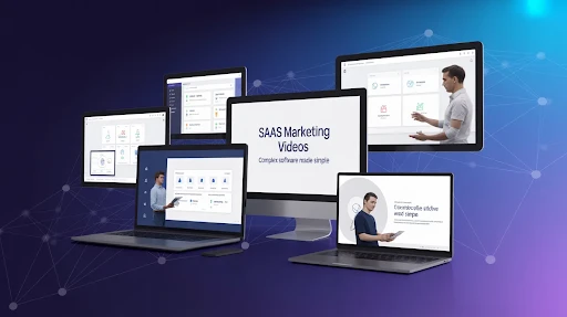
SaaS marketing videos matter because software buyers do not have time to decode a product from a crowded homepage. They want to know what the tool does, who it helps, and why it is worth trying. If the product sounds confusing, they move on.
That is harsh, but it is true. A good video gives the buyer a faster way into the product without forcing them through a wall of feature copy.
That is why software brands use video so often. A strong clip can explain the workflow, show the interface, and make the product feel less abstract.
Why SaaS Marketing Videos Work So Well
Most SaaS products are not hard to use after someone understands them. The hard part is getting them to that first clear moment.
That is where SaaS explainer videos help. They take the product out of internal language and turn it into something a buyer can follow. Instead of listing ten features, the video can show one painful problem and how the software changes it.
This is especially useful for B2B tools. Buyers need clarity, but they also need confidence. Good B2B SaaS product videos help both. They explain the product and make the company look more prepared.
1. Zenoti Shows How 2D Characters Can Simplify a Niche Product
Zenoti’s video works because it understands its audience. Salon and spa owners do not need a dry feature list. They need to see how the platform helps keep bookings full and daily operations under control.
The use of simple 2D characters makes the idea easy to enter. The spa owner and AI sidekick give the video a light, approachable tone while still explaining the product.
This is a good lesson for any explainer video production company working on niche software. If the audience is specific, the story should feel specific too. The more the buyer recognizes themselves, the faster the video works.
2. Webflow Turns No-Code Into a Visual Breakthrough
Webflow’s video is a strong example of using visual metaphor instead of overexplaining.
No-code software can sound technical if you describe it badly. Webflow solves that by showing the frustration of being blocked by code, then shifting into a brighter, more open visual world. That change helps the viewer feel the benefit before every detail is explained.
This is where SaaS video animation can do more than decorate the message. It can show the “before and after” in a way that sticks.
A good metaphor often explains faster than another paragraph of copy.
3. Google Workspace Uses Feature Demos Without Making Them Dull
Google Workspace keeps the video focused on new AI features, which is the right move. The video does not try to explain the entire product family. It shows useful changes in a clean, fast way.
The mix of kinetic text and screen-based visuals helps guide attention. Viewers can see the feature, the action, and the result without needing a long setup.
That is what good SaaS demo videos should do. Show the product in motion, but do not drown the viewer in every possible click.
For feature launches, this kind of structure is often better than a broad brand video.
4. Scuba Analytics Makes Data Feel Less Abstract
Scuba Analytics has a harder job because data tools can get vague quickly.
The underwater theme gives the product a visual world. Data becomes something to explore, not just something to analyze. The use of 3D sheets, flowing movement, and an octopus guide makes the concept more watchable.
This is where a 3D explainer video company can add real value. When the subject is abstract, depth and movement can make the product feel more concrete.
The lesson is not “use underwater visuals.” The lesson is to give complex information a visual anchor.
5. Mailchimp Makes a Brand Initiative Feel Human
Mailchimp’s “Big Change Starts Small” video is not a standard product walkthrough. It is more values-led, which makes sense for the message.
The hand-drawn characters give the video personality. The style feels odd in a deliberate way, and that helps the initiative feel more human than a polished corporate announcement.
This is a useful reminder for SaaS video production. Not every SaaS video has to push features. Some videos build trust by showing what the brand stands for.
When a company has a purpose-led story, the visuals should feel personal, not sterile.
6. Amperity Uses Shapes to Make Data Chaos Visible
Amperity’s video works because it turns a messy idea into something the viewer can see.
Customer data chaos is not easy to picture. Cubes, cylinders, patterns, and movement give the problem shape. The viewer sees scattered information become more organized. That makes the value easier to understand.
This is one of those cases where animated SaaS demo videos do not need characters. Abstract shapes can be enough if they are tied tightly to the message.
For data platforms, less literal storytelling can sometimes be the smarter choice.
7. GitHub Uses Humor Without Losing the Product
GitHub’s video stands out because it understands developer culture. The humor does not feel random. It comes from the world the audience already knows.
That matters.
The video moves between live action, 2D explanation, product logic, and more dimensional scenes. That mix keeps the topic from feeling flat while still explaining who GitHub is for.
A 2D explainer video company can learn from this approach too. Humor works best when it comes from audience truth, not from jokes pasted onto the script.
If the buyer feels “this was made by people who understand us,” the video has already done half the work.
8. Asana Keeps the Feature Story Simple
Asana’s Timeline video is a clean example of a focused product marketing video.
It does not try to sell the whole platform. It introduces one feature and shows why it matters. The simple characters and large colorful blocks make project planning feel visual and easier to manage.
That focus is the strength.
A lot of software advertising videos fail because they try to say too much. Asana keeps the point narrow, which makes the result easier to remember.
For feature videos, one clear use case usually beats a full platform tour.
9. G Suite Shows How Typography Can Guide the Viewer
G Suite’s retail-focused video uses typography, cursor movement, screen moments, and clean color cues to explain collaboration.
The best part is that the visuals do not fight the message. Text, interface, and motion all guide the viewer through the product’s value.
This is a useful format for teams that need a simple product overview video without making the video feel too heavy. It can show workflow, collaboration, and feature use without requiring a big character story.
Typography works well when the message needs structure and speed.
10. Microsoft 365 Shows the Value of a Mixed Format
Microsoft 365 uses a broader mix: live action, interface views, motion graphics, 2D moments, and 3D-style screens. That makes sense because the product covers a lot.
The video sells the idea of working more freely, not just using a set of apps. That is important. A tool suite can easily become a boring list. This video gives the product a bigger reason to matter.
A SaaS explainer video company can take a simple lesson from this: when the product has multiple tools, do not treat every feature equally. Build a clear thread that connects them.
What These SaaS Videos Teach
These examples show that there is no single best style for SaaS.
Zenoti uses characters. Webflow uses a metaphor. Google Workspace uses clean feature demos. Scuba Analytics uses visual immersion. Mailchimp leans into brand personality. Amperity simplifies data with shapes. GitHub uses humor. Asana focuses on one feature. G Suite uses typography. Microsoft 365 blends formats.
The best choice depends on the product’s problem.
If users are confused, simplify.
If the product feels abstract, give it a visual metaphor.
If the feature is new, show it clearly.
If adoption is hard, create SaaS onboarding videos that walk people through the first steps.
That is how video becomes useful instead of decorative.
Frequently Asked Questions
[dynamic_faq]
Final Words
The best SaaS marketing videos make software feel easier to understand, easier to trust, and easier to try. They do not overwhelm buyers with every feature. They choose one clear story and use the right visual style to support it. Some products need characters.
Some need screen demos. Some need 3D depth, humor, typography, or a mixed-media approach. The goal stays the same: help the buyer understand the value before they lose interest.
Related Articles: