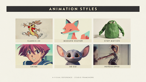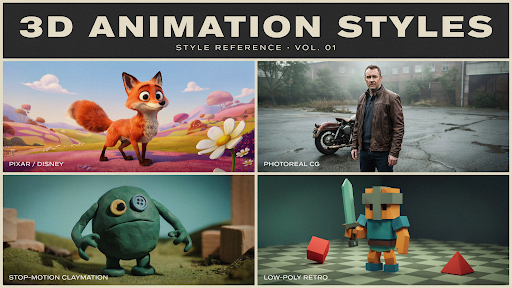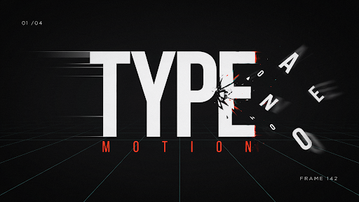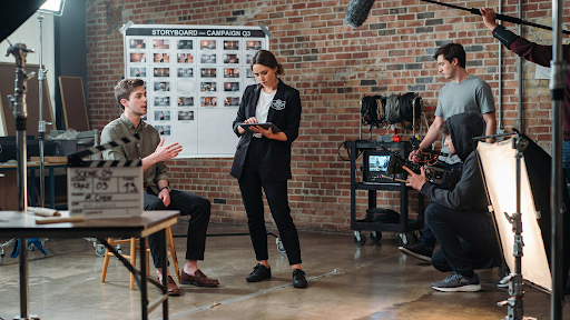
Category: marketing videos

  • 2D vs. 3D Animation: Which Explainer Video Style Is Right for Your Brand?

    2D vs. 3D Animation: Which Explainer Video Style Is Right for Your Brand?

    Three companies enter a production meeting with the same question: should the video be 2D or 3D?

    One sells project-management software. Another manufactures a compact air purifier. The third is preparing patients for a medical procedure.

    The 2D vs. 3D animation choice will not be the same for all three, even if their budgets and video lengths are similar. Each company needs the audience to understand something different.

    That is where the decision should begin.

    Not with which style looks more expensive. Not with what a competitor used last month. Start with the part of the message that is currently difficult to see, explain, or believe.

    Three Briefs, Three Different Visual Problems

    The software company wants prospects to understand how much time is lost switching between disconnected tools.

    The appliance manufacturer needs buyers to see airflow moving through filters hidden inside the product.

    The healthcare organization wants to explain both the patient experience and what happens inside the body.

    These are different communication problems. Treating them as one visual question is how brands end up paying for animation that looks impressive but explains very little.

    An experienced animated explainer video company should be able to identify the visual problem before suggesting an animation style. A production team that recommends 3D after hearing only the budget is skipping the most important part of the discussion.

    The medium should follow the message.

    Brief One: The Software Company Does Not Need a Digital Product Model

    The software team initially asks for 3D because it wants the launch to feel important.

    But the product is not difficult to understand because of its shape. There is no physical object to rotate or open. The confusion sits in the user’s working day.

    A manager checks email for one update, opens a spreadsheet for another, and messages two coworkers for the rest. The product brings that information into one place.

    That story needs people, timing, and recognizable frustration.

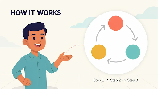
    A 2D explainer video company can show the manager moving through the old process, losing time, and then handling the same task more calmly after the software appears. The video can shift between the character, simplified screens, icons, and process graphics without feeling like a technical demonstration.

    This is when to use 2D animation for business. The value lives in a situation people recognize, not in the physical construction of a product.

    What 2D Can Do Without Feeling Childish?

    Some business teams still hear “2D” and picture a playful cartoon.

    That is a design choice, not a limitation of the medium.

    A financial brand can use restrained colors, precise motion graphics, and simple figures. A healthcare video can use soft movement and realistic proportions. An education company may choose warmer character animation because emotional recognition matters more.

    The strength of a 2D explainer video is control.

    The production can move from a customer’s home to an office, then into an abstract workflow within seconds. It can show hesitation, delay, relief, or confusion without hiring actors or arranging several locations.

    It can also simplify information aggressively. A messy workflow may become four clean steps. An invisible risk can be represented through color or movement. Data can appear beside the character instead of interrupting the story with a separate presentation.

    That makes 2D especially effective for services, customer journeys, training, healthcare education, finance, nonprofits, and workplace communication.

    The Weakness of 2D Shows Up When Exact Form Matters

    Now return to the air purifier.

    The marketing team wants buyers to understand why its internal filter arrangement performs differently from cheaper models. A flat diagram could show the parts, but it may not make the airflow or spatial relationship clear.

    This is where 2D begins to work harder than it should.

    The company does not mainly need a customer story. It needs product visualization.

    A 3D explainer video company can remove the outer housing, separate the filters, and move the camera through the unit. Airflow can be represented clearly. The product can rotate while the viewer sees how each part connects.

    This is when to use 3D animation for product marketing. The audience needs to inspect something that ordinary footage cannot reveal.

    The extra production effort has a clear purpose.

    What a Strong 3D Explainer Actually Reveals
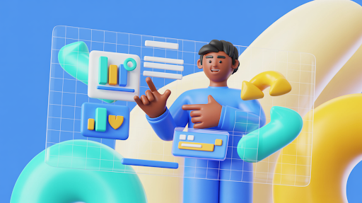
    An example of a 3D-animated explainer video

    A 3D explainer video earns its budget when depth carries information.

    Internal machinery can be exposed without physically cutting the product apart. A medical device can be shown inside the body. An architectural project can be presented before construction. A product still in development can appear finished and working.

    The camera is not limited by the real world. It can move through a pipe, beneath a surface, or around a component that is only a few millimeters wide.

    Materials matter too.

    Metal, glass, fabric, liquid, and plastic can be represented in ways that help buyers understand quality, construction, and use. Good lighting can clarify edges and surfaces. Poor lighting simply makes the object look dramatic.

    That distinction matters.

    A slow product rotation may look premium, but it is not automatically useful visual storytelling. The shot should reveal a feature, show a relationship, or support a buying decision.

    Otherwise, the brand is paying for movement rather than explanation.

    The Cost Difference Is Real, but It Is Not Always Simple

    3D usually requires more production stages.

    A model may need to be built or cleaned from CAD data. Materials are applied. Lights and cameras are placed. Moving parts may need controls. Every finished scene must then be rendered.

    That often means a larger video production budget and a longer animation timeline.

    Still, the assumption that all 2D is cheaper can cause problems.

    A short 3D product spin may be fairly straightforward. A detailed 2D film with frame-by-frame movement, expressive acting, and several original environments may take much longer.

    The real difference between 2D and 3D animation pricing comes from what must be designed, how much movement is involved, and how often assets can be reused.

    Do not compare the styles by label alone. Compare the actual work inside the scenes.

    Brief Three: The Healthcare Video Needs Both

    The third company is preparing patients for a procedure.

    Part of the video needs to show a person arriving, meeting the care team, and understanding what to expect. Another part needs to explain where a device is placed inside the body.

    Neither style can handle the whole message as effectively by itself.

    2D can carry the patient journey. It gives the story emotional distance and avoids making the experience feel graphic. The character can show uncertainty at the beginning and greater confidence after the explanation.

    Then the production can move into 3D for the anatomy and device placement.

    The combination works because each style has a separate job. The transition is not there to make the video feel more varied.

    This is the strongest reason to use a hybrid approach.

    Human context in 2D. Technical detail in 3D.

    Mixed Styles Can Also Waste Money

    A hybrid video is not automatically more effective.

    Some productions switch from 2D to 3D because the team worries one style will become boring. Others add interface animation, typography, characters, product renders, and live footage to make the film appear larger.

    The result can feel disconnected.

    Every change in visual language asks the viewer to adjust. That is worthwhile when the new style explains something the previous one could not.

    It is distracting when the change exists only for visual novelty.

    The best animation style for explainer videos may be one consistent method used carefully. A simple 2D film with a strong script will usually outperform a mixed production with no clear reason for its choices.

    Consistency is not dull when the story is moving.

    Brand Personality Does Not Decide the Medium by Itself
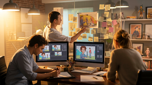
    Animators working on different explainer videos

    A serious company can use 2D.

    A playful brand can use 3D.

    The medium does not create the entire tone. Writing, pacing, color, camera movement, music, sound, and design detail shape how the video feels.

    This is where brand identity should guide the execution rather than dictate the format.

    A medical 2D video might use calm movement, clean anatomy references, and understated narration. A toy company may use exaggerated 3D shapes and energetic camera work. A premium software brand could combine elegant interface animation with restrained character scenes.

    Do not ask whether 2D or 3D matches the brand in general.

    Ask how the selected style should be directed so it feels like the brand.

    Revisions Feel Different in Each Production Pipeline

    A marketing director changes the brand color late in a 2D project. That may be inconvenient, but the team can often update the affected artwork without rebuilding everything.

    A product engineer changes the physical shape of a component during a 3D project. That adjustment may affect the model, materials, rigging, animation, lighting, and final renders.

    The revision risk is different.

    For 2D, settle the character designs, visual system, and storyboard before full animation begins. For 3D, approve the model and key materials before animating detailed scenes.

    Product stability matters especially in 3D.

    A company launching hardware should not begin final animation while engineering changes are still being made every week. The schedule will suffer, and so will the budget.

    Good production planning is not restrictive. It keeps small decisions from becoming expensive ones later.

    What Should a SaaS Company Choose?

    The question of 2D or 3D animation for SaaS videos is usually easier than software teams make it.

    Most SaaS products do not need full 3D.

    Their value sits in a task becoming easier, faster, or more organized. A SaaS explainer video company can show the old frustration through a short character scene, then move into a simplified interface demonstration.

    UI animation and motion graphics often carry the product portion better than realistic 3D.

    There are exceptions.

    Software connected to manufacturing, architecture, digital twins, robotics, virtual environments, or spatial computing may benefit from 3D because the platform interacts with physical space.

    For ordinary business software, though, 3D can become an expensive layer around a problem that is better explained through people and process.

    Show the user first. Show the interface when the story needs it.

    A Quick Decision Test

    Write one sentence describing what viewers must understand after the video.

    If the sentence focuses on a person, service, workflow, emotion, or abstract idea, begin by considering 2D.

    If it focuses on construction, internal movement, physical scale, materials, or spatial relationships, investigate 3D.

    If the sentence contains both a human experience and a technical process, a hybrid may be justified.

    Then test the choice against practical limits.

    How stable is the product design?
    How many stakeholders will review the video?
    Will the assets be reused later?
    Does the deadline allow for rendering?
    Will the content need regular updates?

    These questions are less exciting than browsing animation references. They are also far more useful.

    Final Words

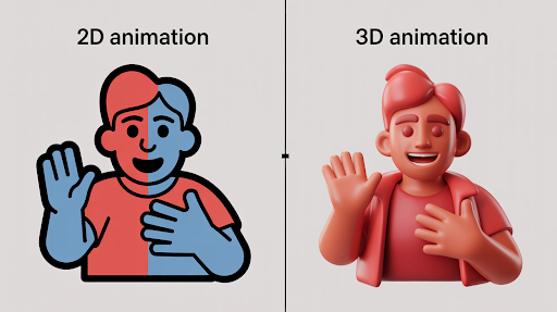
    The 2D vs. 3D animation decision is not a contest between a basic style and a premium one.

    2D is often the better choice for services, characters, ideas, emotions, workflows, and software stories. 3D becomes valuable when the viewer needs to understand physical form, internal construction, movement, scale, or material.

    A mixed approach works when each medium solves a distinct part of the explanation.

    Start with what the audience cannot currently understand. Once that is clear, the right production style usually becomes much easier to defend.

    The best-looking choice is not always the right one.

    The clearest one usually is.

    Frequently Asked Questions

    It depends on the subject. Use 2D for services, people, customer journeys, software, and abstract ideas. Use 3D when the audience needs to inspect a product, mechanism, space, or internal process.
    Usually, but not in every case. Simple 3D product work can cost less than detailed frame-by-frame 2D animation. Complexity, movement, scene count, and revision needs influence the final price.
    Yes. 2D can look restrained, technical, premium, or corporate depending on the art direction. It does not have to resemble children’s entertainment.
    Use both when the story has a human side and a technical side. For example, 2D may show a patient experience while 3D explains anatomy or a medical device.
    Most SaaS explainers work well with 2D scenes, motion graphics, and simplified UI animation. 3D is more useful when the software connects to physical products, spatial systems, or technical simulation.

    Related Articles:
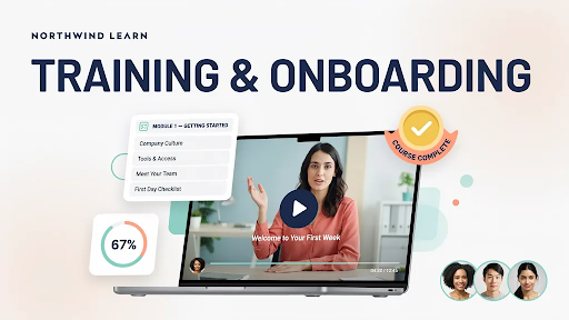
  • Why Storytelling Structure in Corporate Videos Matters More Than Polish

    Why Storytelling Structure in Corporate Videos Matters More Than Polish

    A corporate team can spend weeks choosing cameras, music, animation, and locations, then end up with a video nobody finishes. The problem is often not production quality. It is the lack of a clear storytelling structure in corporate videos.

    Viewers need a reason to keep going.

    They need to understand who the video is about, what is getting in the way, and why the outcome matters. Without that movement, a corporate film becomes a collection of office shots, product features, and polished claims.

    It may look professional. It still feels flat.

    Do Not Make Viewers Wait for the Point

    Corporate videos often begin with company history.

    The founding year appears. The logo moves onto the screen. A narrator talks about commitment, quality, and years of experience. None of this is necessarily wrong, but it may not answer the question in the viewer’s mind.

    “Why should I care?”

    A better opening begins with a recognizable moment.

    A customer cannot get a clear answer. A project manager is searching for one updated file. A medical team is losing time because information sits in separate systems. A manufacturer cannot show buyers how an internal component works.

    Now there is somewhere for the story to go.

    Strong corporate storytelling videos do not hide the company. They simply give the audience a reason to listen before introducing it.

    Find the Human Problem Behind the Business Problem

    Businesses tend to describe problems in broad language.

    Low efficiency. Poor communication. Limited visibility. Slow adoption.

    Those phrases are difficult to picture.

    A real moment is easier.

    A supervisor stays late to correct a report. A customer gives up halfway through a confusing form. A new employee asks the same question three times because the training video never showed the actual task.

    This is how storytelling improves corporate video engagement. It turns an abstract issue into something the audience can recognize.

    An explainer video company can help uncover that moment when a service has several benefits but no obvious story. Instead of describing the entire offer, the video follows one problem far enough for the solution to matter.

    The viewer does not need every detail at once. They need one clear reason to continue.

    A Simple Story Shape Is Usually Enough

    Corporate storytelling does not require a dramatic plot twist.

    A basic three-act structure works because it follows the way people naturally understand change.

    First, show the current situation.

    Then reveal the obstacle, cost, or frustration.

    Finally, show what becomes possible after the customer makes a change.

    That is the practical three act structure for corporate videos.

    A construction software video might begin with a site manager receiving updates through calls, texts, and scattered spreadsheets. The middle shows what that confusion causes: missed information, duplicated work, and delays. The final part shows one shared system and a calmer working day.

    The software is not the story by itself.

    The change is the story.

    The Customer Should Do More Than Stand Beside the Product

    Many corporate videos make the company the hero.

    The brand arrives with expertise, technology, and a list of achievements. The customer appears briefly, usually looking impressed.

    That arrangement feels like an advertisement because it is centered on the seller.

    The customer should have the goal.

    They should be trying to finish the project, understand the diagnosis, reduce waste, train the team, or serve their own customers better. The company becomes the guide that helps them move forward.

    This creates an emotional connection without forcing drama.

    The audience sees its own concerns reflected in the story. The brand earns relevance by helping, not by repeatedly announcing its importance.

    Conflict Can Be Quiet

    Corporate filmmakers sometimes overstate the problem.

    The old process becomes a complete disaster. Employees look miserable. Red warning symbols cover the screen. Everything feels seconds away from collapse.

    Most business problems are less theatrical.

    Someone repeats a task that should be automatic. A buyer cannot compare two options. A team waits an extra day for approval. These situations are small, but they happen often enough to matter.

    That is useful conflict.

    For corporate storytelling videos for business, believable tension usually works better than exaggerated frustration. The audience should think, “Yes, that happens,” rather than, “Nobody’s workplace is that dramatic.”

    A quiet problem can still carry a strong story when the consequences are clear.

    Visuals Should Explain Something the Script Does Not

    A visual of a corporate video

    A common corporate video problem is duplication.

    The narrator says the team is growing while the screen shows employees walking through an office. The voice describes innovation while abstract light streaks move in the background.

    The visuals are present, but they are not adding information.

    Good visual storytelling divides the work between sound and image.

    The narration may explain the customer’s goal while the screen shows the hidden obstacle. A chart may reveal how much time is being lost. An interface may show the exact action that replaces the old process.

    A 3D explainer video company can do this when the audience needs to understand physical form, internal movement, or spatial relationships. A device can be opened, a machine can be separated into parts, or an invisible process can be shown clearly.

    The 3D work earns its place because it carries part of the explanation.

    Corporate Does Not Have to Mean Emotionless

    Emotion in a business video does not require swelling music or a dramatic speech.

    Relief is an emotion. So is confidence. Curiosity. Frustration. Pride. The satisfaction of finally understanding something that used to feel complicated.

    These quieter feelings are often more appropriate for corporate work.

    A training film may show a new employee becoming more comfortable with a task. A customer story may focus on the first moment a team realized the new process was working. A brand film may show why the founders cared enough to solve a particular problem.

    Emotion should come from a specific situation.

    When it does, it supports audience engagement without making the video feel manipulative.

    Pacing Is Not the Same as Fast Editing

    Some corporate videos drag. Others move so quickly that nothing lands.

    Pacing sits between those two problems.

    The audience needs to feel progress. Each scene should reveal something, change the situation, or move the viewer closer to the outcome. A long section that repeats the same benefit will hurt viewer retention, even if the animation is smooth.

    During editing, ask what each scene contributes.

    Does it introduce new information?
    Does it deepen the problem?
    Does it show proof?
    Does it move the story toward a result?

    If it does none of those things, it may not need to be there.

    A calm video can still feel engaging. It simply needs forward movement.

    2D Animation Can Make Workplace Problems Easier to Recognize

    Not every corporate story needs live action.

    Some situations are easier to show with animation. A company may need several locations, a diverse cast, a futuristic setting, or visual metaphors that would be expensive to film.

    A 2D explainer video company can create those scenes while keeping the focus on the human problem.

    Characters can show hesitation, confusion, relief, or confidence without turning the video into a full dramatic production. The art style can remain serious for finance, calm for healthcare, or more playful for education.

    2D works particularly well when the audience needs to recognize a situation rather than inspect a physical object.

    The character does not need to perform like a movie actor. One clear reaction may say enough.

    Internal Corporate Videos Need Structure Too

    Story is not only for customer-facing marketing.

    Onboarding, safety training, policy updates, leadership messages, and process videos often fail because they present information without context.

    A policy video may list several rules. A story-led version shows an employee making a common mistake, explains the effect, and demonstrates the correct action.

    The second version is easier to remember because the information belongs to a situation.

    This matters in corporate video production where the audience may be required to watch the content. Mandatory viewing is not a reason to ignore engagement.

    Employees still need to understand why the information matters to their work.

    SaaS Videos Need a Story Before They Need a Screen Recording

    Writers working on creating SaaS-related video script

    Software videos often begin inside the dashboard.

    A cursor moves. Menus open. Feature names appear. The viewer sees plenty of activity but has no reason to care about any of it.

    A SaaS explainer video company should begin with the user’s working day.

    What are they trying to complete? What slows them down? Which information is missing? What happens when the old process fails?

    The interface can appear after the need is clear.

    This creates a better narrative structure than walking through every feature in order. A homepage video can tell the broad story. A separate demonstration can explain one workflow. Onboarding content can handle the detailed clicks.

    One video should not try to perform all three jobs.

    The Resolution Needs Proof

    A weak ending announces that the product makes everything better.

    A stronger ending shows the difference.

    The manager finishes the report before the meeting. The patient understands the next step. The customer completes the process without calling support. The machine operates with less downtime.

    This is an important part of how to structure a corporate video story.

    The resolution should answer the problem introduced at the beginning. It should not suddenly add five new benefits that were never part of the story.

    Proof can be simple. A visible result, a short statistic, or one specific customer outcome may be enough.

    The audience should feel that the ending was earned.

    The Call to Action Should Not Feel Attached at the Last Minute

    Many videos tell a complete story, then end with a crowded screen asking viewers to call, subscribe, follow, download, share, and buy.

    That is too much.

    The call to action should fit the viewer’s position.

    A first-time viewer may need to visit a service page. A serious prospect may be ready to request a consultation. A software buyer may want a product demo. An employee watching training content may need to complete an assessment.

    Choose one main next step.

    The CTA should feel like the natural continuation of the story, not a sales message dropped onto the final frame.

    Story Structure Should Shape the Brand Style

    Once the story is clear, creative decisions become easier.

    The production team can choose a visual style, music, pacing, voice, and animation approach that support the same idea. This helps the video feel connected to the company’s brand identity rather than looking like a generic corporate template.

    A serious technical story may need restrained graphics and precise movement. A people-focused brand story may benefit from warmer photography and natural interviews. A fast-moving product launch may call for stronger sound and tighter editing.

    Style should grow from the story.

    Starting with style and searching for a story afterward usually creates an expensive mismatch.

    Measure the Parts of the Story, Not Just Total Views

    A high view count does not show whether people followed the message.

    Look at where viewers leave. Check average watch time. Notice whether people remain through the problem but drop during the product explanation. Review whether they reach the final action.

    That is how to measure corporate video engagement in a useful way.

    A sharp early drop may mean the introduction takes too long. Weak retention in the middle can point to repetitive information. Strong completion but few clicks may suggest the CTA does not fit the story.

    The data should help improve the next video.

    It should not exist only to decorate a performance report.

    Final Words

    A clear storytelling structure in corporate videos gives viewers a path through business information. It begins with a situation they recognize, introduces meaningful friction, shows a believable change, and leads toward one relevant next step.

    The customer remains at the center. The brand provides help, expertise, technology, or guidance.

    Strong visuals, animation, sound, and editing still matter. But without structure, they have nothing solid to support. A simple story told clearly will usually hold more attention than a polished video built around a list of claims.

    FAQs

    Storytelling gives facts and business information a clear order. It helps viewers understand who the message is for, why the problem matters, and what changes after the solution appears.
    A three-part structure is usually enough: establish the current situation, show the problem or obstacle, and reveal the result after the customer takes action.
    The customer should usually remain at the center. The company acts as the guide, partner, or provider that helps the customer achieve the desired outcome.
    Introduce a relevant situation early, remove repeated points, maintain visible progress, use visuals that add information, and give viewers a reason to stay for the resolution.
    Useful metrics include watch time, retention by section, completion rate, replayed moments, click-through rate, and the number of viewers who complete the intended next action.

    Related Articles:
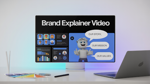
  • Types of Animation Styles and Where They Make Sense

    Types of Animation Styles and Where They Make Sense

    The types of animation styles available today can make a simple video brief unexpectedly messy.

    It often starts with a reference. Someone likes a polished 3D product film. Someone else wants friendly cartoon characters. Another person suggests motion graphics because the message includes data. All three ideas may be good, but they may not belong in the same video.

    The style should not be chosen first.

    Before discussing colors, characters, software, or camera movement, decide what the audience actually needs to see. Are they following a person, examining a product, learning a process, or watching a short campaign message?

    That answer usually narrows the choices quickly.

    First Decide What Carries the Story

    Most animation projects are led by one of three things:

    A person or character.
    A physical object.
    Information or a process.

    Some videos mix all three, but one normally matters most.

    If a viewer needs to understand how a customer feels, character work may help. If they need to see the inside of a device, 3D is more useful. If they need to follow a workflow, motion graphics will probably explain it faster.

    This is the practical way to think about the different types of animation and their uses. Each style gives the audience a different kind of information.

    When People and Everyday Situations Matter

    A lot of business messages become easier to understand once a person appears.

    Imagine a manager switching between four dashboards. A patient waiting for instructions. A parent trying to choose a learning app. These are not technical scenes. They are human situations.

    2D Animation

    2D animation handles this kind of storytelling well.

    The artist can create offices, homes, classrooms, cities, or imaginary spaces without needing actors or locations. Expressions can be subtle or exaggerated. The style can feel warm, formal, playful, or restrained.

    A healthcare video may use calm movement and simple facial expressions. A children’s brand can push color and comedy much further. A financial company might use flatter shapes and less character acting.

    An explainer video company will usually decide how much detail the audience needs. A short service video may only require clear poses and a few expressions. A longer story may need stronger acting, lip sync, and more developed scenes.

    The main advantage is control. Every visual can be shaped around the message.

    Character Animation

    Character animation is useful when behavior carries the idea.

    There is a difference between showing a worker using old software and showing the same worker pausing, sighing, searching through several screens, and finally giving up. The second version lets the viewer feel the problem.

    That is why character-led work appears often in HR, education, healthcare, customer support, and service marketing.

    A mascot can also become part of the brand. It may appear in onboarding, social posts, help videos, and campaign content. Over time, viewers start to recognize it.

    Characters are not always necessary, though. If the audience wants specifications or a product demonstration, a fictional person may slow the explanation down.

    Traditional and Cutout Work Feel Less Perfect on Purpose

    Some projects benefit from visible human touch.

    Traditional Animation

    Traditional animation is drawn frame by frame. Most artists now work digitally, but every key pose is still created by hand.

    The result can feel loose, expressive, and alive. Lines shift slightly. Facial expressions have more personality. Movement does not always feel perfectly mechanical.

    That makes it a good fit for music videos, entertainment, artistic campaigns, title sequences, and short films.

    The tradeoff is time. A small change may affect several drawings. If a company needs weekly content or frequent updates, full frame by frame production may become difficult to maintain.

    A special campaign, however, may benefit from that handmade character.

    Cutout Animation

    Cutout animation uses flat parts that move like a puppet. These pieces may be made from paper or created digitally.

    Its limitations are easy to see. Arms bend at obvious joints. Movement can feel stiff. A face may have only a small set of expressions.

    That can be the whole appeal.

    Cutout work often feels quirky, nostalgic, or editorial. It suits historical stories, educational content, social commentary, and campaigns that should not look overly polished.

    A 2D explainer video company may use a puppet-based system when a project needs character and personality without the time required for full traditional animation.

    The stiffness does not always need fixing. Sometimes it becomes the style.

    When the Product Has to Explain Itself

    Some videos are not really about people. The product is the story.

    The audience needs to see how something opens, turns, connects, folds, or works under the surface.

    3D Animation

    Examples of 3D animation styles

    3D animation allows a camera to move around an object, enter it, separate its parts, or show angles that cannot be filmed easily.

    Medical equipment, industrial machines, architecture, consumer products, automotive parts, and technology hardware often benefit from this approach.

    A 3D explainer video company may show a device working inside the body, a machine being assembled, or a product that has not yet been manufactured. In each case, depth is carrying useful information.

    The discussion around 2D vs 3D animation for marketing should begin there.

    Use 2D when the story depends on people, emotion, or familiar situations. Use 3D when form, material, space, or mechanical movement matters.

    A 3D treatment should reveal something. If it only makes the video shinier, the extra production may not be worth it.

    Stop Motion Animation

    Stop motion animation also puts the object at the center, but it uses real materials.

    A product, paper shape, toy, plate of food, or clay figure is moved slightly and photographed. The process is repeated until the still images create motion.

    Small imperfections give it character. A box may wobble as it opens. Food may slide in a way that feels playful rather than perfectly smooth.

    That physical quality works well for food brands, toy campaigns, handmade products, and packaging launches.

    Revisions can be awkward. If a label changes after filming, the scene may need to be rebuilt. Stop motion rewards careful planning because physical changes are not always easy to undo.

    When the Message Is Mostly Information

    A large number of business videos do not need a character or realistic product model.

    They need to make something complicated easier to follow.

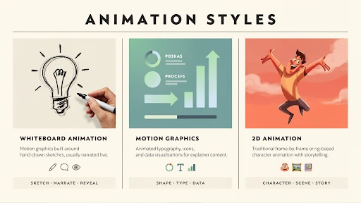
    Motion Graphics

    Motion graphics use icons, text, charts, diagrams, interface elements, and shapes to control how information appears.

    A logistics firm may show the journey of an order. A finance company may explain a payment process. A cybersecurity brand may show how a threat moves through a network.

    The viewer sees each part in order rather than facing one crowded screen.

    This is one of the most common types of animation used in advertising, particularly for technology, healthcare, finance, and B2B services.

    The best motion graphics are usually less busy than expected. Movement should direct attention. When every object spins or changes size at once, the video becomes harder to understand.

    Whiteboard Animation

    Whiteboard animation reveals an explanation gradually.

    A drawing appears, then a note, then another idea connects to it. This slow build can help with lessons, compliance, training, nonprofit messages, and financial education.

    The style feels dated when the drawings are generic. A lightbulb, handshake, dollar sign, and stick figure have appeared in too many videos already.

    Artwork made for the actual subject changes the result.

    Whiteboard work may not be the best animation style for business videos that need luxury, energy, or product beauty. For careful teaching, it can still be effective.

    Typography Animation

    An example of typography animation

    Typography animation makes the words themselves carry the visual.

    Text changes size, position, spacing, and rhythm. Sound and timing give the message more weight.

    It works well for trailers, event openers, social campaigns, lyric videos, launch announcements, and short advertisements.

    The writing has to be strong. Animation cannot rescue a weak sentence.

    Readability also matters. If the viewer has to chase every word across the screen, the visual treatment is getting in the way.

    Mixed Media Works When Every Element Has a Job

    Mixed media animation combines several approaches.

    A brand film may begin with live action, add hand-drawn marks, use 3D for the product, and finish with animated text. Fashion, music, entertainment, and event campaigns use this style often.

    The variety can feel fresh.

    It can also become chaotic.

    Live footage may add trust. 3D may explain the product. Motion graphics may handle numbers. Drawn elements may add humor. Each method should solve a particular part of the message.

    Color, sound, framing, and editing rhythm help connect everything.

    Without that shared direction, mixed media can look like several unrelated videos pushed together.

    Software Usually Needs Interface Animation

    Software presents a different challenge because the product is a series of actions on a screen.

    A screenshot cannot show where someone clicks, what changes, or why the feature matters. Interface animation can guide the viewer through the key steps while removing distractions.

    Motion graphics may explain what is happening behind the interface. A short character scene may introduce the problem before the software appears.

    A SaaS explainer video company may combine all three approaches.

    A homepage video should communicate the main promise. A feature walkthrough should explain one task. An onboarding video should help an existing user complete something.

    Trying to cover every feature in one piece usually creates a rushed tour that nobody remembers.

    For SaaS, simple explanation usually wins over visual spectacle.

    Budget and Revisions Change the Decision

    Anyone asking how to choose the right animation style should think about production realities as well as appearance.

    Traditional animation can take longer because movement is drawn frame by frame. Stop motion may require parts of a set to be rebuilt when changes arrive. Detailed 3D needs modeling, texturing, rigging, lighting, and rendering before a finished scene exists.

    Digital 2D and motion graphics can sometimes be easier to update, though complex character work may still require substantial revisions.

    The platform matters too.

    A large event screen can show more detail than a mobile advertisement. A longer YouTube video may allow slower pacing. A short social clip needs a simpler idea and quicker visual communication.

    The right style sits where the message, audience, budget, schedule, and revision needs meet.

    A Simple Way to Make the Choice

    Start with what must be understood.

    If viewers need to recognize a human situation, look at 2D or character animation.

    If they need to examine a physical object or process, 3D may be the stronger choice.

    If the video is about a system, workflow, or set of figures, motion graphics will often explain it more clearly.

    Choose stop motion when the handmade feel adds value. Use whiteboard for patient teaching. Use typography when the message is short and the words are strong. Combine styles only when each method has a clear purpose.

    That is the honest answer to choosing among the many animation formats. There is no single winner.

    Final Words

    The types of animation styles available today serve different jobs. Traditional, cutout, 2D, and character animation are useful when people and personality lead the story. Motion graphics, whiteboard work, and typography help organize information. 3D explains products, spaces, and physical movement, while stop motion gives objects a real handmade quality. Mixed media brings several techniques together when one approach is not enough.

    Choose the style after the brief is clear. A fashionable visual treatment cannot repair a confused message, but the right production method can make a difficult idea much easier to understand.

    Frequently Asked Questions

    Common formats include 2D, 3D, traditional, character, motion graphics, stop motion, whiteboard, cutout, typography, interface, and mixed media animation.
    It depends on the offer. Services often work well with 2D stories or motion graphics. Products with physical detail may need 3D. Short campaigns may suit typography, stop motion, or mixed media.
    Not in every case. A detailed frame-by-frame 2D film may cost more than a simple 3D scene. Duration, visual detail, number of characters, environments, rendering, and revisions have a larger impact on cost.
    Use character-led 2D for familiar problems, motion graphics for data and systems, interface animation for software, and 3D for products or processes that rely on depth.
    Yes. A production can combine live action, 2D, 3D, interface animation, and typography. Clear art direction is needed so the finished video feels connected rather than patched together.

    Related Articles:
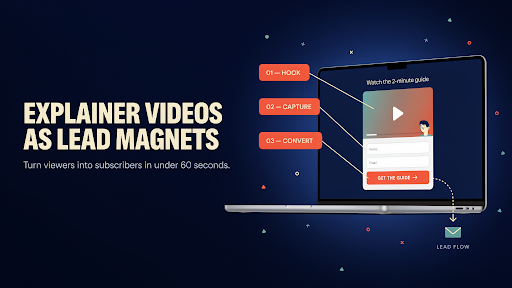
  • What Is Marketing Video Production, Really?

    What Is Marketing Video Production, Really?

    A founder has explained the same service on three sales calls this week. Each time, the prospect understands it only after the founder shares their screen and walks through a real example.

    That is often the moment a business starts asking, what is marketing video production, and whether a video could do some of that explaining before the call.

    Marketing video production is the work behind videos created for a business purpose. That purpose could be attracting attention, demonstrating a product, building trust, answering a common question, or moving a buyer toward the next step.

    The video is not the goal by itself. The result is.

    Start With the Question People Keep Asking

    A business usually does not need “a video.”

    It needs an answer to a communication problem.

    Maybe customers do not understand the difference between two services. Maybe a product looks simple in photographs but has a useful feature people keep missing. Maybe the sales team spends the first ten minutes of every call explaining the same process.

    Those are useful starting points for a marketing video strategy.

    The team should decide what the viewer needs to understand before discussing animation styles, locations, cameras, or music. It also needs to define the target audience clearly.

    A first-time visitor may need a basic introduction. A serious buyer may already understand the problem and want evidence. Treating both viewers the same usually creates a vague video that helps neither.

    Give the Video One Proper Job

    This sounds restrictive. It is not.

    A focused video is easier to write, easier to produce, and easier to remember.

    Problems begin when everyone adds one more request. The founder wants the origin story. Sales wants every feature. Marketing wants a campaign message. The product team wants a full walkthrough. Someone suggests adding customer quotes too.

    The final script becomes a crowded company brochure.

    An explainer video company can help narrow that material into one useful path. The video might introduce a common frustration, show how the service changes the situation, and finish with a sensible next action.

    Everything else can become another video.

    One clear message almost always beats six half-explained ones.

    Buyers Ask Different Questions at Different Times

    Not every viewer is ready for the same conversation.

    Someone discovering the brand may be asking, “What does this company actually do?” A person comparing options is more likely to ask, “Why should I trust this one?” A buyer close to making a decision may want to know about setup, delivery, pricing, or support.

    This is where the types of marketing videos for businesses begin to separate.

    Short promotional videos can attract attention. Brand films can introduce a company’s point of view. Testimonials and case studies provide proof. Tutorials and product demo videos answer practical questions.

    That is also how marketing videos support the sales funnel. Each video removes a different kind of doubt.

    A single general video may still be useful, but it should not be expected to carry the entire buying journey.

    Write for the Ear, Not the Company Brochure

    Marketing scripts often sound fine until someone reads them aloud.

    Then the problems become obvious.

    The sentences are too long. The words sound formal. Claims such as “delivering exceptional solutions” appear without showing what those solutions are. Nobody speaks that way in a normal conversation.

    A spoken script needs air.

    It should use words the audience already understands. It should also replace broad claims with visible examples. Instead of saying a service saves time, show the task before and after. Instead of saying a product is easy to use, show someone completing the key action.

    This is practical brand storytelling. It does not need a dramatic plot. It needs a change the viewer can follow.

    A person has a problem. Something shifts. The result becomes clear.

    The Unexciting Work Usually Saves the Project

    Pre-production rarely gets much attention in a finished case study, but it protects the budget.

    This stage covers the objective, script, structure, visual direction, storyboard, timing, voice, and final delivery formats. It is the foundation of the marketing video production process.

    A rough storyboard can reveal that the product appears too late. A basic animatic may show that the voiceover is rushing through the most important point. These are good problems to discover early.

    The alternative is finding them after animation, filming, or editing has already been completed.

    A sensible video production process settles major decisions while they are still inexpensive to change. That does not remove creativity. It stops the creative team from solving a moving target.

    Live Action Works When Reality Helps

    An example of live action marketing content

    Some messages are stronger when viewers can see real people and places.

    A contractor may want to show the team arriving on site. A manufacturer may need to demonstrate equipment in a working environment. A consulting firm may benefit from showing the people clients will actually meet.

    Live action is useful for interviews, customer stories, workplace content, physical demonstrations, event footage, and company profiles.

    It also comes with practical limits. Locations need planning. People need to be available. Weather, noise, lighting, and reshoots can affect the schedule.

    That does not make live action difficult by default. It simply means the format should be chosen because reality adds something valuable.

    A real face can build trust. A real location can provide proof. If neither matters, another format may be easier.

    2D Animation Can Show Situations That Are Hard to Film

    Some business problems are familiar but not visually exciting.

    A customer moves between several tools. An employee waits for approval. A family tries to understand a service. Filming these scenes may require actors, locations, props, and several setup changes.

    A 2D explainer video company can build those situations without a physical shoot.

    Characters can be simplified. Environments can change quickly. Abstract ideas can become visible through symbols and movement. The tone can also be adjusted to fit healthcare, finance, education, retail, or technology.

    The mistake is assuming 2D must look childish.

    Clean art direction, restrained movement, and good writing can make it feel professional. The style depends on the design choices, not the fact that it is drawn.

    Product Videos Should Answer Questions, Not Pose for the Camera

    A beautiful product shot has value. It just may not be enough.

    Buyers usually want to know what the product does, how it works, what changes when they use it, and which details separate it from competing options.

    Strong product demo videos deal with those questions directly.

    A physical product may need close-ups and a real demonstration. Software may need interface animation. A device may need a mixture of live footage and diagrams. The right method depends on what a buyer cannot understand from photographs and text.

    This is also where brands sometimes waste time on a long visual opening.

    The viewer has come to see the product. Show it.

    Mood can support the demonstration, but it should not delay the useful part.

    Use 3D When the Inside Matters

    A camera cannot always show what a product is doing.

    Internal components may be hidden. A product may still be in development. A medical or industrial process may be unsafe, tiny, or impossible to film clearly.

    A 3D explainer video company can create the object digitally, separate its parts, rotate it, show internal motion, or place it in an environment that does not yet exist.

    That effort makes sense when depth carries information.

    It makes less sense when the message is mainly about a service, a customer experience, or a simple benefit. Choosing 3D only because it looks more expensive can lead to a longer production without a clearer message.

    The format should reveal something viewers need to see.

    Otherwise, it is decoration.

    A Brand Film Needs a Point of View

    Many brand videos look polished and say very little.

    There are office shots, smiling teams, slow camera movement, and a voiceover about quality or passion. The film could belong to almost any company.

    Good video content marketing needs more personality than that.

    A brand film might show how the company approaches a problem differently. It could follow the work behind a product, explain a decision the founders made, or focus on one customer situation that reflects the brand’s values.

    This is how video can support brand awareness. People begin to recognize a tone, visual style, and way of thinking.

    The video does not need to cover every service.

    It needs to leave an impression that belongs to the company.

    Social Video Is Not Just a Cropped Website Film

    A website video often begins slowly because the visitor has already chosen to be on the page.

    A person scrolling a feed has made no such commitment.

    That changes the edit.

    A social media video may need a faster opening, larger text, captions, tighter framing, and one very clear idea. It may also need to make sense without sound.

    This does not mean every social post should flash and jump constantly. Fast does not have to mean chaotic.

    It means the useful part cannot be buried.

    A planned video marketing campaign may produce a main film, several short cutdowns, vertical versions, still frames, teaser clips, and loops from the same production. These assets are easier to create when they are considered before the final edit.

    Distribution should influence production from the beginning.

    SaaS Companies Often Show Far Too Much

    A SaaS-related marketing video example

    Software videos have a habit of turning into feature tours.

    The cursor moves quickly. Menus open. Dashboard panels change. The voiceover names six features in twenty seconds. The viewer recognizes that the platform does a lot but remembers almost none of it.

    A SaaS explainer video company will usually start somewhere else: the user’s problem.

    What is frustrating today? Which task takes too long? What becomes easier after the platform is introduced?

    The interface should appear only when it helps answer those questions. A homepage video may explain the broad value. A separate feature video can demonstrate one workflow. Onboarding content can handle the detailed steps.

    Those videos serve different viewers.

    Trying to combine them usually produces a rushed screen recording with a sales message attached.

    Production Quality Is Not the Same as Visual Complexity

    A video can be simple and still feel professional.

    Clear audio matters. So does readable text, steady pacing, thoughtful framing, and editing that allows the main point to land. None of those things require excessive effects.

    This matters when a team is learning how to create a marketing video.

    Start by deciding what deserves attention. Spend the budget there.

    A product film may need detailed lighting. A testimonial needs clean sound and a comfortable interview setting. An animated explainer may need stronger script development and design. A social series may benefit from a repeatable setup rather than one expensive shoot.

    Production quality comes from judgment.

    More elements do not automatically produce a better result.

    The Ending Should Feel Like the Next Step

    A video should not suddenly become aggressive in its final five seconds.

    If the viewer has just discovered the company, “Buy now” may be too large a request. Visiting a service page or watching a product demonstration may be more reasonable.

    A buyer who has already seen the demo may be ready to book a call. A retail customer may be ready to order.

    The call to action should fit the viewer’s position.

    Keep it to one main action. Asking people to buy, subscribe, follow, download, share, and contact the company at the same time creates unnecessary friction.

    A useful ending feels like a continuation of the video, not a sales message pasted onto it.

    Measure the Change the Video Was Supposed to Create

    Views matter in some campaigns. They are not the only measure.

    A product video may improve conversions on a landing page. A sales explainer may shorten calls. A tutorial may reduce support requests. A brand film may increase direct searches for the company.

    The result should be measured against the original job.

    Completion rate, click-throughs, inquiries, demo bookings, purchases, page behavior, and sales feedback can all provide useful signals.

    This is part of why brands need marketing video production. Video can support several goals, but each video needs a defined purpose before those results can be judged properly.

    Good measurement is not only about proving the video worked.

    It helps the next one work better.

    Final Words

    So, what is marketing video production? It is the process of planning and producing video content that helps a specific audience understand a brand, product, service, or next step.

    Brands need it because some ideas become clearer when people can see them in context. A good marketing video does not try to say everything. It solves one communication problem, uses a format that fits the message, and reaches viewers in a form suited to the platform.

    The strongest video is not necessarily the most elaborate one.

    It is the one that makes the right person understand what matters.

    FAQs

    It may involve strategy, audience research, concept development, scriptwriting, storyboarding, live filming or animation, voiceover, editing, sound, captions, and delivery in several formats.
    Companies use them to explain offers, demonstrate products, answer buyer questions, provide proof, build recognition, support sales conversations, and guide viewers toward a next step.
    Useful formats include explainers, product demos, brand films, customer stories, tutorials, promotional videos, social clips, event content, advertisements, and software walkthroughs.
    The right length depends on the job. A social clip may last only a few seconds, while a detailed demonstration may need several minutes. The video should stop when its main point is complete.
    Neither is automatically better. Live action helps when real people, locations, or physical demonstrations matter. Animation works well for software, abstract services, characters, internal processes, and products that are difficult to film.

    Related Articles:
  • What Makes a 3D Logo Stand Out in Modern Design?

    What Makes a 3D Logo Stand Out in Modern Design?

    A 3D logo stands out in modern design when it feels designed, not dressed up.

    There is a difference.

    A dressed-up logo has shine, shadows, bevels, maybe a dramatic spin. It looks nice for a second. Then it feels like every other logo reveal you have already seen.

    A designed 3D logo has a reason behind it. The depth fits the brand. The material says something. The lighting is not random. The motion has behavior. Even if you remove the effects, the mark still makes sense.

    That is the real test.

    A Weak Logo Does Not Become Strong in 3D

    The flat version has to work first.

    No way around it.

    If the original logo has odd spacing, thin details, confusing shapes, or poor balance, the 3D version will expose those problems. It can sometimes exacerbate their condition. Depth creates extra edges, shadows, angles, and areas for the eye to get lost.

    That is why brand identity design matters before the 3D work begins.

    A good logo should still read in one color. It should still look clear in a small size. It should not fall apart when placed on a plain background.

    Only after that does 3D logo design become useful. Then depth can add weight. Light can add mood. Materials can add personality.

    But effects should support the mark, not rescue it.

    Depth Needs a Reason

    Depth is not automatically impressive.

    A logo can be 3D and still look forgettable.

    The depth has to match the business. A sports brand can carry impact. A children’s brand may need softer volume. A SaaS brand may need clean, controlled surfaces. A gaming studio can go darker and more dramatic. A wellness brand may need warmth instead of heavy shadows.

    This is what makes a 3D logo stand out in real use. It feels like it belongs to that brand, not to a random template pack.

    An explainer video company may treat a logo the same way it treats a video intro. The final mark should feel connected to the whole visual story, not like a separate shiny object placed at the end.

    If depth does not help the brand feel clearer, it is probably just decoration.

    Materials Can Change the Whole Mood

    A logo made in glass feels different from one made in stone.

    Chrome feels different from matte black. Brushed metal feels different from soft plastic. Frosted acrylic feels different from gold. These choices are not small details. They change the personality of the logo.

    This is where logo rendering matters.

    A healthcare logo with harsh metal and sharp reflections may feel cold. A luxury logo with loud neon may feel cheap. A tech logo with muddy surfaces may lose its clean look.

    A custom 3D logo should use materials that make sense for the brand. Not every logo needs to look like polished steel. Not every logo needs glow. Not every logo needs reflections.

    Sometimes the strongest choice is quiet.

    A soft shadow. One clean highlight. A surface that does not fight the mark.

    That can look more premium than a logo overloaded with effects.

    Lighting Is Part of the Design

    Lighting is not a final polish step.

    It decides what people see first.

    Too much light can flatten the logo. Too little light can hide the shape. Too many highlights can make it look like plastic. A hard spotlight can make a serious brand feel like an old TV intro.

    Good lighting gives the logo form. It shows the edges. It creates depth. It gives the mark a place to exist.

    This is where 3D logo branding becomes more than exporting a file. The logo needs a small visual world around it. Maybe it sits in dark space. Maybe it appears over a clean background. Maybe the light moves slowly across one edge.

    The brand decides the mood.

    A calm brand does not need aggressive lighting. A gaming logo can handle more contrast. A fintech logo may need neat reflections and clear surfaces.

    Lighting should guide the eye, not show off.

    Motion Should Behave Like the Brand

    A 3D logo does not need to fly, spin, explode, and land with a heavy sound effect.

    That look gets old fast.

    Good 3D logo animation feels like the brand in motion. A sports logo can hit hard. A luxury mark may reveal slowly. A SaaS logo may assemble with clean timing. A kids’ brand can bounce a little. A film logo may carry drama.

    The motion should feel intentional.

    Good logo animation techniques are not about using every trick. A small camera push can be enough. A clean build can work. A light sweep can work. A material shift can work. A short reveal can work.

    A 3D explainer video company can help keep that motion consistent across a larger brand video system, so the logo reveal, transitions, product shots, and closing screen feel like they came from the same world.

    Random movement makes the logo look busy. Planned movement makes it feel memorable.

    One Hero Render Is Not Enough

    A logo cannot live only in one perfect render.

    It has to work in less perfect places too.

    A reel intro. A website header. A YouTube thumbnail. A pitch deck. A trade show screen. A product launch video. A profile banner. A dark background. A light background. A tiny placement where half the surface detail disappears.

    This is where many 3D logos struggle.

    They look great when shown full-screen, then fail everywhere else. The details are too thin. The shadows are too heavy. The angle is too specific. The logo only looks good on one background.

    A proper logo system needs versions.

    A flat logo for everyday use.
    A 3D still for campaign graphics.
    A short animated logo for social posts and video intros.
    A longer reveal for bigger brand moments.
    A transparent-background version for overlays.

    These are the real benefits of 3D logo design. The brand gets useful assets, not just one impressive file.

    Avoid the Template Feeling

    Most people cannot name why a 3D logo feels generic, but they can feel it.

    Blue glow. Metal text. Smoke. Lens flare. Random particles. Slow spin. Big impact sound.

    It feels familiar in the wrong way.

    For 3D logo design for modern brands, restraint matters. A logo with one good idea usually lasts longer than a logo with ten effects fighting for space.

    Remove the shine for a moment.

    Is the silhouette still clear?
    Does the shape still feel balanced?
    Does the depth make sense?
    Would the logo still work if the animation were shorter?

    If the answer is no, the design is hiding behind polish.

    Good 3D work has taste. Taste often means knowing when to stop.

    The Flat Logo Still Has a Daily Job

    A simple 2D logo design

    A brand still needs the 2D version.

    Documents need it. Invoices need it. Small website placements need it. Favicons need it. Packaging may need it. App icons may need it. Simple social templates may need it.

    A heavy 3D logo cannot do every job.

    That is fine.

    The smart approach is not 2D versus 3D. It is 2D and 3D working together. The flat logo handles daily brand use. The 3D logo handles high-impact moments. The animated logo handles videos, launches, campaign openers, and presentations.

    A 2D explainer video company may use the flat mark inside clean character scenes or educational videos where a dimensional logo would feel too heavy.

    Consistency does not mean every version looks identical. It means every version feels like the same brand.

    Industry Fit Matters More Than Trend

    A gaming logo can be louder.

    A healthcare logo usually should not be.

    A finance brand needs trust. A SaaS product needs clarity. A children’s brand needs warmth. A sports brand can use speed and impact. A luxury brand often needs less, not more.

    This is where how to design a 3D logo becomes a judgment call.

    A logo should fit the market without copying everyone in it. If every competitor is using cold blue glass and chrome edges, a cleaner or warmer treatment may stand out more.

    A SaaS explainer video company may reduce the 3D logo reveal to a minimum because the audience should grasp the platform rather than sit through a visual effects presentation.

    The design should know the room it is entering.

    Process Shows in the Final Piece

    A strong 3D logo is not built by pressing one button.

    The work usually starts with the idea. What should the logo feel like? Where will it appear? What parts of the existing identity must stay untouched?

    Then the mark is adapted for depth. Edges are cleaned. Curves are checked. Spacing is tested. The model is built for the angles people will actually see.

    After that come materials, lighting, camera, render tests, motion, sound, and final exports.

    That animation pipeline matters. A logo that looks good as a still may move badly. A material that works on black may fail on white. A five-second reveal may look great once and feel annoying before every video.

    The process catches those things before the final delivery.

    A rushed logo often looks fine in one mockup and struggles in the real world.

    The Logo Should Help People Remember You

    A well-designed 3D logo

    A 3D logo should not only impress someone once.

    It should help them recognize the brand again.

    This is how 3D logos enhance brand identification. The logo treatment is consistent throughout launch videos, social media, campaign visuals, presentations, product demos, and branded introductions. People gradually come to associate that appearance with the firm.

    A short reveal before a video.
    A clean render on a campaign graphic.
    A motion version inside a reel.
    A closing logo on a brand film.

    Small repeated moments build memory.

    But don’t abuse it. If the logo animation is too lengthy, consumers will skip it. If the render is too busy, people recall the effect rather than the mark.

    The best 3D logos support the content. They do not slow it down.

    Final Words

    A 3D logo stands out in modern design when the idea is stronger than the effects. The flat mark must be clear first. Then depth, materials, lighting, motion, logo rendering, and visual effects can add presence. A strong 3D logo works across real brand touchpoints, not just one beautiful mockup.

    It supports video introductions, social media, product debuts, presentations, websites, and campaigns. But it requires moderation. The goal is not to decorate the logo. The idea is to make the brand easy to identify and recall.

    Frequently Asked Questions

    A 3D logo stands out when its shape is obvious, the depth serves a purpose, the materials are appropriate for the brand, and the lighting or motion enhances rather than detracts from the identity.
    Not always. A flat logo is best suited for everyday use, tiny displays, papers, icons, and basic layouts. A 3D logo is ideal for video introductions, debuts, presentations, promotions, and high-impact digital events.
    The advantages include increased visual presence, greater utilization in video content, memorable logo reveals, reusable digital assets, and a more cohesive brand across websites, social media, and presentations.
    A 3D logo is often generated using concept planning, 3D modeling, material design, lighting, rendering, animation, post-production, and final exports for various platforms.
    Yes. A 3D logo may be utilized in reels, thumbnails, video intros, launch posts, motion graphics, campaign visuals, and profile material if it is correctly converted for mobile displays.

    Related Articles:

  • 10 Types of Explainer Videos and When to Use Each One

    10 Types of Explainer Videos and When to Use Each One

    There are many types of explainer videos, and the wrong choice usually starts with a simple sentence: “Can we make it look like this?”

    That sentence causes trouble.

    A reference video can be useful, but it should not decide the whole direction. A SaaS product, a medical device, a brand story, and a staff training process do not need the same kind of video. One needs screens. One needs depth. One needs people. One needs slow, clear steps.

    The style should answer the viewer’s problem, not the team’s personal taste.

    1. 2D Animated Explainer Videos

    An example of 2D animated explainer videos

    2D animation works well when the viewer needs to see a situation.

    A patient trying to understand care instructions. A manager chasing approvals. A customer support rep stuck with the same question again. A small business owner trying to fix payment issues before the day ends.

    Those little scenes make a message easier to follow.

    A 2D explainer video company can turn a plain service pitch into a short, human story. It does not need to be dramatic. It just needs to show the problem clearly enough for the viewer to think, “Yes, that is what I deal with.”

    Use 2D for healthcare, HR, education, fintech, apps, customer support, service pages, and training topics with a human angle.

    Keep the story small. One problem. One setting. One clear shift.

    2. Whiteboard Explainer Videos

    An example of whiteboard animation

    Whiteboard animation is closer to teaching than selling.

    It has a slower pace. A line appears. A label follows. The next idea connects to it. The viewer watches the explanation form piece by piece.

    That makes it useful for compliance topics, nonprofit messages, policy explainers, safety steps, simple financial education, and internal training.

    If you are wondering when to use whiteboard explainer video content, use it when the topic needs patience. A claims process, employee policy, or step-by-step lesson can work well here.

    But the style has a weakness. It can look tired fast.

    A hand drawing a lightbulb, a stick person, an arrow, and a dollar sign feels like something people have already skipped before. Whiteboard needs specific visuals and a sharp script. Without that, it becomes a template with narration.

    3. Motion Graphics Videos

    An example of a motion graphics video

    Some messages do not need a character walking through a story. They need structure.

    A dashboard flow. A service timeline. A report. A payment journey. A system diagram. A set of numbers that needs to make sense quickly.

    That is where motion graphics help.

    Icons, labels, charts, forms, UI screens, and movement can all be used in a motion graphics video to put together vague ideas. It’s good for banking, cybersecurity, SaaS, transportation, business-to-business (B2B) services, internal slideshows, and information that looks like a report.

    A good explainer video company should not add motion only to make the screen look active. Movement should show what changes, what connects, or what comes next.

    If the viewer is busy watching arrows fly around, the video has already lost focus.

    4. 3D Explainer Videos

    An example of a 3D explainer video

    Some products cannot be explained properly from the outside.

    Medical devices, industrial tools, machinery, construction systems, hardware, product mechanisms, and architecture concepts often need depth. The buyer may need to see inside the product, understand how parts move, or watch an assembly process.

    A 3D explainer video company can show those details in a way photos and flat graphics cannot.

    That is the real value of 3D. Not that it looks expensive. That it makes the physical thing easier to understand.

    The 2D vs 3D explainer video for business question should be practical. If the message is about a person’s problem, 2D may be better. If the message is about a product’s structure, movement, or technical details, 3D is usually the stronger choice.

    Do not choose 3D to impress. Choose it when flat visuals leave too many questions.

    5. Product Demo Videos

    An example of a product demo video

    A product demo video should stop warming up and show the product.

    Too many demos waste the first half with broad claims. “Built for teams.” “Designed for better work.” “Made to simplify.” Fine, but what does it actually do?

    A useful product demo video shows the main action quickly.

    For software, show the workflow. For ecommerce, show size, texture, use, setup, or comparison. For hardware, show handling, assembly, performance, or the main feature.

    It works best when the buyer is already interested but wants to see proof. The best places to put it are on demo pages, sales emails, tracking ads, and training flows.

    Do not turn the demo into a complete feature tour. Show the one action that matters most. Then stop.

    6. SaaS Explainer Videos

    A SaaS explainer video example

    SaaS is hard to explain because software is invisible until the workflow is shown.

    A feature name does not mean much. A dashboard screenshot does not prove value. The viewer needs to see the old problem, the new flow, and the result.

    The best explainer video style for SaaS is often a mix. A short user scene can show the pain. Motion graphics can clean up the workflow. UI moments can show the product doing the work.

    A SaaS explainer video company should not make every SaaS video follow the same structure. A homepage explainer is different from a feature walkthrough. A help center clip is different from a sales demo. Onboarding videos need different pacing too.

    For SaaS, one video should answer one main question. The “everything we do” video usually becomes the video people abandon.

    7. Live-Action Explainer Videos

    A live-action explainer video

    Live action works when a real face adds trust.

    A founder explaining why the product exists. A doctor walking through a treatment. A trainer showing a task. A consultant explaining a service. A customer sharing a real problem.

    These videos can feel direct because there is a human being in front of the viewer.

    Live action is useful for healthcare, coaching, real estate, education, consulting, professional services, and founder-led brands.

    It is not always easier than animation. Lighting, sound, locations, scheduling, reshoots, and camera comfort all matter. It can also age quickly if the office, team, or product changes.

    Use live action when the person on screen makes the message more believable. Not just because “real footage” sounds serious.

    8. Screencast Explainer Videos

    An example of a screencast explainer video

    Screencast videos are plain by design.

    They show the screen. They show the click. They show what happens next.

    Because of this, they can be used for product walkthroughs, software lessons, onboarding, internal tools, help centers, and support material. People aren’t looking for a story. They want to complete a task.

    A screencast needs clean pacing. No rushing. No wandering through menus. No long intro before the first useful action.

    This style works best when the interface is already fairly clear. If the UI is confusing, the video may expose that problem instead of fixing it.

    For practical step-by-step help, a screencast can beat more polished animated explainer videos because it gets straight to the point.

    9. Training and Onboarding Videos

    A training and onboarding video

    Training videos should be judged by what happens after the viewer watches.

    Can they do the task?
    Can they avoid the mistake?
    Can they repeat the process without asking someone else?

    If not, the video missed the point.

    Training videos can use 2D animation, live action, screencast, motion graphics, or a mix. The format depends on what the person needs to learn. Safety training may need real footage. Software onboarding may need screen recording. Customer service training may need character scenes.

    Use training videos for employee onboarding, customer education, sales enablement, healthcare instructions, support content, and internal workflows.

    Keep them practical. Show the step. Show the mistake. Show the right action.

    Nobody opens a training video hoping for a brand speech.

    10. Brand Explainer Videos

    A brand explainer video

    A brand explainer video should make the company easier to understand.

    That sounds basic, but many brand videos fail at it. They look polished. They use nice music. They talk about trust, growth, better solutions, and helping businesses move forward. Then the viewer finishes and still cannot describe what the company actually does.

    That is a problem.

    A good brand explanation shows people what the company does, who it helps, and why that help is important. Someone who hasn’t seen it should be able to explain it in one line.

    This layout works well for landing pages, investment decks, campaigns to raise awareness, sales openings, and new brands that need to be clear quickly.

    Do not try to cover every service. Make the core offer clear first.

    Choosing the Right Type

    If you are asking which type of explainer video is best, start with the viewer’s question.

    Do they need to see a human problem? Use 2D or live action.
    Do they need a lesson? Use whiteboard.
    Do they need a system or data flow explained? Use motion graphics.
    Do they need physical product detail? Use 3D.
    Do they need software steps? Use screencast or a demo.
    Do they need to understand the business quickly? Use a brand explainer.

    This is also how to think about explainer video types for marketing funnel planning.

    Awareness videos should make the problem clear. Mid-funnel videos should show process, proof, or use cases. Bottom-funnel videos should answer doubts and show the product more directly.

    The viewer’s question should choose the format.

    Final Words

    The best explainer video type is the one that helps the viewer understand with the least confusion. 2D works for human stories. Whiteboard is useful for teaching. Motion graphics help with systems, data, and workflows. 3D is better for physical products and technical details. 

    Videos that show how to use a service, live action, screencasts, teaching videos, and brand explainers can all be useful. After you know what the video is for, who it’s for, and what it needs to do, choose the style.

    Frequently Asked Questions

    2D animation, whiteboard animation, motion graphics, 3D animation, product demos, SaaS explainers, live-action videos, screencasts, training videos, and brand explainers are the major kinds.
    A lot of the time, a mix of UI scenes, motion graphics, and short 2D scenes works best in SaaS videos. Whether the video is for teaching, demos, training, or raising awareness, the right style will depend on what it’s for.
    When simple images can’t clearly show how an object works, moves, is put together, or has technical features that need to be explained, use 3D explainer videos.
    Yes. When the script is clear and specific, whiteboard videos can still be used for step-by-step topics, policy discussions, training, and education. 
    Start with the viewer’s need. If they need a story, use 2D. If they need a process, use motion graphics or whiteboard. If they need product detail, use 3D or a demo video.

    Related Articles:
  • How to Use Explainer Videos as Lead Magnets (With Examples)

    How to Use Explainer Videos as Lead Magnets (With Examples)

    An explainer video lead magnet is not just a normal video with a form placed in front of it. That is where many campaigns go wrong. A visitor does not give an email because your team made a video. They give it because the video promises something useful enough to trade for.

    That difference matters.

    A company story video will rarely work as a lead magnet. A short video that helps someone solve a problem, compare options, prepare for a buying decision, or understand a process has a much better chance.

    The video has to earn the lead before the form asks for it.

    Start With a Problem People Already Care About

    A lead magnet should not feel like a locked sales pitch.

    If the video opens with “Who we are” and “Why we are different,” most people will leave. They were not looking for your brand history. They were looking for help.

    Start with a problem that is already sitting in the viewer’s mind.

    A SaaS team may care about onboarding drop-offs. A clinic may need to explain treatment steps to nervous patients. A fintech brand may want to help buyers compare payment tools. A real estate firm may need to explain what investors should check before choosing a project.

    That is a better base for a lead magnet strategy. The video gives value first. The brand earns attention after.

    Make the Promise Specific

    A weak lead magnet says, “Watch our explainer video.”

    A stronger one says, “See the three onboarding mistakes that make new users quit.”

    Now the viewer knows what they will get.

    Specific promises work better because people are busy and skeptical. They do not want vague learning. They want a useful answer.

    This is where video lead generation becomes practical. The video is not just there to look professional. It has a job. It should teach one thing, explain one process, or remove one serious doubt.

    For example:

    “Watch how to compare vendors before booking a demo.”
    “See how the system works from request to delivery.”
    “Learn what your team should fix before switching platforms.”
    “Get a 5-minute breakdown of the buyer journey.”

    That is the kind of wording that makes a form feel less annoying.

    Do Not Gate the Wrong Video

    Not every explainer video should be gated.

    A homepage explainer should usually stay open. A simple product overview should stay open. A short social clip should stay open. Those videos help people understand the basics, and hiding them too early can damage trust.

    A lead magnet should go deeper.

    Think of a buyer guide, a product walkthrough, a short training video, a comparison explainer, a recorded session, or a practical checklist-style video. That kind of gated video content can work because the viewer gets more than a basic introduction.

    An animated explainer video company can help shape the video so it feels like a useful asset, not a commercial trapped behind a form.

    The simple rule: keep first-touch videos open. Gate the videos that answer deeper questions.

    Build a Landing Page That Does Not Oversell

    A lead magnet landing page should be clear, not loud.

    The visitor needs to know what the video covers, who it is for, and why it is worth watching. That does not require a long page.

    A good landing page video setup might include a direct headline, two or three lines of explanation, a few points about what the viewer will learn, and a short form.

    Do not write six paragraphs before the form. Do not stuff the page with every benefit. Do not make the visitor work too hard.

    If the video is useful, the page should make that usefulness obvious quickly.

    A landing page for “How to Reduce SaaS Onboarding Drop-Offs” does not need to explain the entire product. It needs to prove that the video will help the right person solve one painful issue.

    Keep the Form Light Enough

    A lead capture form is where good lead magnets often lose people.

    The video may sound useful, but then the form asks for name, work email, phone number, company size, budget, timeline, job title, country, and a message.

    That feels like paperwork.

    For a short video, ask for less. Name and email may be enough. For a serious demo or technical walkthrough, work email, company, and role may be fair. For a consultation request, more fields can make sense because the person is asking for direct help.

    The form should match the value of the video.

    This affects conversion rate more than many teams expect. One extra field can be enough to make someone think, “Not now.”

    Ask only for what you need to follow up properly.

    Example: A SaaS Onboarding Lead Magnet

    A SaaS explainer video example

    Here is a practical example.

    A SaaS company wants better demo leads. Instead of gating a generic product overview, it creates a video called “Why New Users Drop Off Before Activation.”

    The video walks through three common onboarding gaps, shows what those gaps look like inside a product journey, and gives the viewer a simple way to check their own flow.

    That is one of the best video lead magnets for SaaS because it starts with the buyer’s pain, not the product pitch.

    A SaaS explainer video company can make this stronger by mixing simple UI scenes, short workflow visuals, and plain scriptwriting that speaks to product managers or customer success teams.

    The lead is more useful because the viewer has already shown interest in a specific business problem.

    Example: A Technical Product Walkthrough

    Some products cannot be explained properly with a few photos and a paragraph of copy.

    Medical devices. Industrial equipment. Hardware systems. Machines. Product mechanisms. Architecture concepts. Complex installations.

    For these, a gated technical explainer can be valuable.

    A 3D explainer video company can show internal parts, movement, assembly, depth, and product function in a way flat images cannot. A video called “See How the System Works From the Inside” may be worth a short form if the viewer is a serious buyer.

    This can help with B2B lead generation, especially when the audience includes engineers, procurement teams, investors, distributors, or technical decision-makers.

    The gate works because the video gives access to information the viewer cannot easily get elsewhere.

    Example: A Human Problem Video

    Not every lead magnet has to be technical.

    A service brand can use a video to explain a painful situation. An HR platform might create a gated video called “How to Handle Employee Feedback Before It Turns Into Conflict.” A healthcare provider might create one around patient preparation before a procedure. A finance brand might explain common mistakes before applying for business funding.

    A 2D explainer video company can make these topics feel more human through characters, simple scenes, and relatable moments.

    This works when the viewer needs to feel understood before they trust the solution.

    These are useful explainer video lead magnet examples because they do not start by saying, “Here is our service.” They start by showing a real problem and helping the viewer handle it better.

    Example: A Buyer Comparison Video

    Some leads are not ready to buy yet, but they are close enough to compare.

    That is a good moment for a comparison-style lead magnet.

    A video like “What to Check Before Choosing a Video Production Partner” or “How to Compare SaaS Vendors Without Getting Lost in Feature Lists” can work well because it helps the buyer make a smarter decision.

    This kind of video is useful because it sits between education and sales. It gives the viewer a framework. It also positions the brand as helpful before a sales call happens.

    The best explainer video examples do not feel like a pitch in disguise. They give the viewer something they can use.

    Use the Video in More Than One Place

    A lead magnet should not sit quietly on one landing page.

    Promote it through blog posts, LinkedIn posts, email campaigns, paid ads, retargeting, sales follow-ups, and website banners. A blog can explain the topic broadly and then offer the video as the deeper version. A LinkedIn post can share one strong idea from the video and point people to the full breakdown.

    That is how to use explainer videos as lead magnets without depending on one traffic source.

    The video should have multiple entry points. Different people will find it at different stages.

    A cold visitor may come from an ad. A warmer lead may come from a blog. A sales prospect may get it in an email. Same asset, different context.

    Follow Up Like You Paid Attention

    The lead magnet is not finished when someone fills the form.

    That is where many brands waste the opportunity.

    If someone watches a SaaS onboarding video, do not send them a generic company brochure. Send something related to onboarding. If they watch a technical product walkthrough, send a use-case video or implementation guide. If they watch a buyer comparison video, send a case study or checklist.

    This is how to turn video viewers into leads that sales can actually talk to.

    Watch behavior matters too. Someone who watches the full video is warmer than someone who leaves after 30 seconds. Treat those people differently.

    A form gives you contact details. Viewing behavior gives you context.

    Test the Offer Before Blaming the Video

    If the lead magnet is not converting, the video may not be the problem.

    The title may be too soft. The landing page may not explain the value. The form may ask too much. The CTA may sound boring. The audience may be too broad.

    Test those pieces.

    Try a sharper title. Try a shorter form. Try a different thumbnail. Try a stronger CTA than “Submit.” Try “Watch the Free Breakdown” or “Get the 5-Minute Guide.”

    Lead magnets are small systems. The video matters, but the offer around the video matters just as much.

    Make It Useful Enough to Remember

    A good lead magnet should leave the viewer with something they can use.

    A checklist. A simple framework. A mistake to avoid. A process to follow. A question to ask before buying.

    That is what makes the video feel worth the email.

    Too many gated videos talk about the brand for too long and teach too little. That is why people stop trusting gated content.

    Teach first. Sell lightly. Make the next step obvious, but do not turn the whole video into a pitch.

    Final Words

    An explainer video lead magnet works when the video gives people a real reason to share their details. Keep basic homepage and product videos open. Gate deeper content that teaches, compares, demonstrates, or solves a specific problem. 

    Build a focused landing page, keep the form fair, and follow up based on what the viewer actually watched. The goal is not just email list building. The goal is to attract people who care enough about the topic to become real leads.

    Frequently Asked Questions

    An explainer video lead magnet is a useful video offered in exchange for contact details, usually through a landing page or gated form.
    Product demos, buyer guides, training videos, comparison explainers, technical walkthroughs, and problem-solving videos usually work best.
    No. Basic homepage, product overview, and brand awareness videos should usually stay open. Gate deeper videos that offer more specific value.
    Most lead magnet videos work well between 3 and 10 minutes. The video should be long enough to teach something useful without wasting time.
    Promote it through blog posts, email campaigns, LinkedIn content, website banners, paid ads, retargeting campaigns, and sales follow-up emails.

    Related Articles:
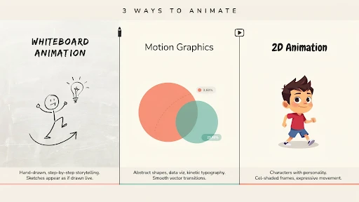
  • Gated vs. Ungated Video Content: What Drives More Leads?

    Gated vs. Ungated Video Content: What Drives More Leads?

    Gated video content leads can fool a marketing team very easily.

    The form goes live. A few names come in. Then a few more. By Friday, the report looks decent, and someone says the gated video is “working.”

    Maybe it is.

    Or maybe sales is about to open a list full of personal emails, fake company names, students, competitors, and people who watched half a minute before leaving.

    That happens more than teams like to admit.

    A gated video can bring real leads. An ungated video can help bring real leads later. The trick is knowing which job the video is supposed to do before you put a form in front of it.

    The Gate Has to Feel Worth It

    A gate is not just a form. It is a small trade.

    The viewer gives an email, job title, company name, or phone number. In return, they expect something useful enough to justify the interruption.

    This is where gated video marketing often gets clumsy. The company thinks the video is valuable because it took budget, meetings, scripts, animation, voiceover, revisions, and approvals. The viewer does not care about any of that.

    They care about one thing: will this help me?

    A quick company overview usually does not deserve a form. A real product demo might. A technical session that saves someone from booking a call just to understand the basics probably can.

    If the trade feels uneven, people leave. Simple as that.

    Ungated Video Builds the Trust That Forms Cannot

    Ungated video content does not always get enough credit because it may not capture a lead right away.

    No form fill. No instant CRM record. No neat number for the weekly update.

    Still, it does a quiet job.

    A new visitor can watch without pressure. They can understand the product, compare your message with another brand, and decide whether you seem credible enough to keep reading.

    That matters.

    Homepage explainers, short product overviews, FAQ clips, educational videos, and social cuts usually work better when they are open. These are not always lead-capture assets. They are trust-building assets.

    This is where ungated videos for brand awareness are useful. They let the viewer learn before asking them for anything.

    Sometimes the first conversion is not a form submission. Sometimes it is just a visitor thinking, “Okay, this company actually explains things clearly.”

    Stop Treating Every Viewer the Same

    The gated vs ungated video content debate gets much easier when you think about timing.

    Someone who has just landed on your website needs clarity. They may not know your product, your category, or even the right words for their problem. That person should not hit a form before they understand the basics.

    Someone comparing vendors is different. They may want proof, use cases, customer examples, a webinar, or a more detailed product breakdown.

    Someone close to buying is different again. A full demo, implementation walkthrough, technical comparison, or buyer-focused session may be worth a form.

    That is the heart of a sensible content gating strategy.

    The video is not gated because it is expensive. It is gated because the viewer has enough intent for the trade to make sense.

    When Gating Works

    Gating works when the content feels specific.

    A recorded webinar about a real industry problem. A practical training session. A product demo made for people comparing options. A walkthrough that shows how a complex setup works. A buyer guide that answers questions sales hears every week.

    That is how gated videos generate leads without making the audience feel tricked.

    The viewer knows what they are getting. The promise is clear. The video sounds useful enough to deserve an email.

    This is common in B2B video marketing because B2B buyers usually need more detail before they talk to sales. A manager may need to understand the business case. A technical lead may need to see how the tool fits. A procurement person may need proof that the product is not just another vague platform.

    But the form still needs restraint.

    A useful webinar can ask for more than a 90-second overview. A deep demo can ask for more than a casual brand video. Match the ask to the value.

    When Gating Backfires

    The fastest way to hurt a first impression is to hide the first explanation.

    A visitor lands on the homepage. They are not sure what you do yet. The explainer video could clear things up, but it is locked behind a form.

    Bad move.

    The visitor has not received value. They have not built trust. They do not know whether the video is worth their email. So they skip it, or they leave.

    That is why should you gate explainer videos usually starts with no.

    Homepage explainers should stay open. Product overview videos should stay open. Short “how it works” videos should stay open. These videos exist to remove confusion.

    Use explainer video services to make that first explanation sharper. Do not hide it from the people who need it most.

    Gate the deeper material. Keep the first layer open.

    Lead Count Is Not the Win

    A gated video can bring in more contacts. That looks nice.

    But lead count can lie.

    What matters is what those people do after the form. Did they watch the video? Did they stay past the first minute? Did they click the next CTA? Did sales accept them? Did any of them move into a real opportunity?

    That is where lead quality beats lead volume.

    A list of 60 serious viewers who watched a full product demo can be worth more than 600 weak contacts who never intended to buy.

    Good video lead generation should look at behavior, not just submissions. Someone who watches 85 percent of a demo is giving you a strong signal. Someone who fills the form and leaves after 20 seconds is giving you a different signal.

    Both signals matter.

    Do Not Make the Form Feel Greedy

    A form for gated video content

    Lead capture forms should ask only for what the next step needs.

    For an educational video, even an email field may be enough. For a serious demo, name, work email, company, and role might be fair. For a consultation request, more detail can make sense because the person is asking for direct help.

    But phone number? Budget? Team size? Timeline?

    Ask too early and people get suspicious.

    Every field adds friction. One field may feel easy. Six fields can feel like paperwork.

    The best form does not collect everything. It collects enough to follow up properly.

    Technical Videos Can Justify the Gate

    Some videos have enough substance to sit behind a form.

    Think about a medical device walkthrough, machine demo, hardware assembly, industrial process, product mechanism, or architecture visualization. A casual visitor may not care, but a serious buyer might.

    A 3D explainer video company can create this kind of asset because 3D can show movement, internal parts, depth, and technical details that normal footage or text may not explain well.

    That is the kind of video a buyer may accept a gate for.

    Not because it looks fancy. Because it gives them information they cannot get from a quick product page.

    Human Stories Usually Need to Stay Open

    A 2D explainer video company is often used when the message needs people and situations.

    A patient confused by instructions. A support agent drowning in repeat tickets. A manager trying to handle feedback without making the conversation worse. A small business owner stuck with payment problems.

    Those videos are doing emotional work. They help the viewer recognize themselves in the problem.

    If you block that moment with a form, you may lose the benefit.

    Let people watch. Let them feel understood. Let the story make the brand feel clearer and more human.

    Ask for contact details later, when the viewer wants something deeper.

    SaaS Buyers Want to Learn Before Talking

    SaaS teams are often tempted to gate every useful video.

    The logic is understandable. Demos took effort. Webinars took planning. Feature walkthroughs explain valuable parts of the product.

    But SaaS buyers like to self-educate.

    They want to understand features, workflows, integrations, pricing logic, onboarding, and use cases before they speak to sales. If everything helpful is locked, they may simply go to another site that explains more openly.

    A SaaS explainer video company would usually separate the videos by intent.

    Keep the homepage explainer open. Keep feature overviews open if they help people understand the product. Keep help center and onboarding clips open. Gate full recorded demos, advanced integrations, expert webinars, or implementation sessions when the content is clearly deeper.

    That creates a better video marketing funnel. Give enough away to build trust. Gate the pieces that show serious evaluation.

    The Follow-Up Matters More Than the Gate

    A form fill is not the finish line.

    If someone gives their email to watch a video, the next message should match what they watched. Not a generic sales push.

    After a webinar, send a short recap. After a product demo, send a use-case video. After a technical walkthrough, send an implementation clip or comparison guide.

    This is where lead nurturing videos can do useful work.

    Also pay attention to watch behavior. A viewer who watches almost the full demo deserves a different follow-up from someone who leaves after one minute.

    The gate gets the contact. The follow-up decides whether the contact goes anywhere.

    Measure the Whole Path

    Gated videos and ungated videos should not be judged the same way.

    For gated videos, look at form completions, watch time, drop-off points, CTA clicks, sales-qualified leads, pipeline, and revenue.

    For ungated videos, look at play rate, engagement, scroll depth, return visits, assisted conversions, and CTA clicks near the video.

    That gives a more honest view of video conversion rate.

    An ungated product video may not capture a lead today. It may help someone understand the product, return later, read a case study, and book a demo next week.

    That still counts. It just does not always show up neatly in the first report.

    A Rule That Saves a Lot of Bad Decisions

    Leave early videos open.

    Gate deeper videos when the content is worth the exchange.

    If the video explains who you are, what you do, or why the problem matters, keep it ungated. If it helps serious buyers compare, evaluate, implement, or make a deeper decision, consider gating it.

    That is the simplest answer to when to use gated video content.

    The strongest strategy uses both. Ungated videos build trust. Gated videos capture higher-intent prospects.

    Final Words

    Gated video content leads can help, but only when the video is worth the form. Ungated videos are better for awareness, trust, first explanations, and product clarity. Gated videos work better for demos, webinars, technical walkthroughs, training sessions, and serious buyer content. Keep early videos open so people understand the brand first. Gate the deeper content that helps qualified prospects move closer to a real decision.

    Frequently Asked Questions

    Gated video content is a video that asks viewers to submit information, such as a name or email address, before they can watch.
    It can generate more form fills, but the real value depends on lead quality, watch behavior, and whether those contacts move toward a real buying conversation.
    Most homepage and product explainers should stay ungated because they help new visitors understand the offer. Deeper demos, webinars, or technical videos can be gated.
    Use ungated video content for brand awareness, homepage explainers, product overviews, short educational clips, social videos, FAQ videos, and trust-building content.
    Detailed demos, webinars, training sessions, technical walkthroughs, buyer guides, expert-led videos, and implementation content usually work best behind a gate.

    Related Articles:
  • Animation Styles Compared: Whiteboard vs. Motion Graphics vs. 2D

    Animation Styles Compared: Whiteboard vs. Motion Graphics vs. 2D

    The whiteboard animation vs motion graphics decision usually starts with someone saying, “Which one looks better?” That is the wrong starting point. A video style is not a wallpaper choice. It changes how people understand the message.

    Whiteboard feels like a lesson being drawn in front of you. Motion graphics feel cleaner, faster, and more structured. 2D feels more human because it can show people, places, and small everyday situations.

    All three can work. All three can also make a good idea feel flat if the style does not match the job.

    Start With the Message, Not the Style

    Most weak animation choices happen too early.

    The team sees a reference video and falls in love with the look. Then the script gets forced into that style, even if it does not fit. That is how brands end up with a whiteboard video that should have been 2D, or a motion graphics piece that needed a simple character story.

    Before choosing between explainer video styles, ask what the viewer needs.

    Do they need to learn a process?
    Do they need to understand a system?
    Do they need to relate to a customer problem?
    Do they need to see a product in use?
    Do they need to trust the brand more?

    The answer usually points to the right style.

    Whiteboard Animation Feels Like Teaching

    Whiteboard animation works when the topic needs a calm, step-by-step explanation. It has that “watch this idea build” feeling. The viewer sees one point drawn, then another, then the connection between them.

    That is why it can work well for policy explainers, nonprofit messages, healthcare basics, safety instructions, simple financial topics, and internal education. It does not ask the viewer to admire the visuals. It asks them to follow the logic.

    If someone asks when to use whiteboard animation, use it when the idea needs teaching more than drama.

    A company explaining a claims process, for example, may not need characters walking through a full story. It may need clear drawings, arrows, labels, and a voiceover that keeps the viewer moving.

    Where Whiteboard Gets Risky

    Whiteboard can also feel cheap if the execution is lazy.

    You have seen the bad version. A generic hand draws a confused person, then a lightbulb, then a dollar sign, then three arrows. Nothing feels specific to the brand. Nothing feels new. The video looks like it came from a template.

    That is the danger.

    Whiteboard needs a strong script because the style is simple. There is nowhere to hide. If the message is vague, the whole video feels thin.

    Brands using explainer video services should not choose whiteboard just because it sounds affordable. Choose it because the content benefits from a drawn explanation. For a premium product launch or a brand film, it may not have enough weight unless the concept is very sharp.

    Motion Graphics Are Good for Order

    Motion graphics animation is strongest when the video needs to organize information.

    Dashboards. App screens. Data points. Payment flows. Timelines. Reports. Integrations. Internal systems. Product steps. All of that can become easier to understand with clean shapes, icons, labels, and movement.

    This is why motion graphics show up so often in video marketing. They help explain an idea quickly without actors, sets, or a complicated animated world.

    A fintech brand can use motion graphics to show how a payment moves. A logistics company can show how an order travels through a system. A SaaS brand can show how a workflow connects across teams.

    It is not always emotional, but it is usually clear.

    Motion Graphics Can Become Too Busy

    The problem with motion graphics is overdesign.

    Too many icons. Too much text. Too many arrows. Too many boxes sliding in from every side. The viewer starts watching movement instead of understanding the message.

    That is bad news for product explainer videos, especially when the product is already complex.

    Good motion graphics should feel guided. One idea appears. The eye knows where to go. The next point arrives only when the first one has landed.

    Movement should earn its place.

    If the animation is only there to keep the screen busy, cut it.

    2D Animation Gives the Message a Human Face

    2D animated explainer video example

    2D animation works when the video needs a person, not just a process.

    A tired manager missing updates. A patient trying to understand care instructions. A founder buried in reports. A customer support rep answering the same question again. A buyer comparing two options and hesitating.

    Those are human moments. 2D handles them well.

    A 2D explainer video company can build a small world around the problem: a character, a setting, a few scenes, a clear before-and-after. That helps the viewer see themselves in the story.

    This is why animated explainer videos often use 2D for services, HR, healthcare, education, apps, customer support, and training. The style can explain the point without making it feel cold.

    Where 3D Belongs in This Conversation

    This article compares whiteboard, motion graphics, and 2D, but 3D often gets mentioned in the same meeting.

    A 3D explainer video company is the better fit when the viewer needs to understand depth, shape, internal parts, assembly, movement, or physical space.

    Think medical devices, industrial equipment, machines, architecture, hardware, product interiors, and technical systems.

    That kind of explanation often needs 3D.

    But 3D is not a shortcut to quality. For a basic service video or a simple SaaS workflow, 3D may only make the video more expensive. Use it when flat visuals cannot explain the thing clearly.

    Best Animation Style for Explainer Videos

    The best animation style for explainer videos is the one that removes the most confusion.

    Whiteboard is best when the viewer needs teaching.

    Motion graphics are best when the viewer needs structure.

    2D is best when the viewer needs a human example.

    That is the simple version.

    The harder part is ignoring personal taste. A CEO may like one style. A marketer may like another. A product team may want screens everywhere. Fine. But the style should serve the viewer, not the meeting room.

    A video is not being made for the people approving it. It is being made for the person watching it.

    Whiteboard Animation vs Motion Graphics vs 2D

    Different styles of animation

    Here is the practical way to compare whiteboard animation vs motion graphics vs 2D.

    Whiteboard teaches. It is useful for training videos, policy content, educational explainers, and step-by-step topics.

    Motion graphics organize. They work for software, systems, data, features, product flows, and business animation videos.

    2D tells a story. It works for customer situations, services, employee scenarios, healthcare education, brand stories, and user problems.

    None of these styles can save a weak script. That needs to be said. A boring message with nice animation is still boring. The style supports the idea. It does not replace it.

    SaaS Often Needs More Than One Style

    SaaS brands ask this all the time: which animation style is best for SaaS videos?

    The real answer is: it depends on the video.

    A homepage video may need 2D to show the buyer’s daily frustration. A feature video may need motion graphics and UI screens. A help center clip may need screen recording with a few animated callouts. An onboarding video may need short product scenes and simple labels.

    A SaaS explainer video company should not force one style across every asset. SaaS usually needs a video system, not one giant explainer.

    One core video. A few feature clips. A few onboarding pieces. Maybe short customer education videos.

    That is more useful than one long video trying to explain everything.

    Frequently Asked Questions

    Whiteboard animation is produced in a step-by-step approach that is instructional. Motion graphics employ moving text, symbols, shapes, charts, and UI-style images to illustrate concepts in a more organized manner.
    2D animation is preferable when the video requires people, emotion, or a relevant plot. Motion graphics are superior for representing systems, data, software flows, and abstract concepts.
    Whiteboard animation should be used when a topic requires easy instruction, step-by-step explanation, or a lighter pedagogical tone.
    SaaS videos often need a mix. Use 2D for user issues, motion graphics for processes and dashboards, and screen-based videos for feature demonstrations.
    The optimal style depends on the aim. Whiteboards instruct, motion graphics explain systems, and 2D makes the tale seem more personal.

    Final Words

    The Whiteboard animation vs motion graphics distinction is not about whether the approach is more visually appealing. The question is which one makes the message the most understandable. When teaching a topic, a whiteboard is useful. Motion graphics are useful when a concept requires structure, data, displays, or process clarity. 

    2D works when the audience requires characters, emotion, and a tale they can relate to. Start with the message. Then select the style. That arrangement saves time, money, and a lot of unnecessary creative argument.

    Related Articles

  • In-house vs. Outsourced Explainer Video Production Cost

    In-house vs. Outsourced Explainer Video Production Cost

    Explainer video production cost is one of those things that looks easier from a distance. A one-minute animated video sounds small. A script. A few scenes. A voiceover. Some music. Done.

    Then Monday comes.

    The marketing team writes the first draft. Product says the feature list is too light. Sales says the buyer pain is wrong. The designer asks for examples. The founder says it should feel “more premium,” which is usually where everyone stops breathing for a second because nobody knows what that means.

    By the end of the week, the video still has no approved script.

    That is the real cost conversation. Not just in-house vs outsourced. Not just “cheap” vs “expensive.” The question is whether your team can get the right video finished without burning three weeks of focus.

    The Number on the Quote Is Not the Whole Price

    Most companies start with the same question: how much does an explainer video cost?

    Fair question. Slightly annoying answer.

    It depends.

    A clean 2D video with icons and light motion can be fairly controlled. A custom animated explainer with original scenes, character work, voiceover, sound, and a few proper revision rounds will cost more. A technical 3D product video can jump quickly because the work is heavier before animation even begins.

    That is why explainer video pricing feels inconsistent.

    Two videos can both be 60 seconds. One is a simple screen-led explainer for a SaaS dashboard. The other needs product modeling, internal mechanics, custom transitions, and different versions for a website, paid ads, and a sales deck.

    Same runtime. Completely different workload.

    In-house Feels Cheaper Because the Bill Is Hidden

    In-house sounds sensible at first.

    You already have a designer. Someone in marketing can write. Product knows the tool. The brand files are already there. Why pay an outside team?

    Sometimes that logic works.

    But the cost of making explainer videos in-house includes the hours nobody tracks properly. The writer spends two days fixing the script. The designer builds scenes between campaign tasks. Product leaves comments in three different documents. Someone hunts for a voiceover. Someone edits. Someone exports. Someone asks for “one small change” after the final file is already done.

    That is in-house video production in a lot of companies.

    Not a disaster. Just slower than expected.

    If your team already makes video every week, fine. If they are squeezing it between product launches, blogs, ads, landing pages, sales decks, and internal requests, the “cheap” route may not be cheap. It may just be paid in attention instead of cash.

    When You Should Keep It In-house

    Explainer video project being handed over to another company

    Some videos do not need a studio.

    A quick support clip.
    A basic screen recording.
    A product update.
    A short onboarding tip.
    A simple internal training piece.

    Those should often stay with the internal team, especially if the brand already has a visual format.

    This is where explainer video services can still help without taking over every small asset. An outside team can create the first strong template: script tone, scene style, icon rules, motion patterns, caption style, intro card, outro card, export sizes. Then your internal team can make smaller follow-up videos without reinventing the wheel every time.

    That hybrid setup is usually more realistic than pretending every video belongs in-house or every video needs outsourcing.

    The Script Is Where Budgets Start Bleeding

    Animation usually gets blamed for cost.

    The script is often the real problem.

    If the message is unclear, everything after it becomes harder. The storyboard changes. The voiceover changes. The scenes change. The timeline slips. People start reviewing the video as if they are seeing the idea for the first time, because they are.

    A weak script can quietly wreck a video production budget.

    The usual signs are easy to spot. The video has three audiences. The problem is vague. Every department gets a line. The CTA is soft. The opening explains the company instead of the customer’s issue.

    Fix the message early and you save money later.

    One audience. One problem. One promise. One next step.

    Boring advice, but it works.

    What Outsourcing Actually Pays For

    Outsourced video production costs more upfront because the invoice is right there. Everyone can point at it.

    But the invoice is not just for animation.

    A proper outside team handles the brief, script, storyboard, design direction, voiceover, animation, sound, captions, revisions, file versions, and project flow. More important, they should keep the video from becoming a dumping ground for every feature the company wants to mention.

    A good explainer video agency asks blunt questions.

    Who is this for?
    Where will it be used?
    What does the viewer need to understand?
    What can we cut?
    What action should happen after watching?

    Internal teams often skip those questions because everyone is trying to keep the peace. Outside teams are paid to make the video work, not to protect everyone’s favorite sentence.

    2D Keeps the Budget Easier to Control

    2D animation cost is usually easier to manage because the style can stretch or shrink.

    A simple icon-led explainer can stay lean. A character-based video costs more. A full custom illustrated style with lots of scenes, transitions, and brand-specific artwork costs more again.

    A 2D explainer video company is often a good fit for SaaS, fintech, healthcare, service businesses, customer education, onboarding, and training videos.

    The best part is reuse.

    Once the characters, icons, colors, UI frames, and motion rules are built, future videos do not always start from zero. A company planning a series can save time that way. Not free, of course. But faster and easier than rebuilding the look every month.

    3D Is Worth It Only When It Explains Better

    3D animation cost rises for a reason.

    Models have to be built. Surfaces need texture. Lighting has to be set. Camera movement needs planning. Rendering takes time. If the product has internal parts or technical details, accuracy matters. One wrong detail can make the whole thing feel careless.

    A 3D explainer video company makes sense when the viewer needs to understand shape, space, mechanics, assembly, depth, or internal movement.

    Medical devices. Industrial equipment. Hardware. Architecture. Machines. Technical products.

    That kind of work often needs 3D.

    But 3D is not a badge of quality. If the video explains a basic app workflow, 3D may just make the bill bigger. Use it when it makes the message clearer. Skip it when it only makes the video look expensive.

    SaaS Videos Get Bloated Fast

    SaaS explainers have a special problem: everyone thinks their feature belongs in the video.

    Marketing wants the big promise. Product wants workflows. Sales wants objections. Customer success wants onboarding. Leadership wants vision. Someone wants the new dashboard included because it took six months to build.

    Now the video is not an explainer. It is a crowded tour.

    A SaaS explainer video company should stop that early. A homepage explainer is not a feature tutorial. A feature tutorial is not an onboarding video. A sales follow-up video is not a renewal video.

    For SaaS, the smarter spend is often one main explainer plus smaller support videos. One for onboarding. One for the strongest feature. One for customer education. One for sales.

    Trying to force all of that into one master video usually creates something nobody wants to watch twice.

    Final Words

    Explainer video production cost is not only about the visible invoice. In-house production can save money when your team has the skill, time, and process to make simple videos often. Outsourcing costs more upfront, but it can save time and protect quality when the video needs to explain a complex product, support sales, improve onboarding, or carry a launch. 

    The smartest setup is usually mixed. Use in-house for speed and repeat work. Use outside production when the video has to do heavier business work.

    Frequently Asked Questions

    An explainer video can cost a few thousand dollars or much more. The final price depends on length, style, script work, animation detail, revision rounds, voiceover, and whether the video uses 2D, 3D, live action, or mixed media.
    It can be cheaper when your team already has the skills, tools, time, and approval process. If the team lacks production experience, the hidden cost of delays and revisions can rise fast.
    Outsourced production often includes strategy, scriptwriting, storyboard, design, animation, voiceover, editing, sound, captions, project management, and revision handling.
    3D animation usually costs more because it needs modeling, lighting, rendering, camera movement, and technical production time. 2D is usually easier to control within a tighter budget.
    Startups can make simple screen recordings, product updates, and internal clips in-house. For launch videos, investor pitches, paid ads, or complex explainers, outsourcing is usually safer.

    Related Articles: