Blog

  • Animation Styles Compared: Whiteboard vs. Motion Graphics vs. 2D

    Animation Styles Compared: Whiteboard vs. Motion Graphics vs. 2D

    The whiteboard animation vs motion graphics decision usually starts with someone saying, “Which one looks better?” That is the wrong starting point. A video style is not a wallpaper choice. It changes how people understand the message.

    Whiteboard feels like a lesson being drawn in front of you. Motion graphics feel cleaner, faster, and more structured. 2D feels more human because it can show people, places, and small everyday situations.

    All three can work. All three can also make a good idea feel flat if the style does not match the job.

    Start With the Message, Not the Style

    Most weak animation choices happen too early.

    The team sees a reference video and falls in love with the look. Then the script gets forced into that style, even if it does not fit. That is how brands end up with a whiteboard video that should have been 2D, or a motion graphics piece that needed a simple character story.

    Before choosing between explainer video styles, ask what the viewer needs.

    Do they need to learn a process?
    Do they need to understand a system?
    Do they need to relate to a customer problem?
    Do they need to see a product in use?
    Do they need to trust the brand more?

    The answer usually points to the right style.

    Whiteboard Animation Feels Like Teaching

    Whiteboard animation works when the topic needs a calm, step-by-step explanation. It has that “watch this idea build” feeling. The viewer sees one point drawn, then another, then the connection between them.

    That is why it can work well for policy explainers, nonprofit messages, healthcare basics, safety instructions, simple financial topics, and internal education. It does not ask the viewer to admire the visuals. It asks them to follow the logic.

    If someone asks when to use whiteboard animation, use it when the idea needs teaching more than drama.

    A company explaining a claims process, for example, may not need characters walking through a full story. It may need clear drawings, arrows, labels, and a voiceover that keeps the viewer moving.

    Where Whiteboard Gets Risky

    Whiteboard can also feel cheap if the execution is lazy.

    You have seen the bad version. A generic hand draws a confused person, then a lightbulb, then a dollar sign, then three arrows. Nothing feels specific to the brand. Nothing feels new. The video looks like it came from a template.

    That is the danger.

    Whiteboard needs a strong script because the style is simple. There is nowhere to hide. If the message is vague, the whole video feels thin.

    Brands using explainer video services should not choose whiteboard just because it sounds affordable. Choose it because the content benefits from a drawn explanation. For a premium product launch or a brand film, it may not have enough weight unless the concept is very sharp.

    Motion Graphics Are Good for Order

    Motion graphics animation is strongest when the video needs to organize information.

    Dashboards. App screens. Data points. Payment flows. Timelines. Reports. Integrations. Internal systems. Product steps. All of that can become easier to understand with clean shapes, icons, labels, and movement.

    This is why motion graphics show up so often in video marketing. They help explain an idea quickly without actors, sets, or a complicated animated world.

    A fintech brand can use motion graphics to show how a payment moves. A logistics company can show how an order travels through a system. A SaaS brand can show how a workflow connects across teams.

    It is not always emotional, but it is usually clear.

    Motion Graphics Can Become Too Busy

    The problem with motion graphics is overdesign.

    Too many icons. Too much text. Too many arrows. Too many boxes sliding in from every side. The viewer starts watching movement instead of understanding the message.

    That is bad news for product explainer videos, especially when the product is already complex.

    Good motion graphics should feel guided. One idea appears. The eye knows where to go. The next point arrives only when the first one has landed.

    Movement should earn its place.

    If the animation is only there to keep the screen busy, cut it.

    2D Animation Gives the Message a Human Face
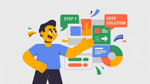
    2D animated explainer video example

    2D animation works when the video needs a person, not just a process.

    A tired manager missing updates. A patient trying to understand care instructions. A founder buried in reports. A customer support rep answering the same question again. A buyer comparing two options and hesitating.

    Those are human moments. 2D handles them well.

    A 2D explainer video company can build a small world around the problem: a character, a setting, a few scenes, a clear before-and-after. That helps the viewer see themselves in the story.

    This is why animated explainer videos often use 2D for services, HR, healthcare, education, apps, customer support, and training. The style can explain the point without making it feel cold.

    Where 3D Belongs in This Conversation

    This article compares whiteboard, motion graphics, and 2D, but 3D often gets mentioned in the same meeting.

    A 3D explainer video company is the better fit when the viewer needs to understand depth, shape, internal parts, assembly, movement, or physical space.

    Think medical devices, industrial equipment, machines, architecture, hardware, product interiors, and technical systems.

    That kind of explanation often needs 3D.

    But 3D is not a shortcut to quality. For a basic service video or a simple SaaS workflow, 3D may only make the video more expensive. Use it when flat visuals cannot explain the thing clearly.

    Best Animation Style for Explainer Videos

    The best animation style for explainer videos is the one that removes the most confusion.

    Whiteboard is best when the viewer needs teaching.

    Motion graphics are best when the viewer needs structure.

    2D is best when the viewer needs a human example.

    That is the simple version.

    The harder part is ignoring personal taste. A CEO may like one style. A marketer may like another. A product team may want screens everywhere. Fine. But the style should serve the viewer, not the meeting room.

    A video is not being made for the people approving it. It is being made for the person watching it.

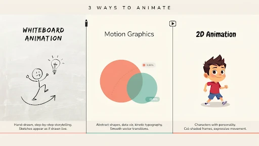
    Whiteboard Animation vs Motion Graphics vs 2D
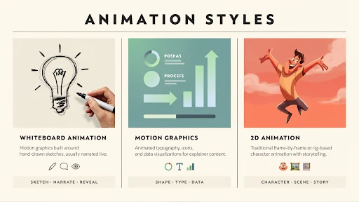
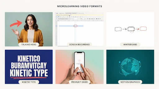
    Different styles of animation

    Here is the practical way to compare whiteboard animation vs motion graphics vs 2D.

    Whiteboard teaches. It is useful for training videos, policy content, educational explainers, and step-by-step topics.

    Motion graphics organize. They work for software, systems, data, features, product flows, and business animation videos.

    2D tells a story. It works for customer situations, services, employee scenarios, healthcare education, brand stories, and user problems.

    None of these styles can save a weak script. That needs to be said. A boring message with nice animation is still boring. The style supports the idea. It does not replace it.

    SaaS Often Needs More Than One Style

    SaaS brands ask this all the time: which animation style is best for SaaS videos?

    The real answer is: it depends on the video.

    A homepage video may need 2D to show the buyer’s daily frustration. A feature video may need motion graphics and UI screens. A help center clip may need screen recording with a few animated callouts. An onboarding video may need short product scenes and simple labels.

    A SaaS explainer video company should not force one style across every asset. SaaS usually needs a video system, not one giant explainer.

    One core video. A few feature clips. A few onboarding pieces. Maybe short customer education videos.

    That is more useful than one long video trying to explain everything.

    Frequently Asked Questions

    Whiteboard animation is produced in a step-by-step approach that is instructional. Motion graphics employ moving text, symbols, shapes, charts, and UI-style images to illustrate concepts in a more organized manner.
    2D animation is preferable when the video requires people, emotion, or a relevant plot. Motion graphics are superior for representing systems, data, software flows, and abstract concepts.
    Whiteboard animation should be used when a topic requires easy instruction, step-by-step explanation, or a lighter pedagogical tone.
    SaaS videos often need a mix. Use 2D for user issues, motion graphics for processes and dashboards, and screen-based videos for feature demonstrations.
    The optimal style depends on the aim. Whiteboards instruct, motion graphics explain systems, and 2D makes the tale seem more personal.

    Final Words

    The Whiteboard animation vs motion graphics distinction is not about whether the approach is more visually appealing. The question is which one makes the message the most understandable. When teaching a topic, a whiteboard is useful. Motion graphics are useful when a concept requires structure, data, displays, or process clarity. 

    2D works when the audience requires characters, emotion, and a tale they can relate to. Start with the message. Then select the style. That arrangement saves time, money, and a lot of unnecessary creative argument.
    Related Articles

  • In-house vs. Outsourced Explainer Video Production Cost

    In-house vs. Outsourced Explainer Video Production Cost

    Explainer video production cost is one of those things that looks easier from a distance. A one-minute animated video sounds small. A script. A few scenes. A voiceover. Some music. Done.

    Then Monday comes.

    The marketing team writes the first draft. Product says the feature list is too light. Sales says the buyer pain is wrong. The designer asks for examples. The founder says it should feel “more premium,” which is usually where everyone stops breathing for a second because nobody knows what that means.

    By the end of the week, the video still has no approved script.

    That is the real cost conversation. Not just in-house vs outsourced. Not just “cheap” vs “expensive.” The question is whether your team can get the right video finished without burning three weeks of focus.

    The Number on the Quote Is Not the Whole Price

    Most companies start with the same question: how much does an explainer video cost?

    Fair question. Slightly annoying answer.

    It depends.

    A clean 2D video with icons and light motion can be fairly controlled. A custom animated explainer with original scenes, character work, voiceover, sound, and a few proper revision rounds will cost more. A technical 3D product video can jump quickly because the work is heavier before animation even begins.

    That is why explainer video pricing feels inconsistent.

    Two videos can both be 60 seconds. One is a simple screen-led explainer for a SaaS dashboard. The other needs product modeling, internal mechanics, custom transitions, and different versions for a website, paid ads, and a sales deck.

    Same runtime. Completely different workload.

    In-house Feels Cheaper Because the Bill Is Hidden

    In-house sounds sensible at first.

    You already have a designer. Someone in marketing can write. Product knows the tool. The brand files are already there. Why pay an outside team?

    Sometimes that logic works.

    But the cost of making explainer videos in-house includes the hours nobody tracks properly. The writer spends two days fixing the script. The designer builds scenes between campaign tasks. Product leaves comments in three different documents. Someone hunts for a voiceover. Someone edits. Someone exports. Someone asks for “one small change” after the final file is already done.

    That is in-house video production in a lot of companies.

    Not a disaster. Just slower than expected.

    If your team already makes video every week, fine. If they are squeezing it between product launches, blogs, ads, landing pages, sales decks, and internal requests, the “cheap” route may not be cheap. It may just be paid in attention instead of cash.

    When You Should Keep It In-house

    Explainer video project being handed over to another company

    Some videos do not need a studio.

    A quick support clip.
    A basic screen recording.
    A product update.
    A short onboarding tip.
    A simple internal training piece.

    Those should often stay with the internal team, especially if the brand already has a visual format.

    This is where explainer video services can still help without taking over every small asset. An outside team can create the first strong template: script tone, scene style, icon rules, motion patterns, caption style, intro card, outro card, export sizes. Then your internal team can make smaller follow-up videos without reinventing the wheel every time.

    That hybrid setup is usually more realistic than pretending every video belongs in-house or every video needs outsourcing.

    The Script Is Where Budgets Start Bleeding

    Animation usually gets blamed for cost.

    The script is often the real problem.

    If the message is unclear, everything after it becomes harder. The storyboard changes. The voiceover changes. The scenes change. The timeline slips. People start reviewing the video as if they are seeing the idea for the first time, because they are.

    A weak script can quietly wreck a video production budget.

    The usual signs are easy to spot. The video has three audiences. The problem is vague. Every department gets a line. The CTA is soft. The opening explains the company instead of the customer’s issue.

    Fix the message early and you save money later.

    One audience. One problem. One promise. One next step.

    Boring advice, but it works.

    What Outsourcing Actually Pays For

    Outsourced video production costs more upfront because the invoice is right there. Everyone can point at it.

    But the invoice is not just for animation.

    A proper outside team handles the brief, script, storyboard, design direction, voiceover, animation, sound, captions, revisions, file versions, and project flow. More important, they should keep the video from becoming a dumping ground for every feature the company wants to mention.

    A good explainer video agency asks blunt questions.

    Who is this for?
    Where will it be used?
    What does the viewer need to understand?
    What can we cut?
    What action should happen after watching?

    Internal teams often skip those questions because everyone is trying to keep the peace. Outside teams are paid to make the video work, not to protect everyone’s favorite sentence.

    2D Keeps the Budget Easier to Control

    2D animation cost is usually easier to manage because the style can stretch or shrink.

    A simple icon-led explainer can stay lean. A character-based video costs more. A full custom illustrated style with lots of scenes, transitions, and brand-specific artwork costs more again.

    A 2D explainer video company is often a good fit for SaaS, fintech, healthcare, service businesses, customer education, onboarding, and training videos.

    The best part is reuse.

    Once the characters, icons, colors, UI frames, and motion rules are built, future videos do not always start from zero. A company planning a series can save time that way. Not free, of course. But faster and easier than rebuilding the look every month.

    3D Is Worth It Only When It Explains Better

    3D animation cost rises for a reason.

    Models have to be built. Surfaces need texture. Lighting has to be set. Camera movement needs planning. Rendering takes time. If the product has internal parts or technical details, accuracy matters. One wrong detail can make the whole thing feel careless.

    A 3D explainer video company makes sense when the viewer needs to understand shape, space, mechanics, assembly, depth, or internal movement.

    Medical devices. Industrial equipment. Hardware. Architecture. Machines. Technical products.

    That kind of work often needs 3D.

    But 3D is not a badge of quality. If the video explains a basic app workflow, 3D may just make the bill bigger. Use it when it makes the message clearer. Skip it when it only makes the video look expensive.

    SaaS Videos Get Bloated Fast

    SaaS explainers have a special problem: everyone thinks their feature belongs in the video.

    Marketing wants the big promise. Product wants workflows. Sales wants objections. Customer success wants onboarding. Leadership wants vision. Someone wants the new dashboard included because it took six months to build.

    Now the video is not an explainer. It is a crowded tour.

    A SaaS explainer video company should stop that early. A homepage explainer is not a feature tutorial. A feature tutorial is not an onboarding video. A sales follow-up video is not a renewal video.

    For SaaS, the smarter spend is often one main explainer plus smaller support videos. One for onboarding. One for the strongest feature. One for customer education. One for sales.

    Trying to force all of that into one master video usually creates something nobody wants to watch twice.

    Final Words

    Explainer video production cost is not only about the visible invoice. In-house production can save money when your team has the skill, time, and process to make simple videos often. Outsourcing costs more upfront, but it can save time and protect quality when the video needs to explain a complex product, support sales, improve onboarding, or carry a launch. 

    The smartest setup is usually mixed. Use in-house for speed and repeat work. Use outside production when the video has to do heavier business work.

    Frequently Asked Questions

    An explainer video can cost a few thousand dollars or much more. The final price depends on length, style, script work, animation detail, revision rounds, voiceover, and whether the video uses 2D, 3D, live action, or mixed media.
    It can be cheaper when your team already has the skills, tools, time, and approval process. If the team lacks production experience, the hidden cost of delays and revisions can rise fast.
    Outsourced production often includes strategy, scriptwriting, storyboard, design, animation, voiceover, editing, sound, captions, project management, and revision handling.
    3D animation usually costs more because it needs modeling, lighting, rendering, camera movement, and technical production time. 2D is usually easier to control within a tighter budget.
    Startups can make simple screen recordings, product updates, and internal clips in-house. For launch videos, investor pitches, paid ads, or complex explainers, outsourcing is usually safer.

    Related Articles:

  • Micro-Learning Videos Under 60 Seconds: A How-to-Make Guide

    Micro-Learning Videos Under 60 Seconds: A How-to-Make Guide

    A micro-learning short video should feel like the answer someone needed five minutes ago. Not a course. Not a lecture. Not a tiny webinar wearing a training badge. Just one useful thing, explained quickly enough that the viewer can remember it and use it.

    That is where most teams mess it up.

    They start with a simple idea, then add a brand intro, three learning goals, a policy reminder, a manager quote, and a closing slide nobody asked for. By the time the actual lesson starts, half the 60 seconds are gone.

    Microlearning only works when it stays small.

    Start Smaller Than Feels Comfortable

    A 60-second video has no patience for “while we’re here.”

    Pick one thing.

    Not “how to handle customer complaints.” That is too big. Try “how to open your first reply to an angry customer.”

    Not “how to use the CRM.” Too wide. Try “how to update a lead status after a call.”

    Not “safety basics.” Too vague. Try “how to check the lock before starting the machine.”

    That is the first rule of microlearning videos. The topic should be so specific that the video almost writes itself.

    A team using explainer video services should expect this kind of trimming before production begins. The hard part is not always animation or editing. Sometimes the hard part is telling the client, “This is three videos, not one.”

    Write the Learning Goal in Plain English

    Before the script, write one sentence:

    “After watching this, the person should be able to…”

    If the sentence keeps growing, your topic is not ready.

    For example:

    “After watching this, the rep should know how to confirm the refund timeline.”

    Good.

    “After watching this, the rep should understand refund policy, customer tone, escalation steps, account notes, and manager approval.”

    Too much.

    That second version is a mini-course. It might be useful, but it is not a 60-second training video.

    This is also the answer to how long microlearning videos should be. They should be as short as the lesson allows. Many sit between 30 and 60 seconds nicely. If the topic needs two minutes, split it.

    Do Not Waste the Opening

    The first line should get straight to the point.

    Bad opening:

    “Today we will discuss an important workplace communication skill that can help improve customer experience.”

    Nobody talks like that. Nobody wants to hear it either.

    Better:

    “Before you reply to an angry customer, check the order history first.”

    Now the viewer knows why they are watching.

    Good short training videos do not warm up for too long. They start where the mistake happens, where the question comes up, or where the viewer usually gets stuck.

    That tiny shift makes the video feel more useful right away.

    Use a Real Moment From the Job

    The best microlearning topics are already sitting inside the workday.

    A new employee forgets to tag a ticket.
    A sales rep skips the follow-up note.
    A warehouse worker scans the wrong label.
    A manager gives feedback that is too vague.
    A customer support agent promises a refund date too early.

    That is where good employee training videos come from. Not from broad training themes. From moments people actually repeat.

    For microlearning video examples for employee training, think smaller than a course menu. A 45-second clip can teach how to greet a walk-in customer, how to confirm a delivery address, how to spot a phishing email, or how to end a sales call with a clear next step.

    One scene. One mistake. One better action.

    Keep the Script Slightly Messy in a Human Way

    Writers working on scripts for a microlearning video

    A training video script should sound spoken, not printed.

    People do not talk in perfect policy sentences. They pause. They use shorter phrases. They explain things in the order they would actually say them.

    For example:

    “Open the customer profile first. Check the last order. Then reply. Do not guess from the email alone.”

    That works better than:

    “Representatives should verify customer account information prior to responding in order to ensure accuracy.”

    The second one sounds like it came from a handbook. The first one sounds like a supervisor who knows the job.

    For e-learning video content, that matters. The viewer is more likely to remember a line that sounds like something a real person would say.

    Show the Action, Not Just the Rule

    A rule is easy to ignore.

    A shown action is easier to copy.

    If the lesson is about logging a support note, show the note being added. If the lesson is about checking a safety lock, show the hand checking the lock. If the lesson is about choosing the right CRM tag, show the dropdown and the correct tag.

    This is where instructional video production needs discipline. Fancy transitions will not save a vague lesson. The viewer should never wonder, “Okay, but what do I actually do?”

    Show the action once. Explain why it matters. End with the reminder.

    That is enough.

    Use 2D When the Idea Needs to Feel Simple

    Some topics are not exciting to film.

    A customer journey. A compliance rule. A workflow handoff. A manager conversation. A refund process. A data privacy reminder.

    That is where a 2D explainer video company can help. 2D animation can turn dry internal training into clean scenes with characters, icons, short labels, and simple motion.

    It works well for bite-sized learning because it removes clutter. You can show only what matters. No messy office background. No awkward acting. No extra details pulling attention away from the lesson.

    The style should stay simple. Microlearning does not need visual fireworks.

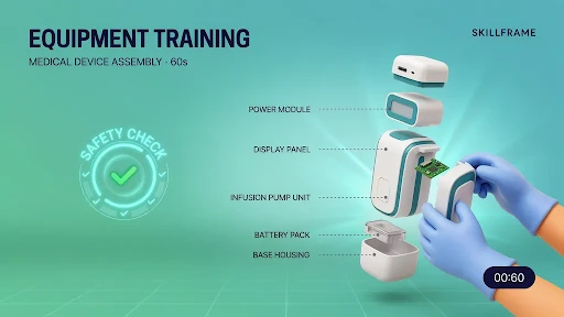
    Save 3D for Topics That Need Space or Movement

    3D animated microlearning video

    Some lessons need more depth than flat visuals can give.

    Equipment training. Product assembly. Medical device handling. Safety checks. Machine parts. Technical hardware. Anything where shape, motion, angle, or internal parts matter.

    That is when a 3D explainer video company makes sense.

    A 3D training clip can show a part from the inside, slow down a movement, rotate the product, or highlight a dangerous contact point. That can be much clearer than filming the same thing with a camera, especially when the real action happens too fast or too small.

    But do not force 3D onto a simple lesson. A password reset does not need dramatic depth.

    SaaS Products Need Microlearning Inside the Flow

    Software users rarely want to leave the product to learn the product.

    They want help right where they are stuck.

    That is why SaaS explainer video company support can be valuable for product teams. A SaaS brand may need short clips for onboarding, feature adoption, dashboard setup, billing steps, account permissions, or customer success emails.

    The best clips feel placed, not dumped.

    A 35-second video beside a setup step can beat a long help article. A quick feature clip inside the dashboard can stop a user from opening a support ticket. A short onboarding video can help someone reach the first useful action faster.

    This is where short training videos for workplace learning and product education start to overlap.

    Where These Videos Fit Best

    Microlearning is useful when timing matters.

    Use it inside onboarding portals, LMS modules, Slack or Teams channels, help centers, customer education emails, sales enablement libraries, product dashboards, HR refreshers, and safety reminders.

    The closer the video sits to the task, the better.

    A safety reminder helps more before the shift than three weeks earlier in a course. A CRM clip helps more next to the CRM task than buried inside a 20-page guide. A product tutorial helps more inside the dashboard than hidden in a support article.

    The best format for micro learning short video is the one the viewer can find when they actually need it.

    Final Words

    A microlearning short video works when it respects the viewer’s time. Keep the topic narrow. Use real work moments. Write as a person speaks. Show the action clearly. Add captions. 

    Choose 2D, 3D, screen recording, or live footage based on what teaches the point fastest. Under 60 seconds, there is no space for filler. The best microlearning videos feel like quick help from someone who knows the job, not a compressed training module.

    Related Articles:

  • The Perfect Explainer Video Structure: Hook, Problem, Solution, & CTA

    The Perfect Explainer Video Structure: Hook, Problem, Solution, & CTA

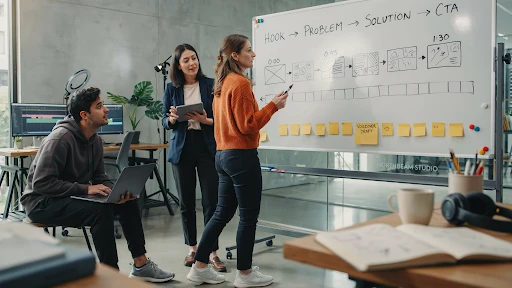
    An explainer video structure formula saves a video from turning into a moving brochure. That is the blunt version. Most weak explainers do not fail because the animation looks bad. They fail because the story wanders. The opening takes too long. The problem feels soft. The solution arrives late. The CTA sounds like it was pasted on in the last five seconds.

    A good explainer does not need a complicated structure. It needs a clean path.

    Hook.
    Problem.
    Solution.
    Proof.
    CTA.

    That is usually enough.

    Why Explainer Video Structure Matters

    A viewer decides fast.

    If the video does not make sense in the first few seconds, they are gone. Maybe not physically. They might still be watching. But mentally, they have checked out.

    That is why explainer video structure matters more than people think. It gives the viewer a reason to keep following. One idea leads to the next. No random feature dump. No slow company intro. No “we are passionate about helping businesses” opener that could belong to any brand.

    A strong explainer video script feels like someone is guiding the viewer through a problem they already recognize.

    That is what makes the structure useful. It removes the guesswork.

    The Explainer Video Structure Formula That Actually Works

    The simplest explainer video structure formula looks like this:

    Start with the hook.
    Name the problem.
    Show what happens if the problem stays.
    Introduce the solution.
    Explain how it works.
    Show the outcome.
    End with one clear action.

    That may sound basic, but it works because it follows the viewer’s attention.

    People do not care about your product first. They care about their own friction. Once you show that you understand the friction, they give you more attention. Then you earn the right to explain the solution.

    That is the core of how to structure an explainer video without overloading it.

    Step 1: Write a Hook That Sounds Like the Viewer’s Problem

    The video hook has one job. Make the viewer feel, “This is about me.”

    Do not open with your company name. Do not open with a vague industry statement. Do not open with a slow brand line that sounds nice but says nothing.

    Open with tension.

    For a SaaS product, it might be:

    “Your team is still chasing updates across five tools.”

    For a fintech app:

    “Most people do not know where their money goes until it is already gone.”

    For a healthcare platform:

    “Patients forget instructions because the appointment moves too fast.”

    That is a real hook. It starts where the viewer already feels the problem.

    A company offering explainer video services should push clients toward that kind of opening. The first line has to earn attention, not decorate the video.

    Step 2: Make the Problem Specific

    The problem section is where many videos get weak.

    They say things like:

    “Managing your business can be challenging.”

    Yes, but that means nothing. What part is challenging? Who feels it? What does it cost them?

    A better problem is concrete.

    “Your sales team spends Monday morning updating spreadsheets instead of following up with leads.”

    That works because it has a real scene. You can picture it. You can feel the wasted time.

    This is the heart of the problem solution framework. The problem should be sharp enough that the solution feels necessary. If the problem is vague, the product feels optional.

    Step 3: Do Not Stay in the Problem Too Long

    A little tension helps. Too much becomes annoying.

    The viewer already knows the problem. They do not need 40 seconds of pain. They need enough to feel understood, then they need movement.

    This is where video storytelling becomes practical. A good script does not sit in one mood for too long. It shifts.

    Problem. Pressure. Relief.

    That rhythm keeps the video moving.

    In a 60-second explainer video, the problem might only take 10 to 15 seconds. In a 90-second video, maybe 20. If the product is complex, you can take slightly longer, but do not turn the video into a complaint.

    Get to the solution before patience runs out.

    Step 4: Introduce the Solution Without Overselling It

    An example of an explainer video

    The solution should feel like the natural answer to the problem.

    Bad version:

    “That is why we created the most advanced platform for modern teams.”

    Better version:

    “That is why our platform brings every update, approval, and next step into one shared view.”

    The second one explains what changes.

    That matters.

    When the solution enters, avoid the urge to sound huge. Most viewers do not need a dramatic reveal. They need a clear explanation.

    If the video is for a technical product, a 3D explainer video company may use product cutaways, system visuals, or spatial animation to show what the solution does. But the script still needs restraint. Do not say everything the visuals already show.

    Let the screen do some of the work.

    Step 5: Explain How It Works in Three Beats

    A good explainer usually needs three simple steps.

    Not seven. Not twelve.

    Three is enough for most videos.

    For example:

    Connect your tools.
    Track every update in one place.
    See what needs action before work gets stuck.

    That is simple. It gives the viewer a mental path.

    This is where a clear explainer video outline helps before production begins. If the team cannot explain the product in three beats, the video may need a narrower focus.

    A 2D explainer video company can handle these steps with icons, character scenes, UI snippets, or simple motion graphics. The key is pacing. Each beat should feel useful, not rushed.

    Step 6: Show the Outcome, Not Just the Feature

    Viewers care about what changes.

    A feature says:

    “Automated reporting.”

    An outcome says:

    “You stop building the same report by hand every Friday.”

    That is the difference.

    A strong animated explainer video should show the viewer a better version of the situation. Less confusion. Faster setup. Fewer missed tasks. Easier decisions. Clearer customer communication.

    This is especially important for the best explainer video structure for startups. Early-stage brands often want to explain everything because they are still proving themselves. That instinct is understandable, but it usually hurts the video.

    Show the outcome clearly. Let the viewer feel the practical win.

    Step 7: Add Proof Without Slowing the Video Down

    Proof does not always mean a testimonial or a statistic.

    It can be a quick product screen.
    A short customer scenario.
    A before-and-after moment.
    A recognizable workflow.
    A result the viewer can believe.

    The point is to make the solution feel real.

    For B2B products, especially software, the explainer video structure for SaaS products should include proof that the workflow actually makes sense. A clean UI moment can do more than a broad claim.

    A SaaS explainer video company may build this proof through screen-based scenes, onboarding flows, dashboard moments, or role-based examples. The best SaaS videos do not just say the product is easy. They show the user getting through one important task.

    Step 8: End With One CTA

    CTA at the end of an explainer video

    The explainer video CTA should be clear and singular.

    Do not ask viewers to book a demo, download a guide, follow the brand, visit three pages, and start a trial all at once. Pick one.

    The CTA should match the stage of the viewer.

    For a homepage video:

    “Book a demo.”

    For a product education video:

    “Start with the setup guide.”

    For a sales follow-up video:

    “See the workflow in action.”

    This is also where how to write a conversion-focused explainer video becomes simple. The CTA should feel like the next step after the story, not a sudden sales push.

    If the video explained a problem well, the CTA does not need to beg.

    Frequently Asked Questions

    The best structure is hook, problem, solution, how it works, outcome, and CTA. It keeps the video focused and easy to follow.
    Most explainers work best around 60 to 90 seconds. More complex products can run longer, but only if the extra time helps the viewer understand.
    The hook should make the viewer recognize their problem quickly. It should feel specific, not like a generic opening line.
    Usually one to three key features are enough. The video should focus on the features that directly support the main problem and solution.
    A good CTA gives the viewer one clear next step, such as booking a demo, starting a trial, watching a walkthrough, or contacting the team.

    Final Words

    The explainer video structure formula is not complicated, and that is why it works. Start with a hook that sounds like the viewer’s real problem. Make the problem specific. Introduce the solution at the right time. Explain how it works in a few clean beats. Show the outcome. End with one clear CTA. 

    That structure gives the video a spine. Without it, even good animation can feel scattered. With it, the message becomes easier to follow, easier to remember, and much easier to act on.

    Related Articles:

  • How to Write an Explainer Video Script

    How to Write an Explainer Video Script

    An explainer video script template helps when the blank page starts staring back at you. That happens a lot. A company knows its product well, but the moment it has to explain that product in 60 or 90 seconds, everything suddenly feels too big. Features pile up. Stakeholders want their lines included. The script turns into a brochure with a voiceover.

    That is the mistake.

    A good explainer video script does not say everything. It says the right thing in the right order.

    Start With the Viewer, Not the Product

    Before writing one line, ask who the video is really for.

    Not “business owners.”
    Not “startups.”
    Not “anyone who needs our product.”

    Get sharper.

    Is the viewer a founder trying to explain a new tool to investors? A marketing manager comparing vendors? A customer who keeps getting stuck during onboarding? A buyer who understands the problem but does not trust the solution yet?

    This is where the target audience changes the whole script. A video for a first-time visitor should not sound like a video for a warm lead. A video for a technical buyer should not sound like a video for a non-technical customer.

    If the viewer is vague, the script will be vague too.

    The Basic Explainer Video Script Template

    Here is a simple explainer video script template for beginners that works for most business videos:

    Open with the problem.
    Show why that problem matters.
    Introduce the solution.
    Explain how it works.
    Show the outcome.
    End with a clear next step.

    That is it.

    This structure works because it follows how people think. They care about their problem first. Then they want to know if you understand it. After that, they may care about your product.

    A weak explainer video script often starts with the company. “We are a leading provider of…” That kind of opening is usually dead on arrival. The viewer is not ready to care about the company yet.

    Start where they already feel friction.

    Write the Problem Like a Real Person Would Say It

    A problem line should feel familiar.

    Bad version:

    “Managing cross-functional workflow visibility is a challenge for growing teams.”

    Better version:

    “Your team keeps missing updates because every task lives in a different place.”

    The second one is not fancy, but it sounds real. That is what good video script writing needs. Less internal language. More human pressure.

    This is also where many scripts get too polite. They soften the problem until it barely feels like a problem anymore. Do not do that. If the issue costs time, say it costs time. If customers are confused, say they are confused. If the current process is messy, say it is messy.

    The viewer should feel seen in the first few seconds.

    Know What to Include in an Explainer Video Script

    Here is what to include in an explainer video script if you want it to stay focused:

    A clear opening problem.
    A simple explanation of the solution.
    One or two useful product details.
    A believable outcome.
    A direct next step.

    That is enough for most explainers.

    The video is not your entire website. It is not a sales deck. It is not a product manual. Treat it like the front door. It should make people understand enough to take the next action.

    That is why brands use explainer video services in the first place. The goal is not just motion and design. The goal is a clearer message that does not waste the viewer’s time.

    Keep the Script Shorter Than You Want

    A professional working on a script

    Most first drafts are too long.

    A 60-second video usually gives you around 130 to 150 spoken words. A 90-second video may give you around 200 to 225 words. That is not much room.

    So, how long should an explainer video script be?

    Long enough to explain one idea. Short enough that the viewer does not feel trapped.

    If the script runs past two minutes, ask why. Sometimes the topic needs more space, especially for technical products. But most explainer videos get longer because the team is afraid to choose.

    A tight script forces decisions. That is a good thing.

    Match the Script to the Animation Style

    A script for 2D animation will not always work for 3D. A script for SaaS will not always work for a product video. The format matters.

    For physical products, a 3D explainer video company may need a script that leaves room for product rotation, close-ups, internal views, or technical motion. The words should not explain every detail the viewer can already see. Let the visuals carry some of the weight.

    That is a common mistake in product scripts. The voiceover says exactly what the screen is showing. It feels repetitive.

    Better scriptwriting gives the viewer two layers: the visual proof and the spoken meaning.

    Use 2D When the Story Needs Simplicity

    A 2D explainer video company often works best when the video needs clean scenes, simple characters, icons, and easy transitions.

    That changes the writing. You can use more visual metaphors. A messy process can become scattered cards. A confused customer can move through a short journey. A complex service can be broken into three clean steps.

    This works especially well for service businesses, apps, customer education, and internal training.

    The script should stay simple enough for the visuals to breathe. Too many words will crowd the animation.

    SaaS Scripts Need a Different Kind of Focus

    An explainer video script for SaaS products should not try to explain the entire platform.

    That is where SaaS scripts go wrong. They start with one problem, then suddenly mention dashboards, workflows, integrations, reports, automation, onboarding, analytics, permissions, and team collaboration.

    Too much.

    A SaaS explainer video company would usually start with one user problem and one product path. What does the user struggle with? What action do they take inside the product? What changes after that?

    That is the script.

    If you need to explain more features, create more videos. One big video trying to do everything usually does nothing well.

    A Simple Drafting Process That Works

    A writer working on the initial draft of a script

    Here is a practical way to write the first draft.

    Write the customer problem in one plain sentence.
    Write the outcome in one plain sentence.
    Write three steps that connect the two.
    Add the product only where it helps the story.
    End with one CTA.

    That gives you a rough video script outline without overthinking.

    After that, cut anything that sounds like a brochure. Remove filler. Replace internal terms with customer language. Read it out loud. Then read it again with the visuals in mind.

    That is how to write an explainer video script without turning it into a product lecture.

    Common Script Mistakes to Avoid

    The biggest mistakes are easy to spot once you know them.

    Starting with the company instead of the problem.
    Using jargon because the team is used to it.
    Trying to cover every feature.
    Writing sentences that sound good on paper but bad out loud.
    Adding a vague CTA.
    Ignoring the visuals until after the script is approved.

    A strong animated explainer video script should feel like a guided path. Problem. Solution. Proof. Result. Next step.

    Simple does not mean shallow. It means the viewer can follow it.

    Frequently Asked Questions

    An explainer video script template is a simple structure that helps you write a clear video script. It usually includes the problem, solution, how it works, outcome, and call to action.
    Start with the viewer’s problem. Do not begin with your company history or a long product intro. The first few seconds should make the viewer feel understood.
    Most explainer video scripts should be around 130 to 225 spoken words, depending on whether the video is 60 or 90 seconds long.
    Avoid jargon, long feature lists, vague claims, overexplaining, and CTAs that ask the viewer to do too many things at once.
    No. A 2D animation script, 3D product script, SaaS script, and live-action explainer script may need different pacing and visual planning.

    Final Words

    An explainer video script template is useful because it gives your message a shape before production begins. Start with the viewer’s problem, keep the product explanation focused, write for the ear, plan the visuals early, and end with one clear next step.

    That is the difference between a video that simply looks polished and a video that actually explains. Good scripting saves time, cuts confusion, and gives the whole explainer video production process a stronger foundation.

    Related Articles:

  • Fintech Explainer Videos: Simplifying Complex Products to Win More Customers

    Fintech Explainer Videos: Simplifying Complex Products to Win More Customers

    Fintech explainer videos work because most financial products are not easy to understand at first glance. A savings app, payment platform, lending tool, investment dashboard, crypto feature, or fraud-prevention system may be useful, but if the customer has to work too hard to understand it, they may leave before signing up.

    That is the real problem.

    Fintech brands often sell trust and clarity before they sell a feature. If the product feels confusing, people hesitate. If it feels risky, they back away. A good explainer video helps close that gap.

    Fintech Customers Do Not Want a Finance Lecture

    Most people do not wake up wanting to learn your product architecture.

    They want to know something simpler.

    Is my money safe?
    How does this work?
    What will it cost me?
    Can I trust this company?
    What happens after I sign up?

    That is where fintech video marketing has to be careful. The video should not sound like a pitch deck. It should sound like someone explaining the product to a smart person who just does not know the industry language yet.

    A strong explainer video company can help turn financial language into a story people can follow. Not by dumbing it down. By removing the fog.

    Why Financial Products Feel Hard to Explain

    Fintech products often sit between technology, regulation, money, and user behavior. That is a tough mix.

    A payment app may need to explain speed and security. A lending platform may need to explain eligibility, repayment, and fees. A trading product may need to explain risk. A banking tool may need to explain account access, transfers, and identity checks.

    This is why financial explainer videos are useful. They can show the steps instead of listing them. They can point to the moment where the user takes action, gets approval, receives funds, tracks spending, or protects an account.

    That is usually easier to understand than a dense product page.

    Start With the Customer’s Anxiety

    A lot of fintech videos start with features.

    That is usually too early.

    Start with the hesitation instead. Money is personal. People are cautious when a product touches their bank account, card, credit score, investment portfolio, or business cash flow.

    This is where trust in financial products becomes the real story.

    A customer may not say, “I need a digital wallet with advanced authentication.” They may say, “I do not want my payment details exposed.” That is the line the video should get closer to.

    If the customer’s worry is security, show security clearly. If the worry is cost, explain pricing plainly. If the worry is setup, show the first few steps.

    Do not hide the hard questions. Answer them.

    Product Videos Should Show the First Useful Moment

    A good fintech product video should get to the first useful moment fast.

    For a budgeting app, that might be seeing spending categories for the first time. For a payment tool, it might be sending money in a few taps. For a lending platform, it might be understanding the application process without feeling trapped in fine print.

    This is the heart of how fintech explainer videos help customers understand products. The video should not explain every feature. It should show the moment when the product becomes useful.

    That is where many videos get bloated. They try to cover the whole platform. The customer just needs to understand the first win.

    Animation Makes Abstract Finance Easier to See

    Finance has a visibility problem.

    You cannot film risk scoring in a natural way. You cannot film fraud detection happening behind the scenes. You cannot film an API helping payments move between systems without turning it into stock footage nonsense.

    That is why financial services animation works.

    Animation can show money movement, approvals, dashboard logic, encryption layers, payment flows, identity checks, and fraud alerts. It can strip the idea down to what matters.

    A 2D explainer video company can be a strong fit when the product needs icons, simple characters, clean UI moments, or a process shown step by step. 2D keeps the message friendly without making it feel childish.

    For many fintech products, that balance matters.

    Some Fintech Products Need 3D Depth

    Fintech product in 3D animation

    Not every financial product needs 3D, but some do.

    A fraud-prevention system, payment network, banking infrastructure tool, or cybersecurity product may need more depth than flat graphics can show. A 3D explainer video company can make abstract systems feel more physical.

    For example, a 3D visual could show secure data movement between banks, merchants, payment gateways, and customer devices. That kind of visual can help a technical buyer understand scale and structure faster.

    Still, 3D should not be used just because it looks premium. Use it when depth helps the explanation.

    If a simple 2D workflow explains the product better, choose that.

    Onboarding Is Where Fintech Videos Earn Their Keep

    Fintech signups can be stressful.

    There may be identity checks, bank linking, account setup, permissions, deposits, approvals, or security steps. If users do not understand why these steps exist, they may abandon the process.

    That is where customer onboarding videos help.

    A short video can explain what happens after signup, why certain information is needed, how long approval may take, and what the user should do next. It can reduce uncertainty before it turns into drop-off.

    This is why fintech explainer videos for customer onboarding are so useful. They make the first experience feel less mysterious.

    Do not make users guess during onboarding. That is a fast way to lose them.

    SaaS Fintech Products Need Role-Based Explainers

    Many fintech products are really software products with financial use cases.

    Think payment dashboards, subscription billing platforms, expense tools, risk platforms, reconciliation tools, lending software, or embedded finance products. Different users care about different parts.

    A SaaS explainer video company can help split the message by role.

    A CFO may care about reporting and control.
    A founder may care about cash flow.
    A developer may care about API setup.
    A customer support team may care about transaction visibility.

    One generic demo rarely speaks to all of them.

    A sharper approach is to create short, role-based videos. One product, different pain points. That is usually clearer than one long video trying to please everyone.

    Compliance-Friendly Does Not Mean Boring

    Fintech brands cannot talk like casual lifestyle brands. Claims matter. Risk language matters. Disclosures matter. Trust matters.

    That does not mean the video has to be dry.

    Compliance-friendly video content can still be clear, warm, and useful. The trick is to avoid exaggeration. Do not promise guaranteed returns. Do not hide fees. Do not make security sound absolute if it is not. Do not make a financial product feel simpler than it really is.

    Say what the product does. Explain the process. Show the guardrails. Tell users where to read more or speak with the right team.

    That kind of honesty can actually make the video more persuasive.

    Product Education Builds Confidence Before Conversion

    Not every viewer is ready to sign up right away.

    Some need to understand the category first. Some are comparing options. Some are worried about risk. Some are trying to explain the product to a manager or partner.

    This is where product education videos help.

    They can explain concepts like open banking, embedded payments, digital wallets, expense controls, underwriting, risk scoring, chargebacks, or automated reconciliation. These videos may not push for an immediate conversion. That is fine. They build understanding.

    For fintech, understanding is part of the sale.

    This is also how financial brands use video to build trust becomes more than a marketing idea. Useful education makes the brand feel safer to approach.

    Best Explainer Videos for Fintech Startups Keep the Scope Tight

    The best explainer videos for fintech startups usually do one thing well.

    They explain the problem clearly.
    They show the product in action.
    They avoid jargon.
    They answer the trust question.
    They end with a simple next step.

    That sounds basic, but many startup videos miss it. They try to sound bigger than they are. They pack in too many claims. They explain the technology before the customer problem.

    A better video feels specific.

    For example, “We help freelancers get paid faster without chasing clients for weeks” is stronger than “We provide a powerful payment solution for modern professionals.”

    Specific wins.

    Animated Videos Help With Complex Financial Products

    Animated videos for complex financial products work when they make the product feel less intimidating.

    Investment tools, insurance platforms, business lending products, fraud systems, and payment infrastructure can all feel heavy if explained only through copy. Animation lets the brand show the process in small steps.

    But the style should match the topic. A playful animation may work for a consumer budgeting app. A cleaner, more restrained style may work better for B2B payments, compliance, or enterprise finance.

    The viewer should feel guided, not distracted.

    Where Fintech Explainer Videos Should Be Used

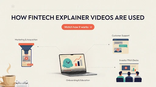
    Usage of fintech explainer videos

    A video can do more than sit on the homepage.

    Use explainers on product pages, onboarding flows, email sequences, sales follow-ups, investor decks, support centers, demo pages, paid ads, and app store pages.

    A short fintech app explainer can help someone understand the value before downloading. A deeper explainer can support a sales call. A short support video can reduce repeat questions after signup.

    That is the smart way to use video. One big explainer is helpful. A small video library is better.

    Frequently Asked Questions

    Fintech explainer videos are short videos that explain financial technology products, apps, platforms, or services in simple visual language.
    They help customers understand complex products faster, reduce confusion, build trust, and make signup or purchase decisions feel less risky.
    It depends on the product. 2D animation works well for simple workflows and customer stories, while 3D can help explain infrastructure, security, or complex systems.
    Yes. They can explain signup steps, identity checks, bank linking, approvals, security steps, and what users should expect next.
    Most fintech explainers should stay focused and short, usually around 60 to 120 seconds. More complex sales or onboarding videos can run longer if needed.

    Final Words

    Fintech explainer videos help brands win more customers because they make complex products feel safer, clearer, and easier to try. The best videos do not bury people in financial language. They answer real concerns, show the first useful moment, explain the process, and build trust without overpromising. 

    For fintech startups, banks, payment platforms, lending tools, and financial SaaS products, clarity is not a nice extra. It is part of the conversion path.

    Related Articles:

  • How SaaS Companies Use Explainer Videos to Reduce Churn

    How SaaS Companies Use Explainer Videos to Reduce Churn

    SaaS companies use explainer videos because churn usually starts quietly. A customer signs up, clicks through the dashboard, gets stuck on one setup step, and thinks, “I’ll come back to this later.” Then they do not. No angry complaint. No support ticket. Just a user who never reached the moment where the product felt useful.

    That is the part SaaS teams often underestimate. People do not always leave because the product is bad. Sometimes they leave because they never understood how to make it part of their work.

    A short, well-placed video can fix that faster than another help article buried three clicks away.

    Why Churn Often Starts Right After Signup

    The first session is messy for a lot of users.

    They are curious, but not loyal yet. They still have doubts. They are comparing your tool against whatever they used before, even if that old system was clunky. If the first few minutes feel confusing, the product starts losing trust.

    That is one big reason why SaaS customers churn after signup. The promise sounded good. The first experience did not make the value obvious.

    This is where an explainer video production company can help, but only if the video is built around the user’s first real problem. New users do not need a grand tour of every feature. They need to know what to do first, why it matters, and what a small win looks like.

    That small win is everything.

    How SaaS Companies Use Explainer Videos After Signup

    SaaS companies use explainer videos best when they stop treating video as a one-time homepage asset.

    The homepage explainer has its place. Fine. But churn reduction happens after the sale, inside the product, during onboarding, in support flows, and before renewal.

    That is where customer onboarding videos come in. A short welcome clip can help users understand the main workflow before they start clicking around blindly. It can show the dashboard, the first action, and the outcome in under two minutes.

    This matters because SaaS onboarding is not just setup. It is the first proof that the product can help.

    If onboarding feels heavy, the customer starts wondering whether the tool is worth the effort.

    The First Video Should Not Explain Everything

    A common mistake: trying to make one onboarding video cover the entire platform.

    That usually fails.

    The first video should get the customer to one useful action. Not five modules. Not every setting. Not the whole admin panel.

    For example, if the product is a reporting tool, the first video might only show how to connect data and generate one simple report. That is enough. Once the user sees something useful, they have a reason to continue.

    That is the real answer to how explainer videos reduce SaaS churn. They remove friction at the point where users are most likely to give up.

    Product Adoption Needs Better Timing

    A help center is useful, but people do not always go looking for help at the right moment.

    A video placed inside the product can catch users before frustration turns into abandonment. A short clip next to a setup step. A quick walkthrough beside a new feature. A small tooltip video after someone repeats the same failed action.

    That is using video to improve product adoption in a practical way.

    The video does not need cinematic production. It needs to appear where confusion happens.

    A SaaS explainer video company can map these moments across the user journey. The best SaaS videos are not always the biggest ones. They are the ones that show up when the user is about to get lost.

    Feature Adoption Fails When Users Do Not See the Point

    SaaS teams get excited about features. Customers often do not.

    A new dashboard view, automation rule, integration, or reporting tool may be powerful. But if users do not understand why it matters, they ignore it.

    That is where feature adoption videos help.

    The mistake is starting with the feature name. “Introducing advanced workflow routing” sounds like a release note. It does not sound like a reason to care.

    Start with the pain instead.

    “Your team is still manually assigning every request. Here is how to stop doing that.”

    Now the feature has a job.

    A 2D explainer video company can make these feature stories easier to follow with simple scenes, clean UI movement, and short examples. The goal is not to decorate the feature. The goal is to make someone try it.

    Customer Education Should Not Stop After Week One

    Explainer videos for customer education

    Many SaaS products become valuable over time, not in the first login.

    That creates a problem. If users only learn the basics, they may never reach the deeper value. They keep using one small part of the tool, miss the better workflows, and eventually decide the product is not worth the cost.

    This is why customer education videos matter.

    They can teach advanced workflows, role-based use cases, integrations, team permissions, reporting habits, and better ways to use the product after the customer is already active.

    A customer who uses one feature is easy to lose. A customer who builds three weekly workflows around your product is much harder to replace.

    That is the real retention play.

    In-App Tutorials Can Reduce Support Friction

    Nobody wants to open a support ticket for something that should feel simple.

    Short in-app video tutorials can catch those moments early. They can explain a form field, a setup step, an integration, or a common error without making the user leave the product.

    Keep these videos small.

    Thirty to sixty seconds is often enough. One task. One result. No long intro.

    For products tied to hardware, data systems, or physical operations, a 3D explainer video company can help when users need to understand how the software connects to something outside the screen. But most in-app videos do not need heavy visuals. They need speed, clarity, and the right placement.

    Videos Help Your Customer Champion Sell Internally

    In B2B SaaS, the buyer is not always the only person who decides whether the account stays.

    A manager may need to explain the product to leadership. A team lead may need to get coworkers to adopt it. A champion may need proof that the tool is doing more than sitting in the tech stack.

    This is where product explainer videos help after purchase.

    They give your customer something easy to share internally. Instead of writing a long explanation, they can send a short video that shows the workflow, the result, and the value.

    That matters because churn often starts when internal buy-in is weak. If only one person understands the product, the account is fragile.

    Customer Success Teams Should Use Video More Often

    Customer success teams repeat themselves a lot.

    Setup advice. Best practices. Missed features. Renewal value. Team adoption. Reporting. Integrations. Same questions, different accounts.

    Good customer success content makes that easier.

    A customer success manager can send a short video before a call so the live conversation starts at a better point. Or they can send a follow-up video after the call to reinforce the next step.

    The video does not replace the relationship. It protects the relationship from turning into basic instruction every time.

    Renewal Videos Should Start Before Renewal Month

    An example of a renewal video

    Renewal is not a last-minute event.

    The customer decides whether your product is worth keeping long before the contract date shows up. If they have not seen enough value during the year, one renewal email will not fix that.

    Explainer videos can help make value visible earlier.

    A renewal-support video might show underused workflows. Another might recap new features. Another might explain how a team can get more from the product before expanding seats.

    These are some of the best videos for SaaS customer retention because they remind users what they already have and what they have not fully used yet.

    Do not wait until the customer is halfway out the door.

    What Kind of Videos Reduce Churn?

    The strongest churn-reduction videos are usually practical.

    Welcome videos. Setup videos. Feature explainers. Role-based tutorials. Help-center clips. Use-case videos. Renewal support videos. Short product updates.

    Each one should answer one question.

    Not six.

    One.

    That is why video can work so well for user retention. It gives customers the right answer before confusion turns into cancellation.

    Frequently Asked Questions

    Explainer videos reduce churn by helping users understand the product faster, complete setup, discover useful features, and feel more confident using the platform.
    Short onboarding videos work best. They should focus on the first useful action, not the entire product.
    Yes. Explainer videos can show users how to use specific workflows, why features matter, and how the product fits into daily work.
    Yes. In-app videos can reduce confusion by helping users at the exact moment they need guidance.
    Yes. They help throughout the customer lifecycle, including onboarding, feature education, support, customer success, expansion, and renewal.

    Final Words

    SaaS companies use explainer videos to reduce churn because customers stay longer when they understand the product faster and use it more often. Videos help with onboarding, product adoption, feature education, customer success, internal buy-in, and renewal support. 

    The point is not to make one big polished explainer and call the job done. The better move is to build a small library of useful videos that show up exactly where users slow down, get stuck, or forget the value.

    Related Articles:

  • Real Estate Explainer Videos: What Works in 2026

    Real Estate Explainer Videos: What Works in 2026

    Real estate explainer videos work in 2026 because people want fewer surprises before they talk to an agent. Photos are fine. Drone shots are fine. But buyers, renters, and investors still ask the same practical questions. How does the layout flow? What is nearby? Is the payment plan realistic? Is this property better for living, renting, or resale?

    A good video answers those questions before the viewer loses interest.

    Not every real estate video needs to feel cinematic. Some of the best ones feel almost simple. Clear shot. Clear explanation. Clear reason to act.

    Real Estate Explainer Videos Are Not Just Pretty Property Clips

    A property video shows the space.

    An explainer tells people what the space means.

    That difference matters. A slow pan across a living room may look nice, but it does not explain why the room layout works for a young family, a remote worker, or a short-term rental buyer. A balcony shot does not explain sunlight, noise, view direction, or rental demand.

    That is where real estate video marketing needs to get more useful. The video should help the viewer decide whether the property is worth the next step.

    A good explainer video production company will not treat a condo, villa, commercial unit, and off-plan project the same way. Each one needs a different story.

    Buyers Want Context Before They Want a Tour

    A lot of property videos jump straight into the walkthrough.

    Front door. Kitchen. Bedroom. Bathroom. Balcony.

    Fine, but often flat.

    Viewers need context first. Tell them what they are watching. A two-bedroom apartment near a business district. A family home close to schools. A retail space built for foot traffic. A new development aimed at investors.

    That one sentence changes the whole video.

    This is the simple answer to how real estate explainer videos help sell properties. They stop making the viewer guess. They connect the property to a real use case.

    Virtual Tours Help, But They Do Not Explain Everything

    Virtual property tours are useful, especially when buyers are out of town or not ready to book a showing. They let people move through the space on their own.

    But there is a weakness.

    A tour can show every room and still not explain the main value. The viewer may see the kitchen, but not understand why the layout is good. They may click through the bedrooms, but not notice storage, privacy, or light.

    That is why tours work better when paired with explanation. A short voiceover, simple labels, or animated callouts can point out what matters.

    The viewer should not have to work that hard.

    Floor Plans Need Animation

    Floor plans are useful, but many buyers do not read them well.

    A flat drawing can show measurements. It does not always show flow. Where do guests enter? Is the kitchen cut off from the living room? Does the primary bedroom feel private? How far is the balcony from the main living space?

    This is where real estate animation helps.

    A 2D explainer video company can turn a flat plan into a moving guide. Show the entry path. Show room connections. Show furniture scale. Show how a buyer might actually live in the space.

    That is not decoration. That is clarity.

    Off-Plan Projects Need More Than Renders

    Off-plan buyers are buying trust, not just property.

    They cannot walk through the finished space yet. They are looking at renders, payment plans, model units, and promises. That makes the video work harder.

    3D real estate animation can help developers show what does not exist yet: exterior views, interiors, amenities, landscaping, unit flow, parking, lobby areas, and neighborhood context.

    A 3D explainer video company is useful here because off-plan projects need scale and depth. A still render can only do so much.

    Just keep it honest. If the real project will not match the video, the short-term excitement is not worth the long-term trust problem.

    Walkthrough Videos Need a Point of View

    A walkthrough video of a real estate property

    Most real estate walkthrough videos look the same.

    Someone opens a door. The camera moves slowly. The music sounds expensive. The video ends with a logo.

    That is not enough anymore.

    A walkthrough should be built around a buyer type. A first-time buyer cares about affordability and low maintenance. A family may care about storage, schools, and room separation. An investor wants rental demand, transport links, and resale logic.

    When the video speaks to one type of buyer, it feels sharper.

    Trying to speak to everyone usually makes the property sound generic.

    Listing Videos Should Be Shorter Than Agents Think

    Many property listing videos are too long.

    Buyers do not need three slow angles of the same kitchen. They need the strongest reasons to keep watching. Location. Property type. Price range if relevant. Main selling point. Next step.

    A good opening might sound like this:

    “Three-bedroom townhouse five minutes from the new retail district, built for families who want space without leaving the city.”

    That is stronger than 15 seconds of driveway footage.

    The best real estate marketing videos in 2026 will feel more direct. Less mood. More meaning.

    Developers Need Smaller Supporting Videos

    Real estate explainer videos for property developers should not rely on one master video to explain everything.

    A development has too many moving parts. Location. Amenities. Unit mix. Payment plan. Build timeline. Rental angle. Lifestyle. Handover. Investment value.

    Put all of that into one video, and it gets heavy fast.

    A better setup is simple:

    One main project video.
    One location video.
    One floor plan video.
    One payment-plan explainer.
    One short investment angle clip.

    That gives sales teams more useful material. It also lets buyers watch what matters to them.

    PropTech Needs Explainers Too

    Real estate is not only agents and developers now.

    There are CRMs, tenant portals, mortgage platforms, booking tools, property management dashboards, investment apps, and listing software. Most of them are harder to explain than the teams behind them think.

    A SaaS explainer video company can help PropTech brands show workflows from the user’s side.

    An agent wants better lead follow-up.
    A property manager wants fewer tenant calls.
    An investor wants cleaner numbers.
    A landlord wants fewer manual tasks.

    One generic product demo will not satisfy all of them.

    Animation Should Explain What Cameras Cannot

    Using animation in real estate marketing videos makes sense when the camera cannot explain the point quickly.

    Use it for maps, nearby landmarks, travel times, amenity labels, payment steps, floor plan flow, construction timelines, neighborhood growth, or rental income examples.

    Do not animate every corner of the screen.

    Real estate still needs real presence. Show the actual space when you can. Use animation to make the important parts easier to notice.

    That balance is what keeps a video helpful instead of noisy.

    Lead Generation Needs Better Questions

    Real estate lead generation does not improve just because a video gets views.

    A better question is: did the video move the right viewer closer to action?

    Did someone book a tour?
    Ask for pricing?
    Download the brochure?
    Join the launch list?
    Message the agent?

    That is why a proper real estate video strategy matters. A social teaser, listing explainer, neighborhood video, and investor breakdown should not all do the same job.

    Each video needs one purpose.

    Best Real Estate Explainer Videos for Agents

    Another example of a real estate video

    The best real estate explainer videos for agents often answer questions agents already hear every week.

    For buyers:
    How does pre-approval work?
    What happens after an offer?
    What are closing costs?
    How does inspection work?

    For sellers:
    How should we prepare the home?
    Why does pricing matter so much?
    What happens before listing?
    How do showings work?

    These videos build trust before the first call. They also save agents from repeating the same explanation over and over.

    Real Estate Video Ideas for 2026

    Here are practical real estate video ideas for 2026 worth using:

    A 60-second listing explainer.
    A neighborhood value video.
    A floor plan walkthrough.
    A payment plan explainer.
    A first-time buyer guide.
    A seller prep video.
    An off-plan project overview.
    A rental income breakdown.
    A property management explainer.
    A short FAQ series for social media.

    The best idea is usually the one that answers a question your buyers already keep asking.

    Frequently Asked Questions

    Real estate explainer films are brief videos that visually demonstrate a property, development, real estate service, buyer process, selling process, or PropTech product. 
    They assist purchasers in understanding the property’s layout, location, cost, procedure, or investment value before speaking with an agent or scheduling a visit. 
    Yes. 3D videos are ideal for off-plan developments, luxury residences, architecture, interior previews, and projects that require customers to visualize the finished area. 
    Agents should produce listing explainers, neighborhood movies, buyer education films, seller preparation videos, market update clips, and brief FAQ videos. 
    Most listing and social videos should be around 90 seconds long. Project explainers might be lengthier if customers want additional information.

    Final Words

    Real estate explainer videos work in 2026 when they make property decisions easier. Buyers do not only want attractive shots. They demand layout clarity, geographical context, pricing recommendations, investment rationale, and an incentive to act. Agents, developers, and PropTech businesses may utilize explainer films to reduce misunderstanding and attract more quality prospects. 

    The best videos aren’t usually the most spectacular. They are the ones who explain the correct thing at the appropriate time.

    Related Articles:

  • Explainer Videos for Healthcare: Educating Patients

    Explainer Videos for Healthcare: Educating Patients

    Healthcare explainer video marketing works best when it answers the question a patient is too stressed, embarrassed, or rushed to ask. What happens during this test? Do I need to prepare? Is this normal after treatment? How do I use this portal? What does this device actually do?

    That is the real job. Not making healthcare content look fancy. Not turning a clinic into a commercial. Just making the next step easier to understand.

    A good healthcare explainer gives patients something they can replay later, when they are calmer and not trying to remember every word from a short appointment.

    Healthcare Explainer Video Marketing Should Start With Real Patient Worries

    Healthcare content often starts with the provider.

    The service. The equipment. The credentials. The treatment name.

    Patients usually start somewhere else. They want to know what the experience will be like. They want to know what to do before they come. They want to know what happens next. They may desire simple confirmation that they are not overlooking anything apparent. 

    That is why healthcare explainer videos can be useful. They take one confusing moment and make it easier to follow.

    A strong explainer video company should not treat healthcare like a normal sales category. The tone has to be steadier. The script needs fewer big claims. The visuals should support the patient, not overwhelm them.

    Nobody Wants to Decode Medical Language

    A patient may nod during a consultation and still leave confused.

    That does not mean the doctor explained it badly. It often means the patient was nervous, tired, or trying to process too much at once. Medical instructions can feel simple to staff and still feel heavy to the person hearing them for the first time.

    This is where patient education videos help.

    A short video can walk through one topic slowly. One appointment. One prep step. One aftercare routine. One device. One portal action.

    That is the most practical answer to how explainer videos educate patients. They give people a second chance to understand the information without pressure.

    Animation Shows the Parts Cameras Cannot

    Some healthcare topics just do not work well with live footage.

    You can film a physician speaking. You can film someone checking in at reception. You can film a product being held. But you cannot easily film how medication moves through the body, what happens inside a joint, or how a device works beneath the surface.

    That is where medical animation videos make the explanation cleaner.

    Animation can remove visual clutter. It can zoom in. It can slow the process down. It can label what matters and leave out what does not.

    For anatomy, implants, internal movement, diagnostics, and treatment processes, a 3D explainer video company can make a difficult subject easier to picture. The point is not to impress patients with detail. The point is to show only the details they actually need.

    Some Healthcare Topics Need a Softer Look

    Not every medical video needs 3D anatomy.

    A video about therapy intake, appointment booking, insurance steps, telehealth setup, or discharge instructions may work better with simple 2D visuals. A 2D explainer video company can use calm characters, icons, and clean scenes to make the topic feel less clinical.

    That matters.

    A patient watching a video about mental health support does not need harsh visuals. A parent learning how to prepare a child for a visit does not need technical diagrams. They need clarity and a tone that feels safe.

    This is where healthcare animation works well. It can make serious information easier to approach without making it feel childish.

    Good Healthcare Video Marketing Reduces Repeat Confusion

    A lot of confusion happens outside the exam room.

    Before the visit, people forget how to prepare. After the visit, they forget what they were told. At home, they may not remember which symptom is normal and which one needs a call.

    Good healthcare video marketing can support those moments.

    A clinic can send a prep video before an imaging appointment. A hospital can use a short discharge video for common aftercare steps. A specialist can explain what happens during a first consultation. A telehealth provider can show patients how to upload documents or join a call.

    These videos do not need to be big productions. They need to answer the question at the right time.

    That is better healthcare communication. No more information. Better-timed information.

    Medical Device Videos Need to Speak to People, Not Just Specs

    Medical device explainer videos can become too technical very quickly.

    That is usually because the company wants to show every feature. Patients and providers may not need that at first. They need to understand the problem, the use, and the value.

    A strong medical explainer video should start with the human problem. What is difficult right now? What does the device make easier, safer, clearer, or more manageable?

    Then show the device in use.

    For patients, the focus may be comfort, safety, or confidence. For providers, it may be workflow, accuracy, setup, or training. Those are different needs. Trying to fit all of them into one video often makes the message weaker.

    Sometimes the smartest move is to make separate versions.

    Healthcare SaaS Needs Different Videos for Different Users

    Healthtech platforms are not always as obvious as product teams think they are.

    A patient portal may seem simple internally. The patient still may not know where to log in, how to book, how to upload documents, or where results appear. A remote monitoring platform may help nurses, doctors, admin teams, and patients in completely different ways.

    A SaaS explainer video company can help split those messages.

    One video for patients.

    One for providers.

    One for admin teams.

    One for onboarding.

    That is much cleaner than forcing everyone into the same long demo.

    This is also why healthcare explainer videos for hospitals and clinics can do more than market a service. They can make systems easier to use.

    Patient Engagement Starts With Understanding

    Understanding medical concepts with explainer videos

    People talk about patient engagement as if it is only about apps, reminders, or portals.

    It starts earlier than that.

    A patient who understands the next step is more likely to follow it. A patient who can replay instructions is less likely to rely on memory. A family member who watches the same video can help support care at home.

    Short videos usually work best here.

    One video for preparation.

    One video for the visit.

    One video for aftercare.

    That is easier to use than one long video trying to explain everything.

    Complex Procedures Need a Careful Script

    Medical explainer videos for complex procedures should never feel rushed.

    The script has to be plain, but still accurate. The visuals should explain, not scare. The final video should be reviewed by qualified medical professionals before it goes live.

    A safe structure is usually:

    • What the procedure is
    • Why it may be recommended
    • How to prepare
    • What usually happens
    • What recovery may involve
    • When to contact the care team

    That gives patients a clear path. It does not pretend that one video can answer every personal medical question.

    Healthcare videos should educate. They should not diagnose.

    What Makes a Healthcare Explainer Work?

    The benefits of explainer videos in healthcare marketing show up when the video focuses on one real patient question.

    Not the entire service line.

    Not the full clinic story.

    Not every possible benefit.

    One topic. One answer. One clear next step.

    The wording should sound human. The tone should stay calm. The visuals should make the message easier to follow. And the video should avoid fear, pressure, and exaggerated claims.

    Patients do not need a performance. They need help understanding what comes next.

    Hospitals and Clinics Should Keep the Video Useful

    Hospital marketing videos do not need to feel dramatic.

    A simple doctor introduction can work. A short animated guide to a screening can work. A calm check-in walkthrough can work. A discharge video that patients can replay at home can work.

    Healthcare already carries enough stress. The video should not add more.

    Help first. Promote second.

    Frequently Asked Questions

    Healthcare explainer video marketing makes use of short instructional movies to explain medical services, procedures, gadgets, healthtech tools, and patient instructions in simple language. 
    They help patients understand what to expect, how to prepare, what steps to follow, and what questions to ask their care team.
    Animated movies for patient education may easily explain anatomy, instruments, procedures, and care processes, particularly when live footage is insufficient or unpleasant. 
    Videos may be used by hospitals and clinics to prepare appointments, explain services, give discharge instructions, create patient portals, train personnel, and provide follow-up care. 
    Yes. Any film that describes medical care, symptoms, treatment processes, procedures, or device use should be evaluated by trained healthcare experts before publication. 

    Final Words

    Healthcare explainer video marketing is effective when it makes healthcare appear less complex. Patients may be nervous, preoccupied, weary, or attempting to aid someone they care about. A decent video offers people a better idea of what comes next. 

    It helps doctors, clinics, hospitals, medical device manufacturers, and healthtech teams by transforming complex information into something that people can utilize. The most effective healthcare explainers aren’t glamorous. They are calm, factual, practical, and based on the patient’s actual questions. 

    Related Articles:

  • Mixed Media Explainer Videos: Blending Animation With Live Action for Higher Conversions

    Mixed Media Explainer Videos: Blending Animation With Live Action for Higher Conversions

    A live action animation explainer video can work really well when a brand has two problems at once. The product needs to feel real, but the explanation needs help. That is exactly where plain live footage can fall short. 

    A person talking on camera may build trust, sure, but they cannot easily show invisible workflows, data movement, app logic, or technical product details. Animation fills that gap.

    So no, mixed media is not just a “cool style.” Used properly, it is a practical way to stop viewers from guessing what your product actually does.

    What a Live Action Animation Explainer Video Actually Does

    A live action animation explainer video mixes filmed footage with animation. That could mean a founder speaking on camera while icons appear around them. It could be a customer using a product while animated callouts explain what is happening. Or it could be a software demo where real footage, UI animation, and simple graphics all work together.

    That is the basic idea behind a mixed media explainer video.

    The live-action side gives the viewer something grounded. A face. A product. A real setting. The animation then explains the pieces that the footage cannot show clearly.

    A good explainer video company should not add graphics just to fill the screen. Every visual layer needs a job. If it does not clarify, highlight, or move the story forward, it probably does not belong.

    Why Plain Live Action Often Is Not Enough

    Live action is good at trust. It shows real people and real environments. That helps, especially if the brand needs to feel human.

    But it has limits.

    Try filming how a cloud platform saves time across three departments. Try filming how a payment flow protects customer data. Try filming the “before and after” of a messy internal workflow without making it look like a fake office scene.

    That is where live action and animation start to make sense together. The footage creates context. The animation makes the idea readable.

    You are not asking the viewer to imagine the value. You are showing it.

    The Real Benefits of the Mixed Format

    The biggest benefits of live action animation explainer videos are not about making the video look expensive. They are about making the message easier to believe and easier to follow.

    Live footage helps with credibility. Animation helps with clarity. Together, they can make a product feel more understandable without stripping away the human side.

    This is useful when the product is:

    • hard to explain in one sentence
    • too abstract for simple filming
    • too personal for full animation
    • too technical for a basic talking-head video
    • too important to leave unclear

    That is why the format works well for healthcare, finance, SaaS, training, product demos, and service-based brands.

    When Mixed Media Is the Right Call

    An example of mixed media

    The question is not whether mixed media looks good. The question is whether it solves a real communication problem.

    When to use mixed media explainer videos is usually clear once you look at the message. If the audience needs to see a real person or product, live action matters. If they also need diagrams, UI movement, data visuals, or visual shortcuts, animation matters too.

    A basic talking-head video may work for a quick update. A fully animated piece may work for a simple service explanation. But when the buyer needs both trust and clarity, a hybrid explainer video can do more.

    One example: a cybersecurity company films a team member explaining the risk. The animated overlays show how the threat moves through a system. The viewer gets the human authority and the technical breakdown in the same video.

    That is the point.

    SaaS Products Are a Strong Fit

    A mixed media explainer video for SaaS products can be especially useful because software is not easy to film.

    You can show a person using a laptop, but that does not explain the platform. You can show screens, but too many screen recordings get dull fast. Mixed media gives you a middle path.

    A SaaS explainer video company might combine a short presenter clip, screen captures, animated cursor paths, interface zooms, motion graphics, and quick callouts. Done well, the video feels guided instead of crowded.

    This works for onboarding, feature launches, sales pages, product demos, and help-center content.

    The mistake is trying to show the entire platform. Do not do that. Pick one painful workflow and explain that properly.

    2D Can Keep Things Clean

    Not every mixed media video needs big visual effects.

    A 2D explainer video company can bring a lot of clarity with simple graphics, icons, animated scenes, charts, and text callouts. This is often enough for apps, services, customer journeys, and process-based videos.

    Say a logistics company films real warehouse footage. The 2D animation shows shipment flow, delays, route changes, and delivery updates. That makes the video useful without turning it into a heavy production.

    2D works best when the idea needs structure. It can simplify without making the video feel cold.

    3D Helps When the Product Needs Depth

    Some products need more than flat graphics.

    If the product has parts, layers, scale, motion, or internal mechanics, a 3D explainer video company can make the mixed media format much stronger. Live footage can show the product in use. 3D can show what happens inside it.

    This works for medical devices, machinery, hardware, architecture, industrial tools, equipment, and technical products.

    A filmed hand holding a device builds trust. A 3D cutaway showing how it works builds understanding. Together, they can make a product demo video feel more complete.

    Use 3D when depth matters. Do not use it just because it sounds premium.

    How to Combine Both Without Making a Mess

    A combination of live-action and animation

    The key is planning.

    Too many teams film first and think about animation later. That is how mixed media starts looking patched together. The footage has no space for graphics. The camera angle fights the animation. The edit feels like two separate videos glued into one.

    If you want to know how to combine live action and animation in explainer videos, start with the script.

    Mark the lines that need real footage. Mark the lines that need animation. Leave visual space in the frame. Plan where the text will sit. Decide where the viewer’s eye should go.

    Good mixed media feels intentional. Bad mixed media feels like someone added moving graphics because the footage was boring.

    Why It Can Help Conversions

    Here is how mixed media videos improve conversions: they reduce doubt.

    People do not convert because a video has nice transitions. They convert when they understand the offer, trust the company, and feel confident about the next step.

    Mixed media can help with all three.

    The real footage makes the brand feel less faceless. The animation makes the message easier to follow. The visual rhythm keeps people from dropping off too early.

    That is why conversion-focused videos need more than style. They need a clear path.

    Problem. Explanation. Proof. Next step.

    If the video skips that structure, the visuals will not save it.

    Where Motion Graphics Fit

    Motion graphics are often the glue in mixed media videos.

    They can highlight numbers, label product parts, show steps, add arrows, bring UI screens to life, or turn a dull explanation into something easier to track.

    But use them carefully. Too many graphics can make the video feel noisy. If everything is moving, nothing feels important.

    Good motion graphics guide the viewer. Bad motion graphics beg for attention.

    There is a difference.

    What to Avoid

    Do not make the live-action part fake.

    Bad office acting, forced smiles, fake customer scenes, and generic stock footage can hurt the whole video. If the footage feels staged, the animation will not rescue it.

    Do not over-explain either. A mixed media video still needs restraint. One clean idea is better than five half-explained ones.

    A brand storytelling video should feel like it knows why it exists. If the story is only “we are great,” the format does not matter. People have heard that already.

    Give the viewer a real reason to care.

    Frequently Asked Questions

    A mixed media explainer video combines live-action footage with animation, text, icons, UI visuals, motion graphics, or other design elements to explain an idea more clearly.
    Yes, when they are planned well. Live action builds trust, while animation makes hard ideas easier to understand. That combination can help buyers feel more confident.
    Use mixed media when real people, products, or settings matter, but the message still needs animated support to explain details clearly.
    Yes. SaaS brands can combine presenter footage, screen recordings, UI animation, callouts, and motion graphics to make software easier to follow.
    Planning. The live footage and animation should be designed together from the start. If animation is added later as a patch, the video usually feels forced.

    Final Words

    A live action animation explainer video works best when the brand needs trust and clarity in the same piece. Live footage gives the viewer something real to connect with. Animation explains the parts that are hard to film. 

    Together, they can make products easier to understand, reduce confusion, and support video marketing conversions without making the content feel like a boring demo. The key is control. Plan the mix early, keep the message tight, and make every visual earn its place.

    Related Articles: